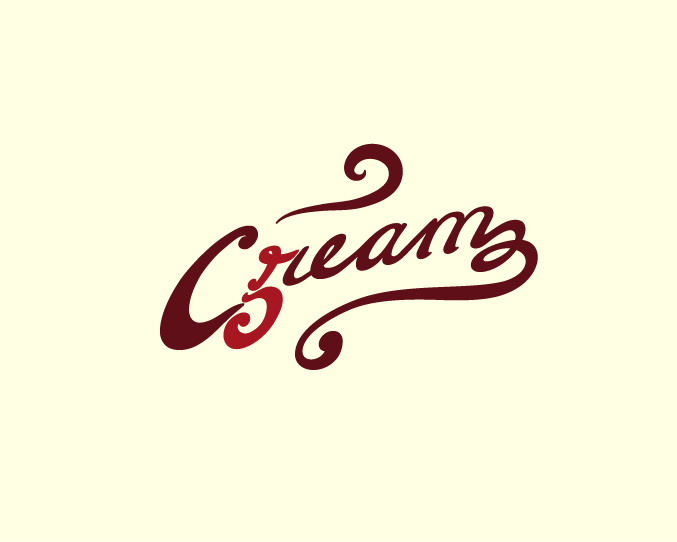
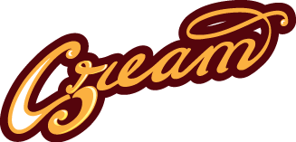
This is this logo I've come up with for a design firm called Cream 5. I'm looking for critique on the typograhpy only, I want to keep the original design intact. If there are any ideas or suggestions for improving the kerning, width, etc. etc. please chime in.
Thanks!