
Ignore the theology....I am looking only for a critique of the typography used. :) :) I just uploaded a different version...)
| Attachment | Size |
|---|---|
| Acts 1-9-11 and Matthew 24-1-34 Regarding the Coming Back of Jesus 17a.pdf | 122.35 KB |
Ignore the theology....I am looking only for a critique of the typography used. :) :) I just uploaded a different version...)
| Attachment | Size |
|---|---|
| Acts 1-9-11 and Matthew 24-1-34 Regarding the Coming Back of Jesus 17a.pdf | 122.35 KB |

Except that the theology is intricately connected with the typography. I don't know which new testament interpretation you're using, but anything but the early 17th c. King James version written in blackletter just seems wrong and out of place to me. Contemporary English in an antique typestyle seems self-contradictory.
I was also briefly confused by the initial blackletter glyph. The verse number appeared as the letter 'g' rather than the number '9'.
Herb VB

These are just very quick comments. Many of the things that I've commented on look like default settings rather than deliberate choices on your part; if this is so, you may want to consider going through a couple of books on typography and print design. I've found The Elements of Typographic Style by Robert Bringhurst an excellent and accessible introduction to typography in general, and Book Typography: A Designer's Manual by Michael Mitchell and Susan Wightman to be an excellent introduction to book design.

The above opinions are solid, but mainstream. Specifically:
- Blackletter can make sense beyond mere historicism - it has a flavor and relevance all its own. That said, it certainly is difficult finding a blackletter than can work in a sophisticated way.
- Although Bold is indeed almost always too disruptive, do consider using a Demi for emphasis (if available). To me that's even more elegant and functional than using Italics.
hhp

Try something other than Times for your body text. A classic serifed font should work well. Perhaps then you can set the biblical extracts in a compatible sans serif — or vice versa.
I do think the blackletter is too disruptive and unreadable. I might simply use italics, or a second color. If you must use blackletter, though, why not find one that's more open and readable, like Clairvaux? Or simply set the titles ("Acts 1:9–11") in blackletter, and leave the text in roman? Or just use a blackletter drop cap or something?
I recommend old-style ("lowercase") numerals, and en dashes as opposed to hyphens in verse numbers. You use them sometimes, but not always.
You do not need quote marks around the biblical passages; a change of font (and, probably indent) is enough.
I would set the verse numbers in the text in a different color (red) or in light grey.
If you set the extracts narrower, with a large right margin, and the commentary narrower, with a large left margin, or some such arrangement, you could make an interesting visual alternation between text and commentary, while suggesting two columns or trains of thought.
The main thing, though, is to find an alternative to the blackletter you're using.
Super quick sample of a different approach, just to give you some things to think about:
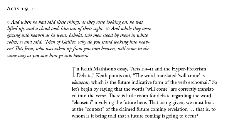
If you must use blackletter, though, why not find one that's more open and readable
Bingo: http://www.type-together.com/Eskapade%20Fraktur
And if even that's too much, maybe something gently evocative of blackletter, like Bremer Antiqua* or at least Emerson (the latter showing the hand of the punchcutter of the former, even though Blumenthal wouldn't explicitly admit it).
* http://www.bureau-perraudin.com/en/typo_04.html
hhp
I just uploaded a new version....I still want the bold type for emphasis.....Ed Stevens, the leading world authority on the topic of the essay, uses that technique and he recommended it to me. The topic of the essay is very "revolutionary" and sometimes in a "revolution" shouting is needed. ;) ;) The essay is trying to change well ingrained old concepts of the reader, so great emphasis is needed in certain key phrases etc.
Is he the world authority on the content, or its presentation? Very different animals. If he's the world authority on the latter, please send him over here.
hhp
> the leading world authority on the topic of the essay
According to who? (Not trying to be argumentative, just curious.)
The new version is a huge improvement. Well done.
I still would like to see oldstyle figures for verse numbers (which Times New Roman actually does have, in some versions), or at least reduced size lining figures.
The italic is much more readable than the blackletter, and the two-column setting helps.
Some of your quotes are still straight.
You might try reducing your type size by one or two points, but keeping the leading the same. I think that will greatly help your readability overall — smaller type, more space between the lines. This is generally easier to reads than large type, tightly spaced.

The bold type is a very bad idea: it fragments the text and actually reduces the readability of the document. As soon as one engages with the page, one's eye is drawn to these passages, but they don't make sense without the connecting text. This is lousy text articulation, and there is good reason why, in +550 years, this has never become one of the norms of typography.
As for reflecting a 'revolutionary' content of the theology... well, no, it just makes you look like a typographical crank, the documentary equivalent of someone ranting on a street corner. Theological arguments must hold their own in the norms of reasoned discourse, and dressing them up with idiosyncratic emphasis is likely to make readers question that ability.
Just a suggestion — as you update the design, keep the old versions posted so future readers can follow the progression of the thread.

Where and in what medium is this likely to be published?
It's quite possible Eskapade has become the best solution to this project:
http://typophile.com/node/96106
hhp
I know you said, "Ignore the theology....I am looking only for a critique of the typography used," but I think the typography matches the writing style and the theology.
Even so, listen to John Hudson.
Captured from commoncrawl.org on 19 Apr 2015. original URL