Hello everyone,
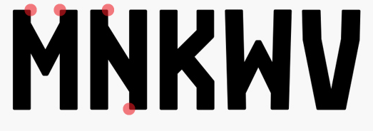
this is my first post. I just read and enjoyed a couple of threads and thought this might be a good idea for me as well. And I’d like to show you what I’m working on right now. I have some issues with my design because it’s so hard for me to make a decision to my letters M, N, K and W. I’m showing you the dilemma on the bottom of this post, so you know what I’m talking about.
I’d really happy about some feedback because I have actually no exchange to this and I got no idea if it’s good or not. So every opinion is welcome and … yeah, thank you!
Enkle means simple in danish even if I’m not danish but I meet a nice girl from Kopenhagen as I started designing this font and she taught me the language a bit. At this time there were just the Caps and I liked how “ENKLE” characterized the font how I wanted. My inspirations for this font come from industry, harbour, road-signs, eastern europe, the russian “i”, machines, wine- or apple-boxes, etc.
There is already a light (very light, close to thin ;)) version but I haven’t worked on since months so I show you sometime later maybe. I’m looking forward to finish it as a multiple master with light, regular, bold.
There is actually no Spacing or Kerning yet. I don’t feel ready for this.


and here is what I told you about:

edit:
ah, and I forgot, I already designed a concert-flyer back in ’11 using my font.