
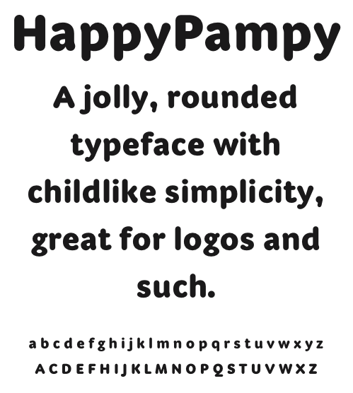

Cute. Even that "g" actually works I think!
hhp

Really nice! I wonder if the tail terminal of the /y/ could have more presence; it looks slightly pinched where it changes direction. Not convinced about the /g/, would need to see a pdf. Lovely work.
Captured from web.archive.org on 16 Apr 2015. view this capture