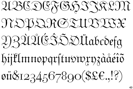
These are my all time favorite Blackletter typefaces....Any others that you regard very highly out there?
 Blackletter High Quality.pdf
These are my all time favorite Blackletter typefaces....Any others that you regard very highly out there?
Blackletter High Quality.pdf
Wilhelm Klingspor Gotisch, and of course the inimitable Linotype Sangue.
hhp
Ouch, I start to bleed just looking at Linotype Sangue LOL
As the feature is common to the examples on your list, all being in the Old English vein, it finally occurs to me to wonder about the dealie in the capitals consisting of an extraneous vertical hairline connected to the letter proper by two little hairlines bowed toward each other. It is purely decorative and weirdly structural at the same time. How did it come about? Does it have a name? I never questioned it before, but now, upon examination, I can't see the sense of it. If anyone has any clues to the history of this curious artifact, I would like to hear them.

Quite a few in here:
http://www.underconsideration.com/speakup/archives/005536.html
Cerulean, I may be incorrect, but I understand it is to be a parallel to the ribbing of Cathedral Church stained glass windows....

@cerulean I presumed it was to give balance to the overall tone of the letter. The big open forms have a lot of negative space without those lovely little hairlines.

Moyenage by František Štorm

Blaktur, by House Industries.
Rudolf Koch's Deutsche Zierschrift

Hrant beat me to it!
But I will also add Clairvaux, which I've sometimes seen called a "whiteletter."
It's funny how blackletter types are called "Old English." Old English — as in the language, Anglo-Saxon — was not written in anything like a textura style, but in something closer to a half-uncial style. English was not written or printed in blackletter until the Middle English period (c.f. Caxton's Chaucer).
Captured from web.archive.org on 21 May 2018. view this capture