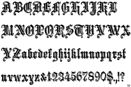
Any idea what font this might be?
| Attachment | Size |
|---|---|
| Screen Shot 2012-08-27 at 12.28.50 PM.png | 463.85 KB |
Any idea what font this might be?
| Attachment | Size |
|---|---|
| Screen Shot 2012-08-27 at 12.28.50 PM.png | 463.85 KB |

Most likely a custom-made title for the magazine. It doesn't match any common blackletter font. It has some stylistic similarities to Letterhead Font's LHF Old Blackletter. The one PDF on the website includes the title only as outlines, while other text is in embedded fonts. I'd bet that whoever designed it also created other alphabetic numbers for himself or herself!
- Herb
Thanks Herb.
I had the discussion with a friend and he has som references and said it was only the L that was straighten etc. I'll keep looking. Thanks.
The general style of the L can also be seen in Archive School Text, Blackletter 686BT, and some others. It hasn't been straightened. The general form of the i, n, r, and v are quite common (but far from identical). Although the spur on the i's tittle (dot) is quite unusual. Also, the flourish on the n clearly exists only because it's the last letter in the word - it would be out of place elsewhere. What can't be seen (at least by me) in any other blackletter font is the central dip in the top strokes of the a, s, and o.
- Herb
Captured from web.archive.org on 24 Feb 2013. view this capture