Hi gang,
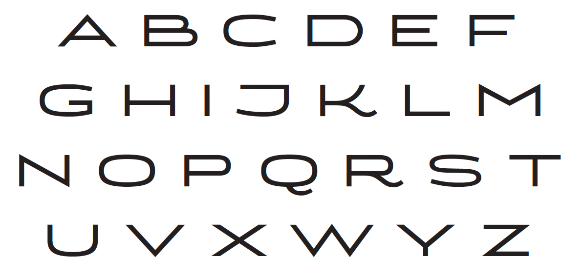
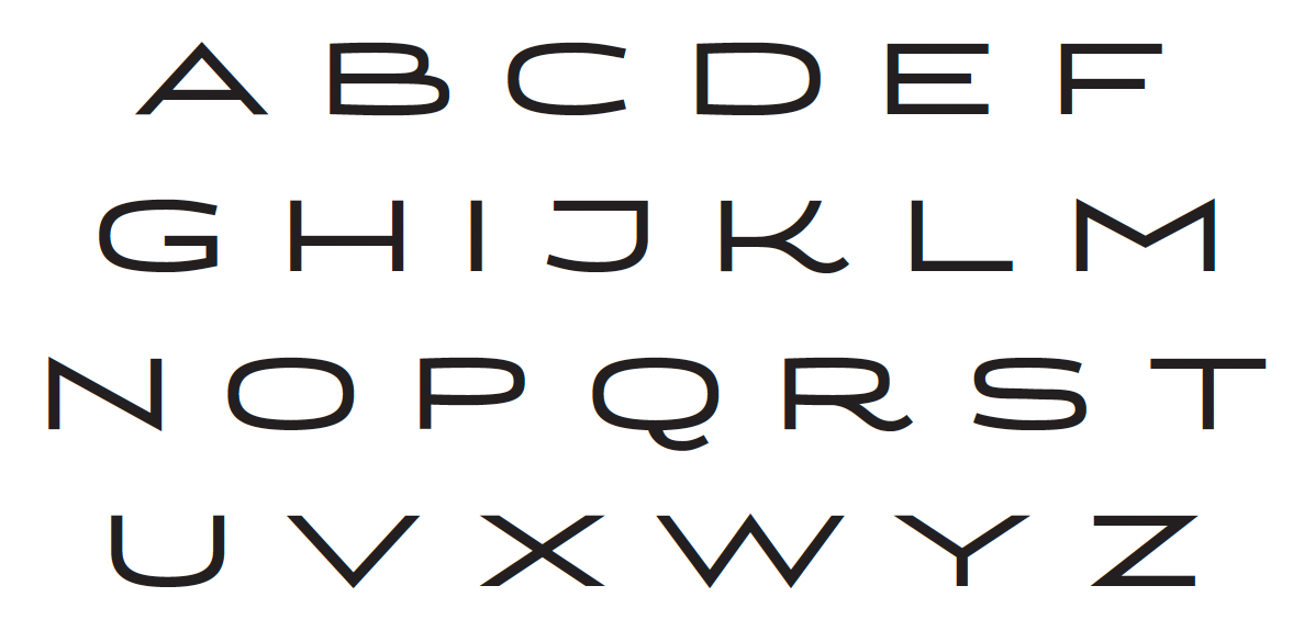
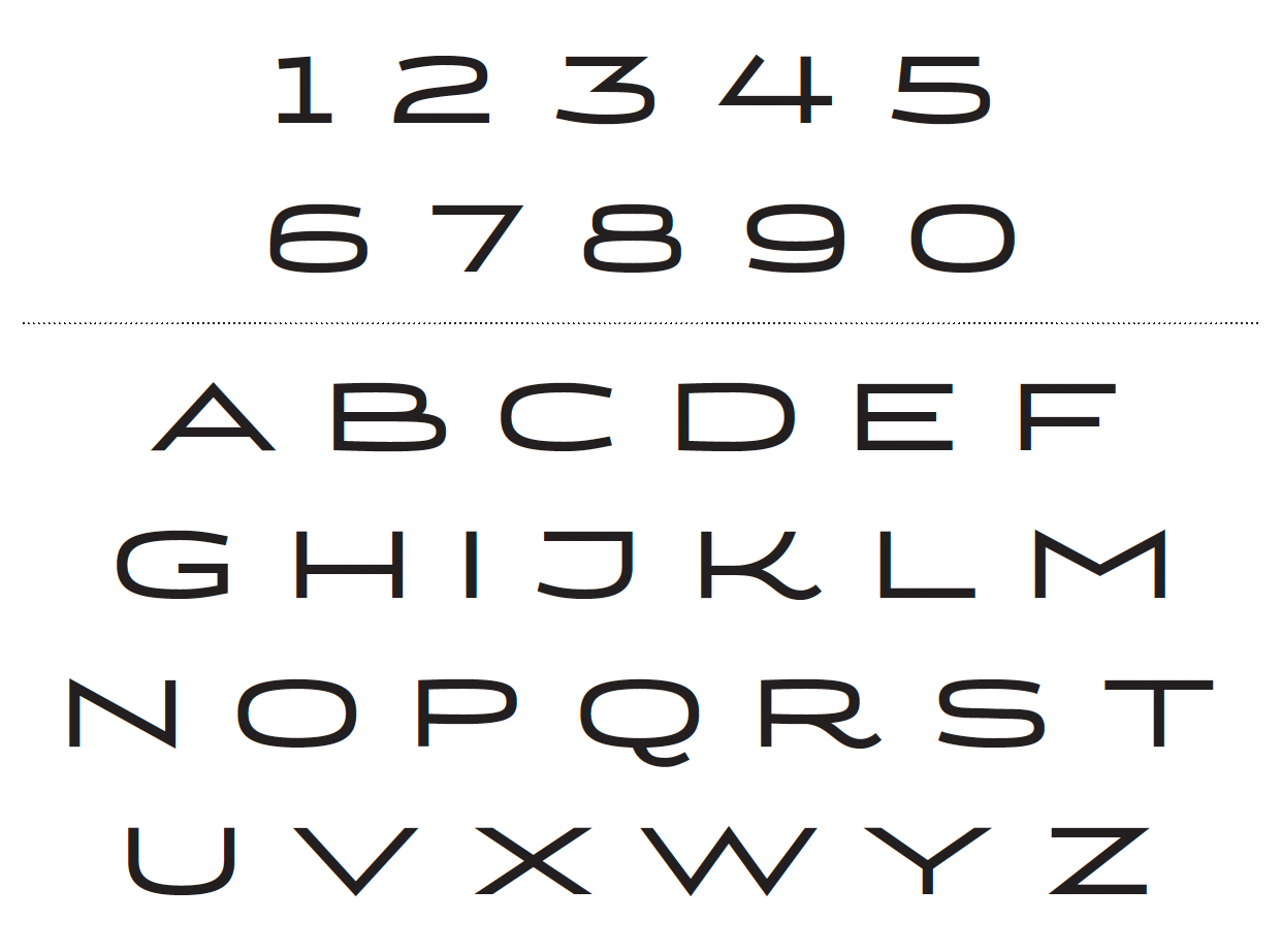
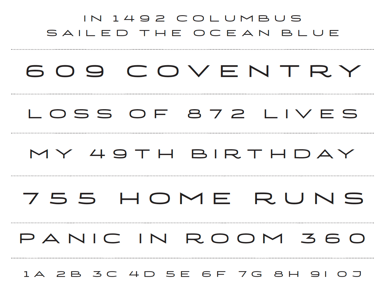
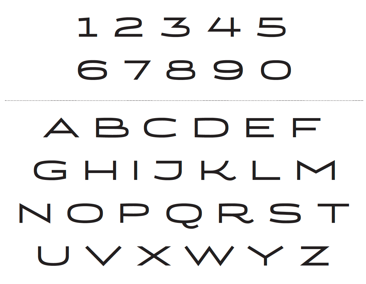
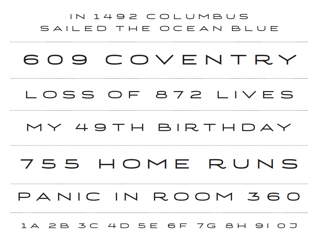
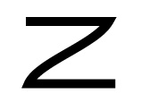
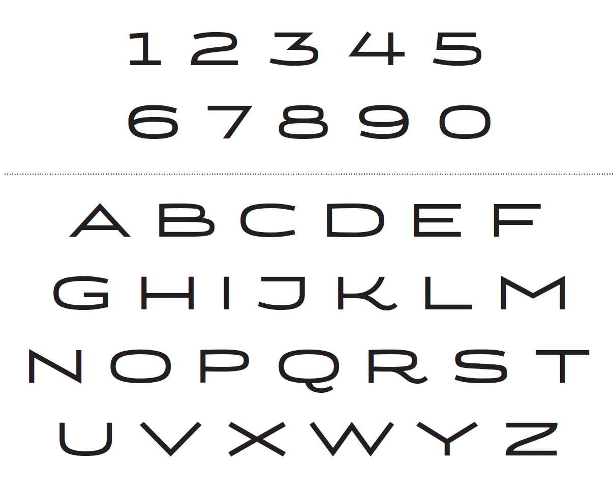
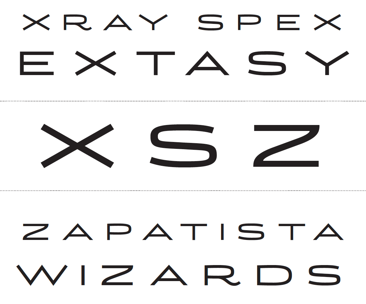
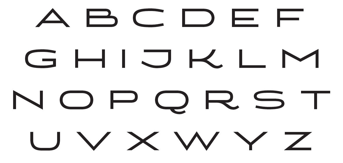
I'd love to get your feedback on this typeface. While I've been wrangling bezier curves and setting/licensing/ogling type for a couple of decades as an art director, this is my first attempt at type design.
The spacing hasn't been addressed yet -- I wanted to make sure the glyphs were solid before tackling that task.
Thanks!
P.S. -- See below for a link to a PDF, for those who care to inspect the shapes more closely.
| Attachment | Size |
|---|---|
| specimen_082612.pdf | 26.69 KB |
| specimen_082712.pdf | 26.64 KB |
| specimen_082812.pdf | 27.09 KB |
| specimen_090512.pdf | 27.65 KB |