
Hello all--
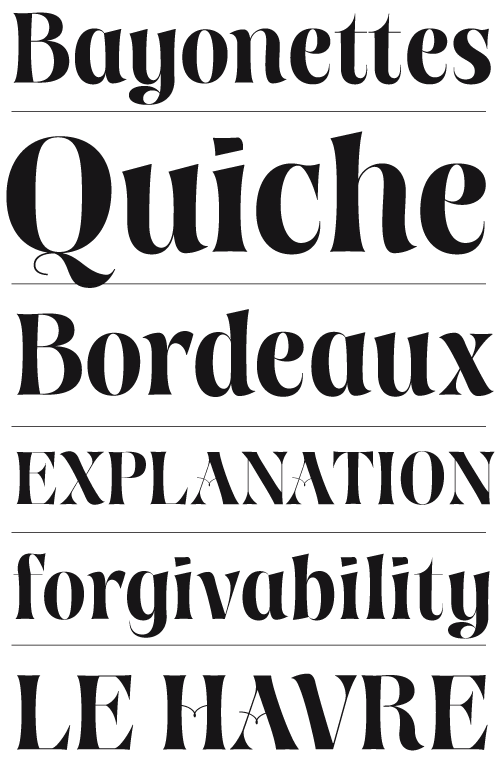
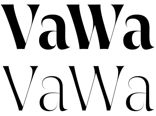
I've got an in-progress here that needs your eyes. It's based on a hastily designed logo for a paper sculpture artist that I thought had some potential as a full set of letters. It's a bit of a mash-up of different elements but here's the main points I want: display face, high contrast, flared serifs and abrupt wedge serifs, large x-height, and some other thin, swashy elements and unconventional forms are ok with me since I envision it being used at large sizes. I'd also like to make light and ultra weights too.
| Attachment | Size |
|---|---|
| Papreo_02.pdf | 84.82 KB |


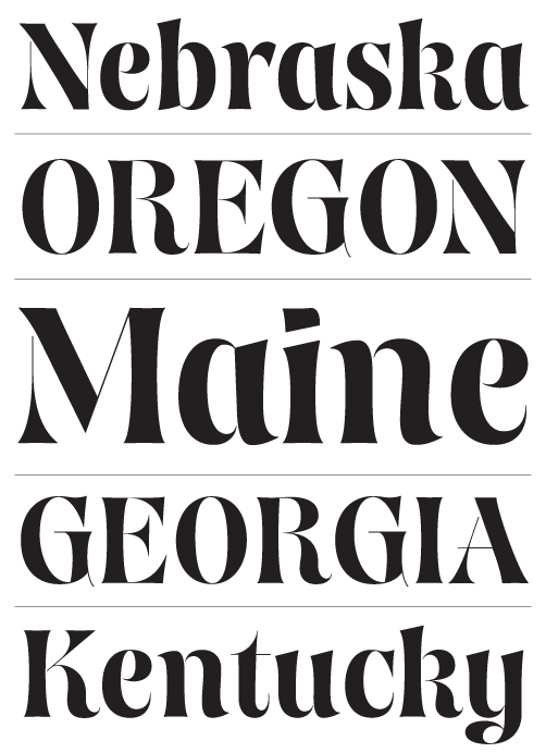
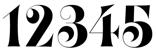

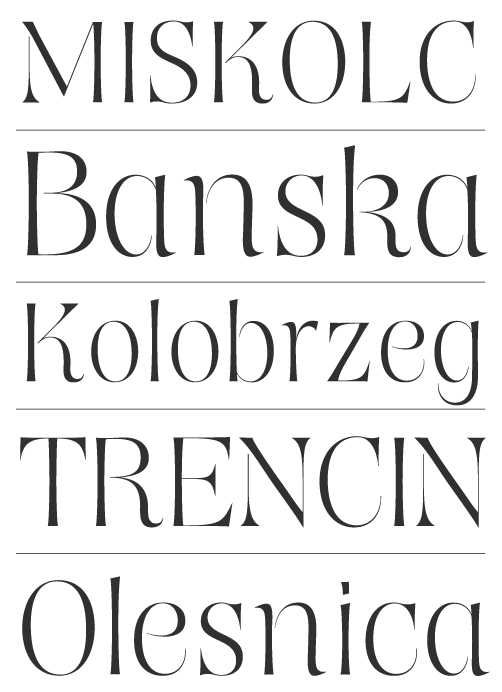




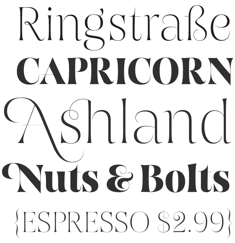


In my opinion, I think the crossbars (at /A/, /t/, /eszett/...) might be slightly thicker, they appear too thin to me (in comparison to the other lines). The /A/ crossbar disturbs me a bit with its geometrical straightness (it makes the left "overshoot" I guess).
Maybe I would add some extra volume to the legs at /R/ and /K/ letters to compensate missing ending serifs in order to add more stability. (light version)
And one more point: The dollar sign is missing contrast at upper right and lower left side (the ending swashes) (for me)
That's all from my side :)
Regards
Jan