
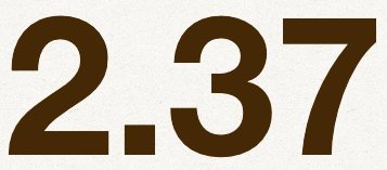

Helvetica Bold

Can anyone explain to me why that 2 and 3 isn’t flawed? Helvetica is a display face after all. You are supposed to see it up close.
Thanks... I apologize for taking up your time with, what turned out to be, Helvetica after all. Appreciated. :-)
Captured from web.archive.org on 18 Oct 2013. view this capture