Typophile

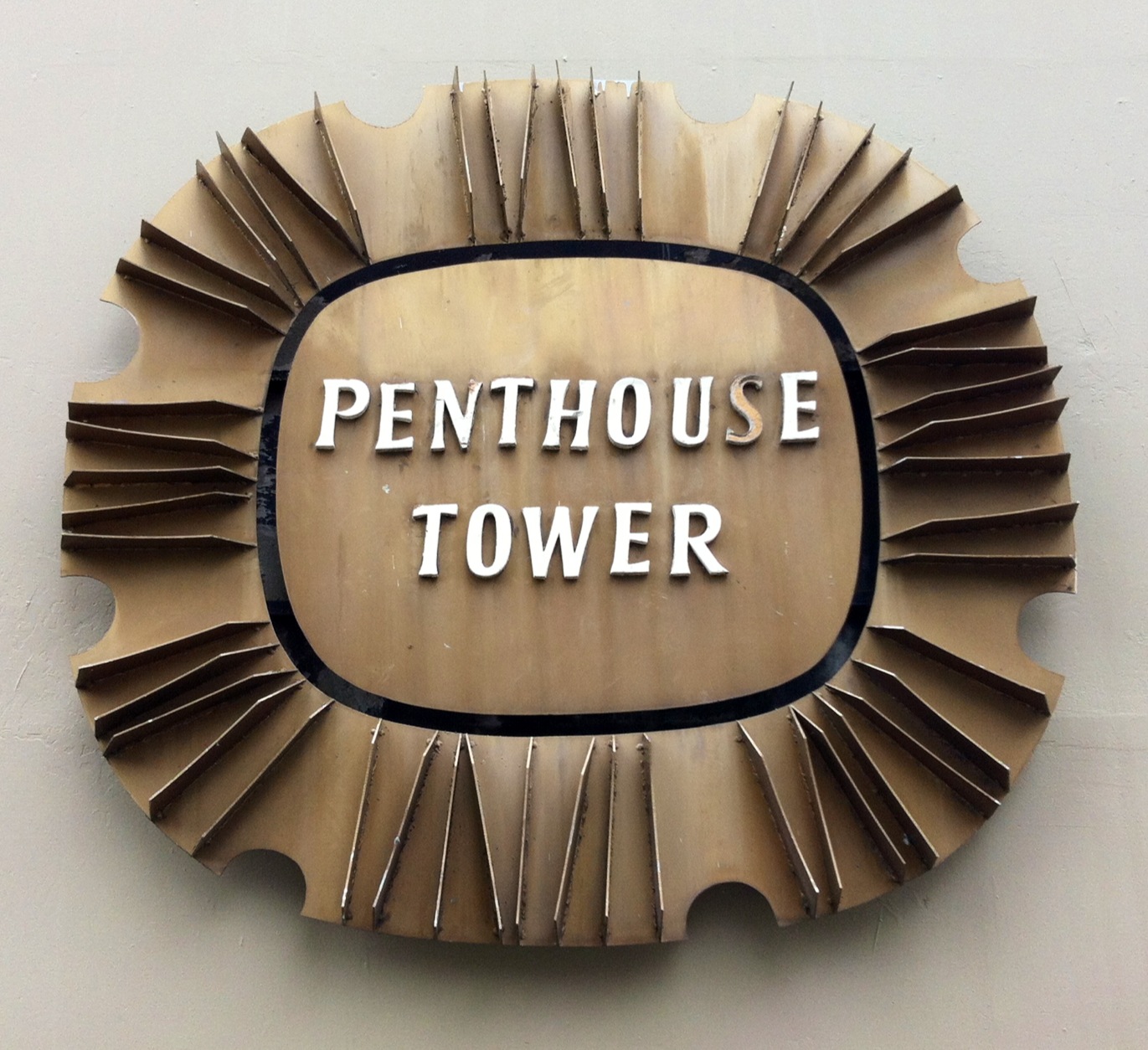
60's-era, flared-serif, display face

Sort of Albertus meets a Michael Harvey face (Ellington, Strayhorn). These letters are in bad repair. Is this a font or custom lettering? Smaller image below. See large image at http://loose-oddities.posterous.com/my-favorite-lettering-in-vancouver

AttachmentSize
Penthouse Tower small.jpg59.55 KB

Reminds me of one of Michael Harvey's designs but mixed with Albertus. Is this a font or custom lettering?

Most likely custom. One-off signs like this were still mainly a hand craft in the 60s. The P and the R are relatively wider than all the other characters, suggesting the designer was drawing inspiration from more than one alphabet.

The P and the R are close to Friz Quadrata, but that font wasn't designed until 1973, so if this sign really dates back to the 60s, your hunch about Albertus is right on.

Captured from commoncrawl.org on 26 Apr 2015. original URL