Since the main thread "Source Sans Pro: Adobe’s first open source type family"
see http://typophile.com/node/95280
deals only with licensing matters and not with the font itself, I open here a new thread to draw the attention to strange technical peculiarities of this new font.
When I heard of this font here at Typophile, I download it and made a lot of printouts for testing purposes. At first I thought: Wow, a great new sanserif font, and available for free at that.
But when I studied all the printouts made on my laser printer in more detail, I came to the conclusion that all the weights of this font family must have been generated automatically or mechanically in a faulty way with the detrimetal consequence that all the caps heights and x-heights and ascender heights are different in different weights.
When you open a professional font, e.g. Adobe's Myriad font, with a font editor, you will find that the caps heights of all weights are identical. For instance, the uppercase "U" of Myriad OpenType has a caps height of 674 units as regular weight and as semibold weight and as bold weight and as black weight, that is, all the caps heights of the same letters are identical in different weights. That is what you expect from a professional font, otherwise the letters in a line of text would not align properly.
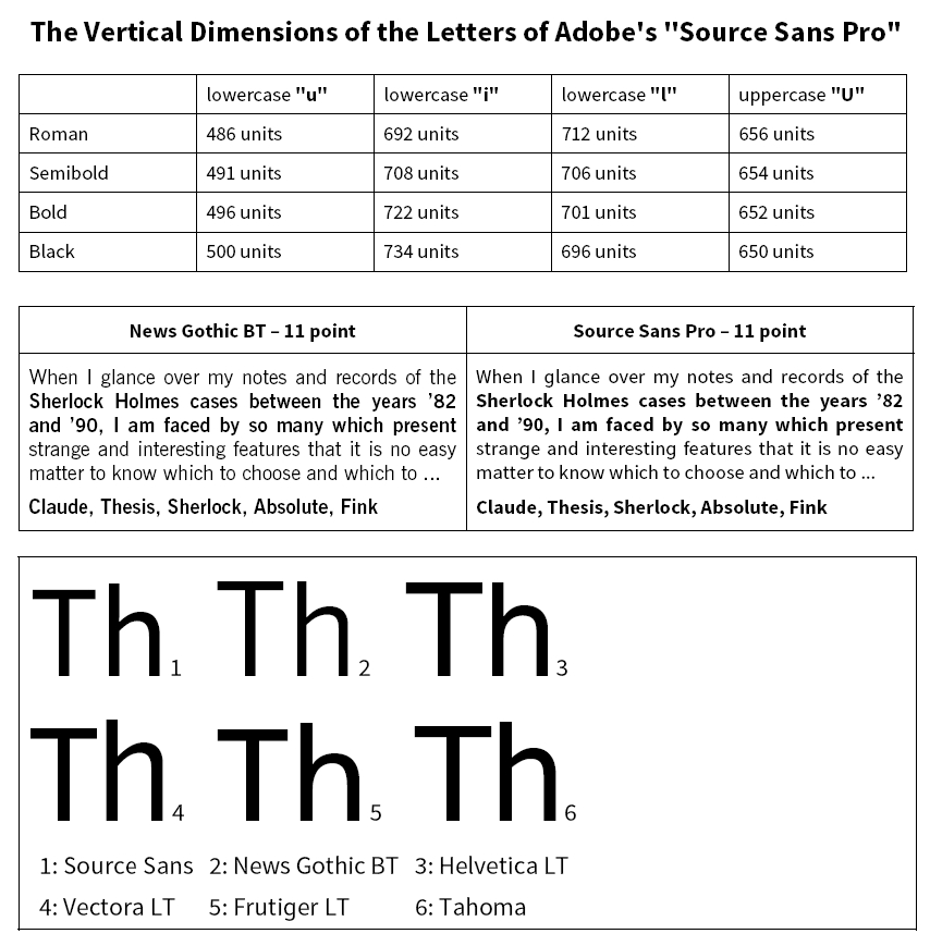
However, if you open the new font Source Sans Pro with a font editor, you will find that the caps heights and the x-heights of all weights are entirely different with the consequence the letters in a line of text do not align properly.
Have a look at the picture vertical.jpg attached below. What you see in this picture is the capital "I" of Source Sans Pro in roman, semibold, bold, and black (from left to right).
The vertical dimensions of the capital "I" are as follows:
Roman: 656 units
Semibold: 654 units
Bold: 652 units
Black: 650 units
The bizarre logic for uppercase letters seems to be this:
The blacker the uppercase letter, the smaller the vertical dimension.
Now, if you measure the vertical dimensions of the lowercase "u", you will find these dimensions:
Roman: 486 units
Semibold: 491 units
Bold: 496 units
Black: 500 units
The bizarre logic for lowercase letters seems to be this:
The blacker the lowercase letter, the larger the vertical dimension.
What is your opinion?
| Attachment | Size |
|---|---|
| vertical.jpg | 21.07 KB |