Typophile

SciFi78 - my n00b type

This is my first real attempt at building something. The archetype is derived from the LEDish look of typefaces seen in late 70's scifi movies. I penned versions of this in my undergrad days and wanted to commit something to digital form.. and open type/webfont it. Unfortunately, I was working more or less in a vacuum before finding you. I'll do my best to adjust it based on your comments and criticism.
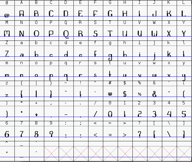
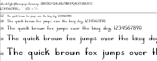
The working files can be found here: http://github.com/timBrockman/SciFi78.git
Thanks in advance.
Cheers,
Tim

Sorry to be brutally honest, but I've rarely seen anything so bad. That doesn't say 70's scifi to me, it just looks incredibly poorly executed and extremely amateurish. Examine lots of typefaces, look at proportions, think about it for a long time then start again, but with smaller ascenders and descenders. There really is no point critiquing this version as there is so much wrong here.

On the other hand, this is how virtually all first fonts look.

Indeed it wouldn't be fruitful to critique details; however it's still possible to help by providing guidance in terms of overall technical issues, by pointing out good precedents in this genre, and by trying to figure out how this effort can stand out (where for example the long extenders might actually make sense).

hhp

So for example maybe this can be to Computer* what Mrs Eaves is to Baskerville.

* http://www.myfonts.com/fonts/mti/computer/

hhp

Captured from commoncrawl.org on 19 Apr 2015. original URL