Typophile

Blog page with mixed fonts

Hi, I am trying to improve this page, and I am not sure which fonts to remove or change;
I used Lobster to "soften" the sharpness of the page, but it looks out of place, and I'm not sure if the body font (Hattori Hanzo) is also a good choice here.
I am trying to achieve an "artsy" look, It is suppose to be a part of a photography portfolio, and I don't want the hexagon and square shapes to make the page too "robotic"
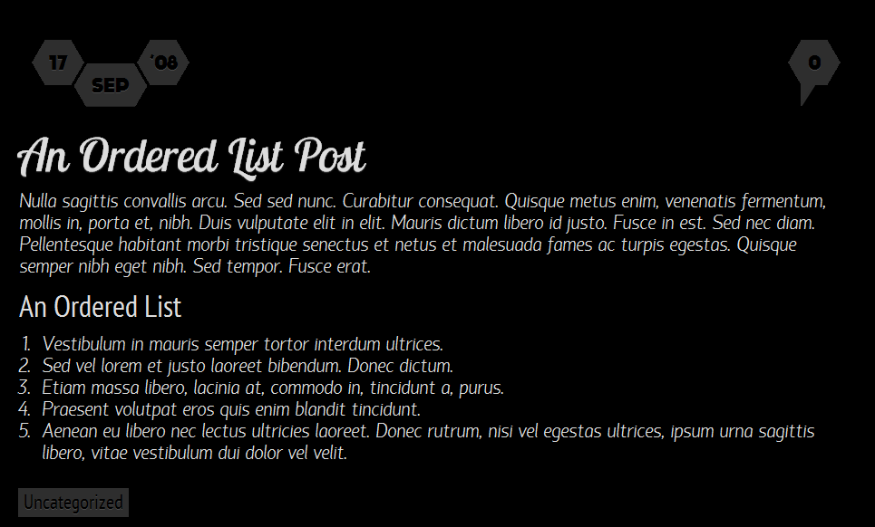
Link?

Now added, I thought "attach" is enough..

Instead of Lobster try something that's both hard and soft, like:
http://www.linotype.com/915/kursivschrift-family.html
It's also rather mannered = artsy.

For the text, I'll have to think about it...

hhp

Both of these fine faces are so tightly spaced I would not use them in the varying conditions of the web. Unless of course you think it looks cool this way... tight, italic, white on black, sans, longlined and small.

One uses an italic for distinctive parts, not for whole swaths of text. Make that body type a roman and all is well.

And the linespacing should be a bit more.

I think some Italics (like Ernestine's) can handle a fair amount of text, especially if they have serifs.

hhp

This one doesn’t, Hrant…

Something else: every font that”s used in the example is a narrow one. When some kind of distinction is needed, variation is what one wants — wide vs condensed, for instance.

Agreed, I was just countering your blanket statement.

hhp

Thanx guys, I didn't notice how narrow the fonts are until you pointed it out.
BTW why is it a rule not to use italic in a body, does it make it less readable?

Are you new to earth?

I am new to making font choices. Any other meaningful and relevant questions?

Welcome to our planet. It's small and monochrome, and you can't leave.

The way Italics are traditionally made (steep slant, narrow, cursive, no serifs) causes them to be bad for continuous reading. That said I believe it's possible to make an Italic in a certain way so that it's more readable than most Roman fonts tend to be. The thing is if the Italic has too much of a Roman's good attributes it stops doing its main job well enough, since as a rule an Italic is designed to serve its Roman, and that town ain't big enough for both to be highly readable.

hhp

OK, thanx for the detailed explanation.
Do you have an example of a font that it's italic is good for readability?

The one I mentioned before is pretty good: http://ernestinefont.com/
It has a great Roman too, and renders very well onscreen. Plus it breaks from the dead old model for making an Italic.

hhp

Looks interesting, thanx

Captured from commoncrawl.org on 26 Apr 2015. original URL