
Hello,
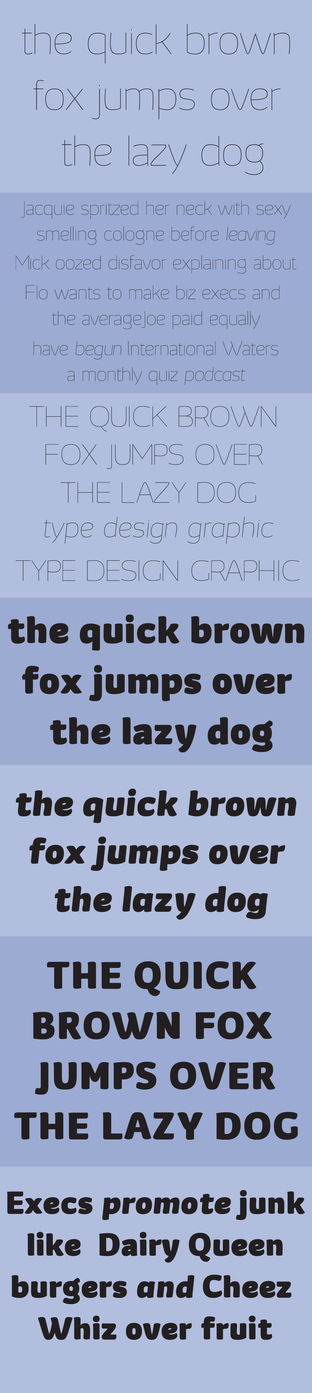
This is Suba, a sans family that I'm developing. I want to do a interpolation. But I'm not sure if I should draw the regular weight to do it.
And the italics, I'm not sure about it. Thanks for you feedback.
Hello,
This is Suba, a sans family that I'm developing. I want to do a interpolation. But I'm not sure if I should draw the regular weight to do it.
And the italics, I'm not sure about it. Thanks for you feedback.

It's nice!
It's hard to imagine "blind" interpolation working between such extreme weights, especially in a curvy monoweight.
Some crits:
- I would give one of the diagonals of the "x" some curling (especially looking at the "z").
- The sharp turns when diagonals meet look unhappy. I think it would be much better to have the diagonals (even if they're curved) meet sharply.
- I think some parts of some letters in the Bold need more contrast.
hhp

where is the wavy-curviness coming from in the the fatter weight? I dont't see any of that in the thin weight. To me they look like two different fonts, not two different weights of the same font.
To be clear I like both of them. Just not sure if they connect with eachother. One looks almost like it was done with a brush, while the other doesn't have anything brushy about it at all.

Pretty hard to get the same “wavy-cirviness” in ultra thin weight but I think it can be done. With this image I can’t see if you have the same terminal. It's also hard to interpolate from an ultra thin to an ultra, I strongly recommend to draw a regular weight to interpolate from thin to regular and regular to ultra. Keep going.
I understand, I think the way things go with the fatter weight are different for what the thinner are proposing. Maybe a change into the brushy on the black may things seems more alike.
He could alter the straightness of the thin weight a bit, (this is just a quick sketch):
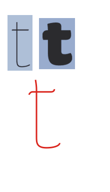

You could always take a similar (reversed) approach than this one:
http://typophile.com/node/93711
Hello, I've been doing some things that you guys and other friends said.
And then I was talkin to some friend, and she told me to do that way. Like a Male and a Female version of that. Then I can keep going with two almost same structure but in different ways of design.
Well, I think I will need to do a few changes in order to keep this thinking.
Please comment.
Hope you liked.
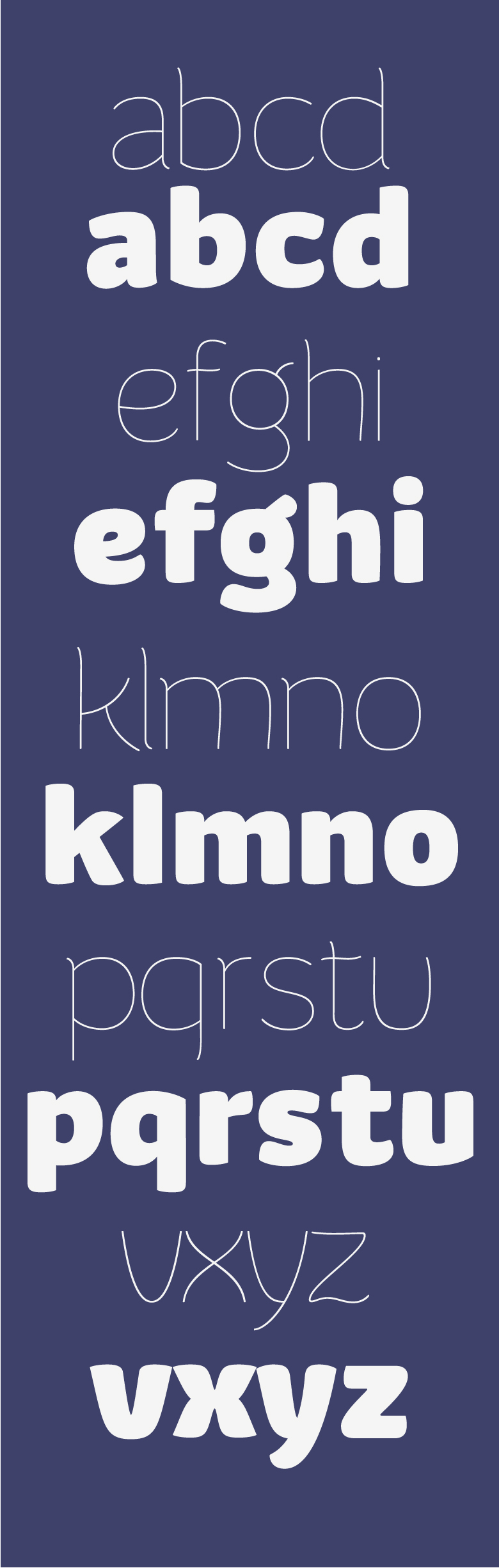
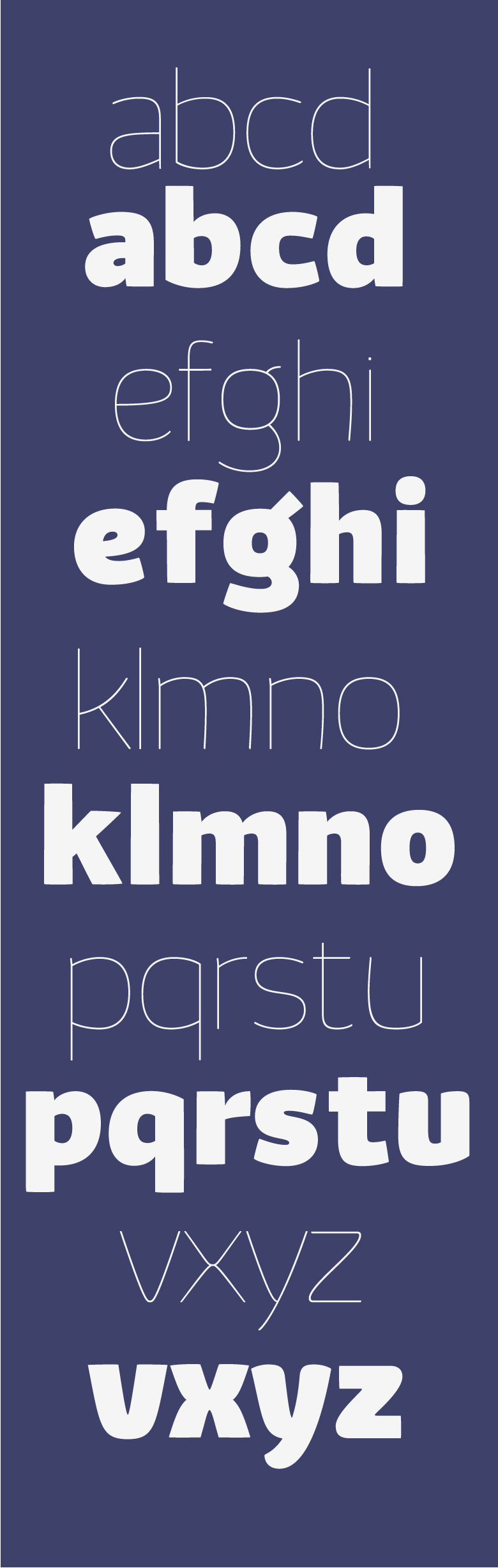
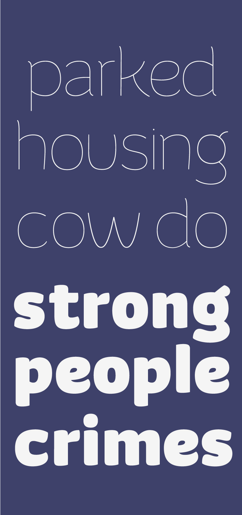
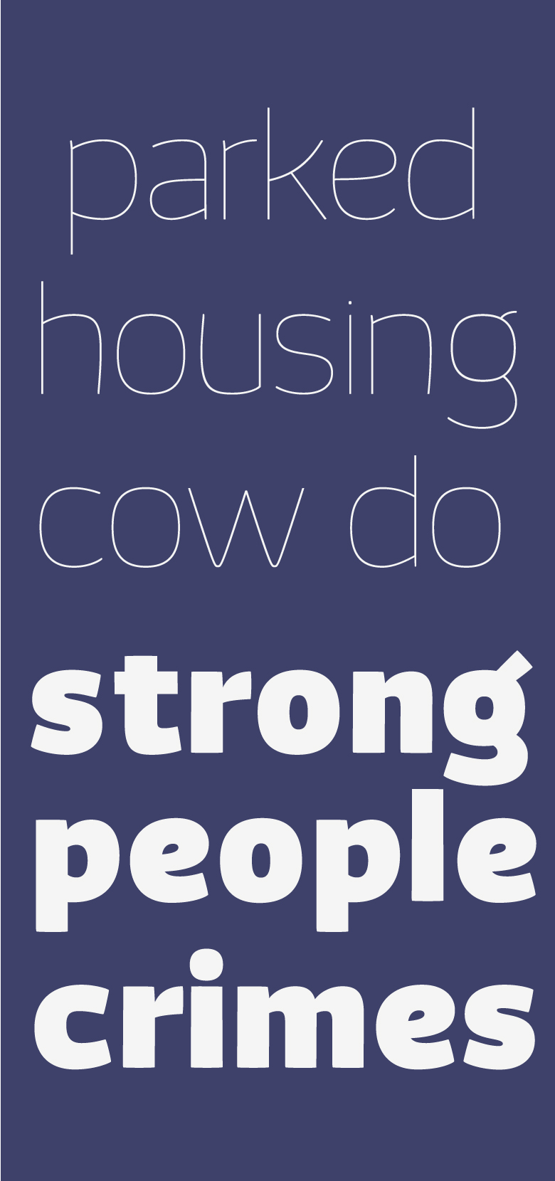

Personally, I don't like where it's going with the Thin. Maybe it's true that the Bold and the Thin from the first post represent similar, but slightly different font, but they're both very pleasant. Now it seems like you're trying to fit the Thin into the Bold curves by force and it isn't doing much good for the font.
I've made some changes on the design. Maybe it's getting somewhere.
What do you guys think about it?
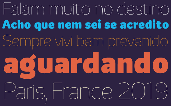
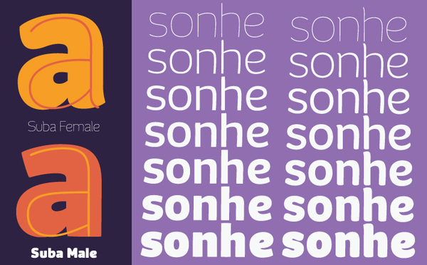
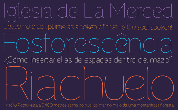

Gorgeous!

The light weight is bad spaced, e.g. /h/, /u/, /e/ in Riachuelo. The /c/ in the bold "male" version is too wide. In the "female" version it looks just right.
Keep it up!

Yes, the spacing needs attention. But aside from that, all I can do is encourage you to keep going with it, it's a lovely design :)
Thanks guys!
Yes, the spacing is really bad. I'm taking some reviews on the characters, and I will space it better.
Captured from commoncrawl.org on 26 Apr 2015. original URL