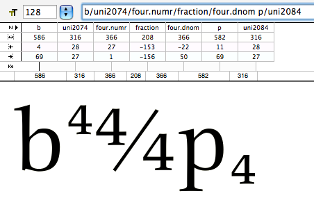
We modeled a fraction feature from things we saw in other fonts and even got some pretty cool code from this very fabulous build forum. When there is no glyph for a particular fraction the glyphs used in the substitution are encoded in the Private Use area.
Now, however, we’re wondering if they would be better in the superscript and subscript range (2070-209F). The main use of the font thus far is typesetting in InDesign. The client wants to use this same font for their web product though we’re not sure what that will be just yet. So, our thought is that if all the numerator and denominator glyphs are encoded in the superscript and subscript range we’ll have a little more of a direct “conversion” from the InDesign file using the fraction feature to the superscript and subscript Unicode range that should (I think?) be pretty easy to display on the web.
We’re hesitant, however, as very few fonts seem to use the superscript and subscript range in any significant way.
Can anyone comment on what the intent of this range is and/or why the numerous fonts we checked out all use private use range or unencoded glyphs for the numerator and denominator glyphs?
Thanks very much for slogging through this far too long post.