
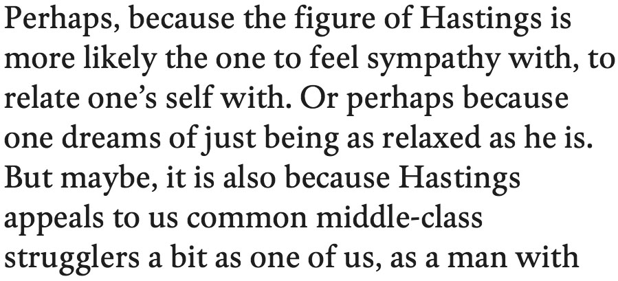
Not quite sure what you would make of this.
Comments welcome.
Not quite sure what you would make of this.
Comments welcome.

For some reason at first blush it felt like Plantin's more dapper brother...
Looking at it a little longer, it's reminiscent of Sumner Stone's work.
The ascender/descender ratio should be higher.
hhp

I agree with Hrant here in all three points. Ascenders look a bit short.

Big yawn.

Is this a design by you, or something else? Why "Design" instead of "Critique"?
> a design by you, or something else?
It’s a trial by myself.
> Why "Design" instead of "Critique"?
My fault, sorry. I’ve moved it.
> Ascenders look a bit short.
Oh dear. And I guessed you would go and praise the generous x-height …
> Big yawn.
Hm.
So, a reader of a given text would not take any notice of the type design – ?
This is exactly what I was after.
/u/ looks a little narrow and /t/ a little short to my eyes. I also agree with Hrant about the extenders.

It's nice, solid and professional. But not more than that... sorry
So, a reader of a given text would not take any notice of the type design – ?
Readers adjust quickly and acclimatize to the document.
You have designed some very inventive faces.
Please continue in that vein, and don’t waste your talents on fine tuning established genres!
You asked, and that’s my comment.
Generous x-height is good, but compared to the descenders the ascenders look too short.
> You have designed some very inventive faces.
Thank you.
> don’t waste your talents …
Very little time has been wasted so far.
> … on fine tuning established genres
This is a remarkable thought, I’d say.
> You asked, and that’s my comment.
I appreciate it anyway, honestly.
Sorry, I realize I meant to say /u/ looks a little *wide*.
If you want a large x-height, sure, but then make the descenders shorter.
Concerning originality: I have to agree with Nick, including about wasting time (something I consider our most valuable resource - I tend to even get religious about it). And I would offer the following "antidote" to the Warde-ian "transparency" business: just because a layman can't spontaneously see differences in fonts doesn't make them the same. Or: Nothing is really transparent to the human unconscious.
/u/ looks a little *wide*.
Making the "u" slightly narrower (mathematically) than the "n" is a classic optical compensation.
hhp
> Generous x-height is good, but compared to the descenders the ascenders look too short.
Right, ascender height to descender height is not yet balanced enough. Agree.
No one of you have claimed so far that the O is far too wide …
I thought about it but decided to wait until a showing with more caps!

Andreas, it's impossible for me to evaluate a text font without looking at it on paper in a multi-page document. Looking at a snippet, enlarged, on a screen just doesn't do it. But... Holy Hannah, this is one dark font! That's the kind I like. And it reads very well, as far as I can tell from the screen snippet. The ascenders/descenders look fine to me. The "fi" in "figure" looks good enough for me to say: no ligature needed. I realize it's a work in progress, but to my eye the spacing of "Pe" in the first word and "pp" in appeals looks a shade too wide. My big picture opinion: This might be one of the dark, twenty-first century book text faces we've been waiting for.
Having just celebrated the fiftieth anniversary of the first performance by the Rolling Stones, and being somewhat steeped in Stones’ arcana, I’m reminded of how Andrew Oldham (their manager) was certain they’d never be as big as the Beatles if they didn’t write their own material, so he locked Mick and Keef in the kitchen of the flat he was sharing with Mick at the time, and wouldn’t let them out till they’d written an original song. That first one wasn’t Satisfaction, but you have to wonder whether they’d still be around singing old Muddy Waters and Sam Cooke songs.
> this is one dark font
What do you mean by ‘dark’ if I may ask?
> book text faces we've been waiting for
What kind of book text face are you waiting for? What do you think others are waiting for?
I’m not sure.
Andreas, to me your font looks like it would fit in with the fonts mentioned in this old post about dark book typefaces:
http://typophile.com/node/51171
It looks darker than Skolar. And about as dark as Greta Text. It is darker than the Microsoft font Cambria.
I'm sorry but I have no specific answer about that book text face I am waiting for. I definitely can't speak for any crowd.

Make of it... Oi dunno... Make with it... A whodunit krimi.
…dark, twenty-first century book text faces…
Dark? I’d like to see anybody top this oldie:
http://www.amazon.com/Chronicles-Volume-1-Bob-Dylan/dp/0743228154
(Look inside.)
The matter of darkness is a worthy concern, surely. But I never actually thought about that with any of my typefaces. I think, one has achieved by time a kind of subconcious sensibility for the proper weight of a text face in 10 points on the printed page of a book.
However, my thoughts guiding me towards that attempt have been of another sort.
I would never be so bold to claim that anyone may be waiting for this. (who on earth did ever WAIT for a PARTICULAR face to come?!!)
No.
But if there would be something sensible in the design, I’d wonder why this face is not always out there.
Or is it – ?
sorry for my ignorance.
who on earth did ever WAIT for a PARTICULAR face to come?!!
Well, I believe that to ideally typeset any given job, the font does not exist; what people do is compromise and [hopefully / try to] choose the one font that does exist and does the job better than any other. So to me it makes total sense for somebody to exclaim "Eureka!" when he sees a particular font (and this could be a font that was just released, or even under development).
And this isn't just hypothetical: when Emily Artinian started looking for Latin and Armenian fonts to set "From Ararat to Angeltown"* she became stuck. When she bought Nour&Patria she said it was the only typeface that could do what she needed.
* http://www.vampandtramp.com/finepress/a/emily-artinian-ararat-L.jpg
hhp

At first I thought it might be one of Gerard Unger’s http://www.gerardunger.com/allmytypedesigns/allmytypedesigns01.html
But it does not seem to be any of his.
If you are looking for something similar (and better), Unger’s type will work for you. Maybe Swift, Amerigo, or Capitolium News.
Thank you for pointing at Unger, Joseph. The comparison IS interesting indeed:
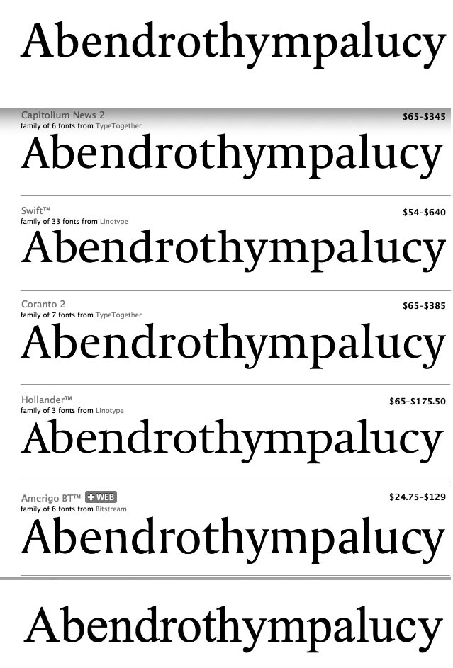

Hahahahahahahahaha
I had a go at something roughly based on Times’ proportions—Beaufort—with low contrast and “glyphic” serifs.
(Shown here in medium weight, for those who like dark.)

So Andreas, you tried to reform Times into something else?* And you kept that a secret to see our honest reactions? Neither of which I mind. But what I do mind is that frankly I have to say that to me you made it worse. :-/ Which might still be instructive though.
* If so, the Plantin connection I made is interesting...
BTW, to me it looks nothing like Unger's work.
hhp
John: … – ??
> you tried to reform Times into something else?
No, of course not. (Look again).
> And you kept that a secret to see our honest reactions?
This is really funny.
(I trust your honesty always, anyway.)
> you made it worse.
I made WHAT worse?
I think your seemingly arbitrary appending of Times after the list of Unger's faces (and really, certain similarities between this and Times) triggered a perception with John, Nick and myself that Times served as some sort of original.
But if that perception is wrong, "you made it worse" of course doesn't make sense.
hhp
No, I ignored the Times stuck on the end. I was having a laugh at Andreas' visual demonstration, in response to Joseph's comment, of the almost complete lack of similarity between his new roman and any of Gerard's designs.
Andreas, I think this is a nice, very readable typeface, with its own charm. If you like it, and if you think there is a reasonable chance for sales, finish it up and release it. Fortune favors the bold. Go with what's in your heart.
@ John:
> the almost complete lack of similarity between his new roman and any of Gerard's designs
cheers.
> if you think there is a reasonable chance for sales …
I have no idea.
It’s impossible to calculate the investment against the possible earnings.
I’m not eager to release it. As I said initially, a try.
> Fortune favors the bold
– a nice motto for a typeface!
It seems "to me it looks nothing like Unger's work" didn't deserve a "cheers" because of its source.
hhp
Gentlemen, thanks for your opinion.
Captured from web.archive.org on 17 Apr 2015. view this capture
