Hello,
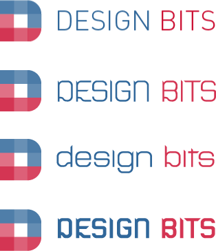
I am looking for a font to match my logo. It should have a somewhat boxy feel to it. Right now I am using FF Din, I just wish it was available in small caps. Can anybody think of a better font?
It should be simple, pure, minimalist, geometric, highly visible at small sizes, and it should be a good fit for the logo.
Thanks for any suggestions!
| Attachment | Size |
|---|---|
| logo.png | 2.61 KB |