
Helvetica?
With all the rich heritage of expressive lettering and type that's part and parcel of comics and graphic novels they chose Helvetica for the end credits?
Really?
Helvetica?
With all the rich heritage of expressive lettering and type that's part and parcel of comics and graphic novels they chose Helvetica for the end credits?
Really?

The posters around here for Dark Knight Rises use Franklin Gothic. It looks like they use the same on the official website too. Why didn't they use that?

they chose Helvetica for the end credits
End credits rarely get some love.
But it could’ve been worse: at least they didn’t use Arial.
> End credits rarely get some love.
Too bad. People who really like movies stay to watch them. It's part of the experience, and it really dosen't amount to a big effort .
> But it could’ve been worse: at least they didn’t use Arial.
Helvetica is the Arial of the Mac world. (I.e. 99.99% certain to include the designers who made these credits.)

What font would you select for the end credits?

I'd buy that man a drink if he used Gotham.

I <3 end credits!
We should found an "End Credits Appreciation Society"! ;-)
@ JamesM; Why, Comic Sans, of course.
@ Ricardo; :o)
The credits were beautiful in moonrise kingdom. They looked great, and meshed perfectly with the movie as a whole. (... by Jessica Hische)
"The credits were beautiful in moonrise kingdom"
YES!!! I just saw that yesterday, I agree!
There should be something along the lines of http://www.artofthetitle.com/ and http://annyas.com/screenshots/ for end titles.
Something that could be included in this hypothetical ECAS collection, off the top of my mind:
Virtually all Pixar movies.
The third Harry Potter film.
And, not especially typographic, but the first example which shown me that end credits could be interesting: The Cannonball Run (featuring outtakes).

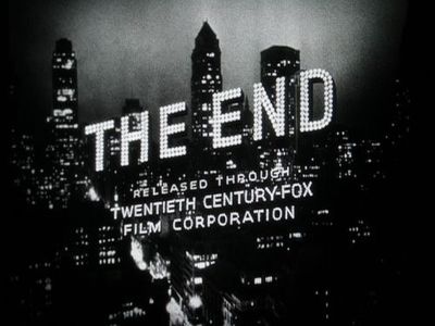
Slide show of over 500 "The End" title cards:
http://www.flickr.com/photos/djll/sets/72157608369709836
> the first example which shown me that end credits
> could be interesting: The Cannonball Run (featuring outtakes)
http://www.youtube.com/watch?v=WvHTeNThAo0
That movie is a guilty pleasure for me. A bad movie in many ways, but I really enjoyed it
However I have mixed feelings about outtakes during credits. They can be enjoyable, but everyone watches the outtakes and ignores the credits, which robs the behind-the-scene folks of their moment of recognition.
Slide show of over 500 "The End" title cards
They’re beautiful, but lack credits ;-)
outtakes during credits […] can be enjoyable, but everyone watches the outtakes and ignores the credits, which robs the behind-the-scene folks of their moment of recognition.
In this some of Pixar’s end credits are especially clever, presenting an appropriate theme according to the roles listed.

With all the rich heritage…
…I would have preferred a cell-animated movie with real art (not composited and rendered), directed perhaps by Sylvain Chomet (Triplets of Belleville, The Illusionist).
The graphic Wham! Pow! &c. of the TV series were spot on.

Sure, Cannonball Run wasn't the Great American Artwork, but the cars, man... the cars!
/me falls into a drooling stupor equalled only by thoughts of a grown-up Modesty Blaise in her birthday suit...
Wham! Pow! &c
Spot on for the TV series, but this ain't the TV series.
No, it’s Hollywood grand guignol, gravitas applied pretentiously to a campy kids comic book.
Graphics and text can be integrated into a filum, but instead we get the pseudo-reality of a video game.
It’s not as if outrunning an explosion or surviving a 30 ft fall without crippling yourself is real, so why pretend? To me, the feigned realism of such movie effects just looks stupid—why not have something impossible shown in non-naturalistic imagery, especially if it’s derived from a comic book? Didn’t art get beyond mere naturalism in the 19th century?
However, I thought The Matrix made sense.

Nick, you must be a The Adventures of Baron Munchausen fan like me. You should also see The Thirteenth Floor.
James: Everybody knows credits aren't about crediting, they're about contracts. That's why the type is super narrow on posters, and it flies by at unreadable speeds on TV.
BTW, why don't movies have colophons? ;-)
hhp
Hrant,
They only put colophons in movies if it is in the contract--then the run it by really fast ;-)

Nick: Hollywood grand guignol, gravitas applied pretentiously to a campy kids comic book
Gravitas was applied to Batman in comic book form long before even the relatively campy Tim Burton film version. The Christopher Nolan films are fairly alike to much of the last three decades of the comics, most obviously Frank Miller's Dark Knight series, which contains much of the incipient fascism that becomes pretty explicit in the last of the Nolan films. Heck, why didn't they just have Bane burn down the Reichstag?
Sure, Miller’s Dark Knight series took itself pretty seriously, but it’s still a kids’ (adolescent males of various ages) superhero comic book about a guy who dresses up as a bat and wears tights and a cape to fight super-villains with nifty gadgets. No Maus.
incipient fascism
Really? Smelled more overtly Bolshy to me. Maybe it is a rather fine distinction between two forms of totalitarianism, but fascists wear better uniforms and speak less about "the people".
No Maus.
... And Maus is no Sense and Sensibility. And Sense and Sensibility is no Pee Wee's Big Adventure. They are different things entirely.
That's not the fault of the fault of the art directors, Nick. I enjoyed the movie for what it is, and, in the way that people who notice such minutia as the type used in the titles, I felt ever so slightly let down (but not surprised) by the choice of Helvetica for titles.
...fascists wear better uniforms and speak less about "the people".
Which pretty perfectly describes Batman.
In terms of political analysis of the new Batman film -- and there has been plenty of it --, Gavin Mueller's article seems to me most consistent with the thing described.
*grumblegrumble* wannabe vamps...
:o)
I thought the reference was to Bain.
Dunnoo. Was grumbling about Batman. Guy looks too vampirish for my liking.

> they chose Helvetica for the end credits?
So? what's the big deal?
(so because of Helvetica you don't know who's running the dolly?)
>..., Gavin Mueller's article seems to me most consistent with the thing described.
I don't know who's Mr. Mueller, but his article is bullcrap.
So? what's the big deal?
I don't know. Why give a damn about anything?
Especially if it has anything to do with type or typography and especially on this forum.
I don't know who's Mr. Mueller, but his article is bullcrap.
A spirited rebuttal, but I doubt you'll influence anyone without a bit of elaboration.
Agreeing some what with David, I think the political interpretations of super hero stories are some what overblown. A more sophisticated, yet no more compelling version of the old concerns that comics would (... fill in the blanks... ) and ruin society.
This stuff is conceived of as simple and simplistic fantasy fiction that will make money. A super hero who by some extraordinary means saves people from terrible dangers instantly and dramatically, motivated only by a sense of right and wrong and who acts entirely outside any of the typical constrains that tends to make stories about law enforcement wherein everyone operates by the rules very, very boring.
Batman has no super power, so he needs a back story that gives him access to extraordinary weapons and tools and lots of free time. Therefore the back story makes him the playboy heir to a vast industrial empire. That's all peripheral the the fact that his raison d'être is to punch the crap out of villains.
No one confuses this with real life. These stories take place in a Universe where you solve complex problems by punching the bad guy so hard he flies across the street and goes through a plate glass window, without causing any injury other than some slight grogginess.
I'd bet you'd find more Batman comics in the homes of members of the Occupy movement than in the homes of the cops, the "1%" or any of the others Gavin Mueller says are propagandizing us. If that is their intention, they are not doing a very good job of it, although, the use of Helvetica does add some credence to their arguments, I'll admit.
Therefore the back story makes him the playboy heir to a vast industrial empire.
However, more of an action-movie norm is the dispossessed outcast with NO resources other than resourcefulness, determination and fists of fury, triumphing against impossible odds.
You can save the world with just one plain everyday font, no need for a huge exotic font library.
Playboy industrialists sell more units than dispossessed outcasts with no resources. Or something.
no need for a huge exotic font library.
Do we really want to go there, Nick? :o)
Fontman with his utility belt of Helvetika-shuriken vs. his nemesis the Comic Sans?
**
I partly conceived of Merlin as a collection of Klingon glyph’leths.
Fontman with his utility belt of Helvetika-shuriken vs. his nemesis the Comic Sans?
This will be in my graphic novel. We may have to duke it out about the rights in an epic battle of good vs. evil, but I'm prepared to be 'evil' to avoid causing any offense. (Which of course puts me squarely on the side of 'good'.) :o)
The titles will be in Helvetica, but hand-drawn.

"I'd buy that man a drink if he used Gotham."
Indeed!

Batman is an elitist.

I really enjoyed the movie, and I love end credits. "Batman Rises" end credits were dull... I know the movie is not like the Tim Burton's ones, Nolan's Batman is more dramatic. But I expected more than Helvetica. Anyway, I liked the fact that they started in "Batman Begins" with that font, and stuck to it till the very end.
BTW, "The Machinist" end credits were awsome.
I don't think you could safely make a habit of choosing fonts based on coincidentally suitable names... Although, I did sell a bakery on using Delicious in their ID pretty easily. :o)
Gotham is a great typeface and all that, but it would not necessarily be my choice for Batman.
Captured from commoncrawl.org on 25 Apr 2015. original URL
