
Thank you for helping to identify this sample!
| Attachment | Size |
|---|---|
| erste.jpg | 137.05 KB |
Thank you for helping to identify this sample!
| Attachment | Size |
|---|---|
| erste.jpg | 137.05 KB |

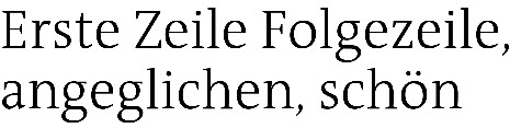
This seems to be some customisation of Luc(as) de Groot’s TheAntiqua (look at ‘r’ and ‘t’, especially the latter being markedly changed and not for the better). Where did you get the sample from?

This looks very much the same except for the top of the /t.
/Lucas Fonts/TheAntiquaB-Light
Thank you very much, R and D. Very helpful!
You’re welcome! Would you mind answering my question: Where did you get the sample from, who uses this version of TheAntiqua? Just curious …
The book «Lesetypografie»
Hans Peter Wilberg and Friedrich Forssman,
Verlag Hermann Schmidt (Mainz), ©1997 / 2005
Quite interesting, thank you! :-)
Captured from web.archive.org on 30 Aug 2014. view this capture
