Typophile

Handlettering on WWI-era poster

PublishingMojo


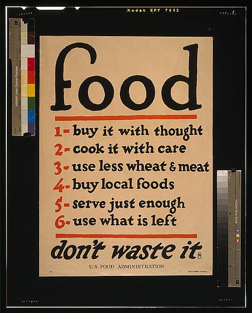
Five out of six ain't bad (sorry, I'm a big fan of wheat and meat), but I love this poster. By technical standards the handlettering isn't even very good (the s's are particularly egregious). But the artist had a natural eye for good composition, and rendered the letterforms with a playful energy that invites you to read them, and softens the stern austerity of the message.

This has an Oz Cooper feel, no? But maybe an imitator?

hhp

Given that it was produced during an era when display lettering for signage and process graphics was produced by skilled professionals, this is abysmally amateurish. Perhaps the real talent was busy on the assembly line, making weapons.

Meh, more likely it went "Anyone with some art talent, raise your hand!"

Hrant,

You are close. It IS a Cooper, but not Oz; rather, it is Fred G. Cooper, a predecessor and—AFIK—no relation. Letterer, illustrator and former Art Director for Life Magazine—in case you're interested.

The other Nick—and there are a lot of them—does not quite "get" the FGC vibe. Okay. Strokes for folks. I even make allowances for Canadians: they are people, too.

I get Fred. I like Fred. If you do to, check this out…

http://www.myfonts.com/fonts/nicksfonts/mrs-bathhurst/

Dundee Brewing Company liked the typeface so much, they have—at least, in the past—used the typeface for their beer bottle labels. Cool, retro and quite affordable.

The preceding has been a commercial message by a guy who could use a few extra bucks in the till.

If you catch my drift…

I do so get the vibe, but this poster just butchers it, which is why I posted.
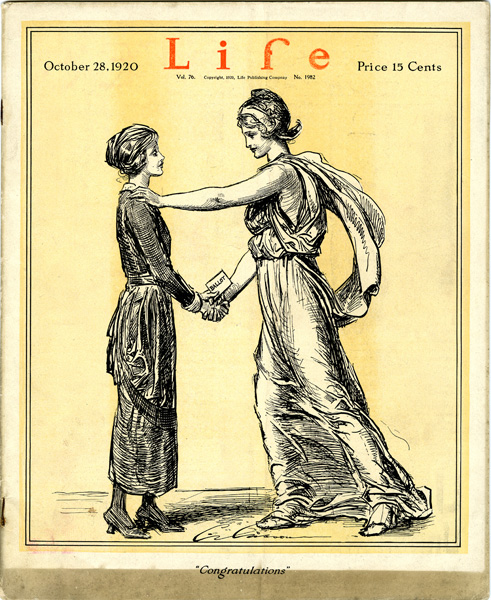
An earlier Life than Luce’s:


(Illustration by C.D. Gibson.)

Nick,

You do so? I do not recall saying "do not" unequivocally. I distinctly remember saying "does not quite," which gives you some benefit of the doubt. Which, you being Canadian and all, you deserve. Which I mean in a good way. Canadians get multiculturalism, and celebrate diversity as a positive thing. Unlike Americans, who like everything homogenized and pasteurized. Why has worked out SOOO well, don't you think?

Another brief irony break here…

So, Nickster: are we cool?

Anyhow, Leslie Cabarga did a book on Fred G. Cooper, which is well worth reading…if you can get it cheap. Hand-drawn stuff, quite honestly, does vary in quality, but FGC was one wild and crazy guy…once you get to know him.

Dundee Brewing Company liked the typeface so much, they have—at least, in the past—used the typeface for their beer bottle labels

Oh they still do, Nick.

I thought that distinctive f in food looked vaguely familiar.

Kent,

Well, you thought you knew, but you weren't sure, but then I clued you in. Which is always cool.

"...this is abysmally amateurish."

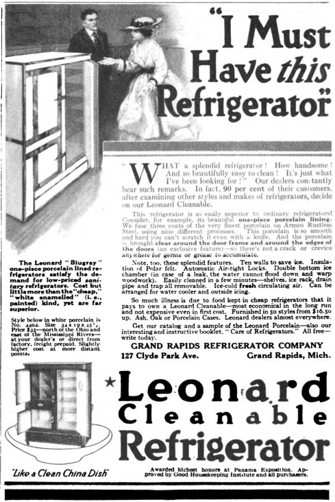
It's a poster, to get housewives, to save food, in the kitchen. That was a great "Life"! You can see from both these examples how important the bold sans was to become to the American typographic experience. Now, on to an example of the pinnacle of professional posters for the 1st generation of ice boxers, please?

I wouldn’t say this is the pinnacle, but its lettering is considerably more polished than the “food” poster, while still maintaining a certain one-off charm:

Hey, Nick—

Paying work vs. patriotic duty. The guy WAS an American, after all: cut him some slack, would ya? That's the way he was raised…

But this is ad type Dizzy. About and for a fridge are differing levels of quality;) thanks though.

Sorry guys, didn’t mean to start an international incident.
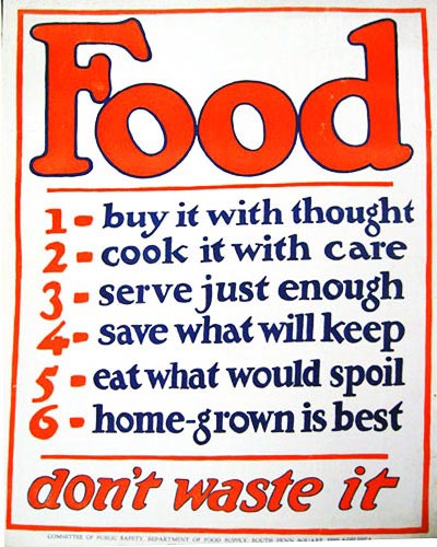
Perhaps it’s the crappy repro that really bothered me.
This is a bit better:


But wait, looks like there’s some versioning going on here…

@ Nick S., I like your poster better, 'cause it doesn't say I have to eat less wheat and meat. (Of course, maybe they just changed it to make the right margin less ragged.)

As Belldandy in O!MG would say: "Food cooked with love will always taste wonderful."

I Must Have this Refrigerator

Nick, are you working on digitizing this?

Captured from web.archive.org on 25 Apr 2015. view this capture