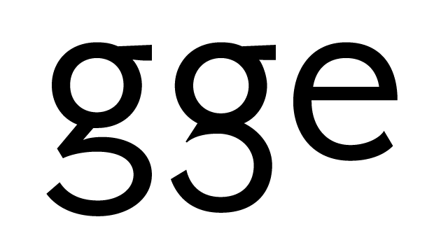
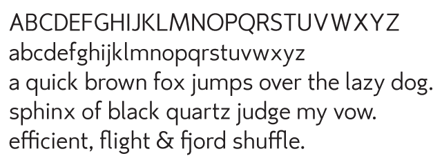
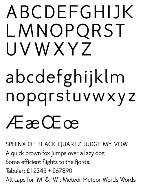
This is my first attempt at making a typeface. It is meant to be a rather generic looking sans-serif as the main purpose of this is for teaching myself by making something. One thing I wanted to have is a clearly differentiated I, l and 1 which is the reason behind the l having the curl. I haven't done accents yet, but I want to 'finalise' the main letters before I do them so I don't get into a situation where I have to change 8 glyphs because of a change in one of the characters.
If someone with more experienced eyes could take a look and spot things I missed, I would be very grateful!
| Attachment | Size |
|---|---|
| sample_b.pdf | 47.89 KB |
| sample_b.gif | 22.43 KB |
| sample_c.pdf | 24.24 KB |
| some_text.pdf | 48.01 KB |