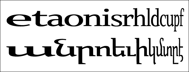
Type design is hard. I laugh at myself about it. How could it possibly be so hard? An A is an A is an A. Plus, I've been making these forms since I was 5 years old. How can this be so hard?
It's amazing how fast you can tell if a typeface is great or not as well. We may disagree between eachother about which ones are best, but it takes no scientific investigation to decide if a typeface is beautiful or not. Your mind becomes made up about this before you can even read the words. It's pretty much instant.
Making a competent typeface is not that hard. At least that's what I have found. You know what I mean by competent, something that is skilfully done, well executed, but yet somehow lacking that 'thing' that makes the best faces sing. The most common adjective for a competent face would be -- boring. It works, it's legible, it holds true to itself, but it isn't interesting, it isn't overtly attractive. It is boring. Bland.
What does one have to do to take a competent face an make it beautiful? why is one face merely competent and another is mind jarringly beautiful? What is this ungraspable thing that makes a typeface sing? I wonder if some of the more experienced designers here would share their thoughts on this.