Hello.
Need your advice/criticism
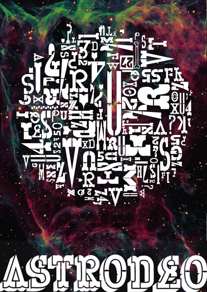
This is a school project and the concept of the project is a boutique hotel with a space-cowboy theme.
Wild West meets intergalactic. I want to come up with a typeface for the logo.
The thing that seemed logical for me to do is design a futuristic looking slab serif. The slab serifs that are usually
associated with wood-type letter-pressing.
So let me show you what I've got so far and let me know what you think or any suggestions. Thank you very much once
again typophiles.
Oh yeah, the name of the hotel is 'Galileo'.