Could it be that Wim's Neu Alphabet was never made into a font? Hard to believe, but I can't find one.

Could it be that Wim's Neu Alphabet was never made into a font? Hard to believe, but I can't find one.

It actually reads "New Alphabet". That weird W is because of the self-imposed constraints.

It was digitized by The Foundry in 1996.

I knew I would find some on Fontstruct.
I knew I would find some on Fontstruct.
Looks too bold. Can you change that on fontstruct?

Fontstructions are made of “bricks”, so you can’t simply make it lighter. But you can easily make your own version.
Yeah but I could legally use it?
“The New Alphabet was over-the-top and never meant to be really used. It was unreadable.”
— Wim Crouwel
Well I still want to use it.
Well, it seems that the Foundry’s digitalisation isn’t available anymore.
So I suppose you should ask Mr. Crouwel.

It's called "new alphabet", not "new font". Seeing a rendering of it as "too bold" misses the point. Crouwel, along with Thompson, Cassandre, yours truly and a few others have intended to design a variation/improvement of the Latin alphabet itself, not merely a font. In fact even on that very cover above you can see two renderings of his New Alphabet.
An idea can be patented, but I don't think Crouwel did any such thing; and in my book any alphabet designer must necessarily give up any IP protection, otherwise the idea can never catch on. So to me there are no ethical or legal repercussions possible here.
Lastly, although I'm not a big fan of the New Alphabet, I wouldn't call it useless simply because it's not sufficiently readable. It's legible enough to be usable, under the right circumstances. Even NotCaslon is.
hhp

I designed a (moderately) new alphabet, which I named “Panoptic” and demonstrated in the Panoptica superfamily of typefaces/fonts. So far (10 years) nobody else has developed a typeface using the same alphabet, AFAIK. In fact, I haven’t added any more either.
In theory, Crouwel’s alphabet could be rendered as a Didone, Oldstyle, whatever.
Rounded terminals (rather than chamfering) and a conventional-alphabet “stylistic alternate” (or vice versa) would make it more amenable to practical usage by non-robot readers.
BTW, the area of unicase offers a remarkably plethora of alphabet forms, as my pupils demonstrated when I taught a type design course and set them the task of designing a unicase face.
nobody else has developed a typeface using the same alphabet
I've learned from my own experience that it's very hard to spread something like that, but without explicit promotion it's pretty much impossible. When people see an actual font it's very hard for them to see the new alphabet behind it. To this day I get emails asking for the so-called Mas Lucida font I made to demonstrate my alphabet reform ideas from 1998, and I have to again explain what the point really was... An alphabet, being an idea, needs to be seen and promoted as a non-tangible thing.
Unicase: I certainly agree it's an interesting area, but I still think it's a bad idea to start students off with it; if time is limited (and from Art Center At Night course I learned that it always is) I think it's better to just stick to lowercase.
hhp
I didn’t stick with teaching unicase, as I found that despite being educationally useful (offering perspective on the bicamerality of the Western alphabets), it encouraged speculation and experimenting that was a little too expressive and open-ended. I suppose I could have limited students to a particular flavor of unicase alphabet, probably the Alphabet 26 variant, but that would have been restrictive. Alternatively, the constraint could have been to a certain genre of typeface, e.g. oldstyle or geometric sans, while keeping the unicase alphabet options open.
At any rate, I moved on to different non-unicase strategies at another design school, and haven’t taught for 18 months.

This MoMA link gives three different weights for The Foundry version of the New Alphabet. The fontstruct version appears to correspond to "New Alphabet 3".
Crouwel often used grids for his alphabets and I like this figure (from Appendix 32 of Typography is a grid by Anthony Froshaug, which I edited a little).

Looking at the smaller font on the cover at the top, I'd say the chamfered corners are not part of the alphabet, they're a rendering detail. So the grid you show is tangential.
hhp
The smaller "font" as you say probably corresponds to this picture and is built differently. The chamfered corners appear to be part of the "other" design if I look at this other picture. Notice that in the same book, you also find this big grid with a totally different "font" or whatever you want to call it.
So, in the very same book entitled "New Alphabet" you have all those different avatars of the latin alphabet. Does the blobbed version belong to the same "font family"? I don't think so. What appears to be relevant is some underlying geometrical construction process that may differ from avatar to avatar but that remains simple (the one corresponding to my post above being relatively complicated).
It's interesting that Wim's grids were never uniform. Always bigger rectangles next to smaller rectangles. I wonder if he just happened across that idea, or if it derives from a more classical source.
I would not say the grids are not uniform. The dotted font has a grid of 5 by 9.

So does the bold, so far as I can see. The square grid above is 7 by 13. The rectanges are two small squares and the big squares are four small squares.
So, in the very same book entitled "New Alphabet" you have all those different avatars of the latin alphabet.
I would say you have different "avatars" (renderings) of Crouwel's New Alphabet. Note BTW that a writing system can be defined to a varying extent; the Latin alphabet is very loose and nebulous, and invented alphabets based on it as a rule make things more formalized. For example in my alphabet reform work I've stipulated that the lc "el" leans rightward. Crouwel's has its own formalizations that can be intentionally adhered to or deviated from. All the fonts in that book are essentially strict incarnations of his idea, not merely Latin fonts.
Does the blobbed version belong to the same "font family"? I don't think so.
Why not? It's just a rendering where the pixels are overlapping circles. BTW as far as I can tell that's supposed to simulate what happens on an imagesetter (in "write-black" mode).
hhp
I was not referring to the dotted font, but to this:

This one has "a closed counter", the other one not (if I am not mistaken with the terminology).
I thought you were talking about the blobby glyph on the right of that spread. Yes, that conventional (Jannon?) "a" is not a New Alphabet letter.
hhp
I agree that the right blobby would be the same though, from a "programmatical" point of view (is that not part of the title) there is a difference between the font with the "chamfered corners" and the two others (dotted and blobbed). The dotted and blobbed are clearly made out of planar pieces. The one with straight edges is more simply described by its contours on a grid of points with integer coordinates. You can easily directly write an eps file to display each of those characters with "newpath", "moveto", "lineto" and "closepath" commands.
At any rate, I moved on to different non-unicase strategies at another design school, and haven’t taught for 18 months.
You should take me up as your new pupil. I will make you proud!
Also, Unical alphabets always seem to use the lowercase a. Has anybody else noticed this?
A brief point of terminology: uncial (note order of letters) refers to a style of lettering that existed before upper and lower case came into being, and unicase refers to modern efforts to blend them back together again.
Much of the practical value in a unicase is the lack of ascenders and descenders. The list of normally-formed Latin lowercase letters that have a significantly different shape from the uppercase and remain within the x-height are: a, e, m, n, r. That's a short list to work with. But you are right to observe that 'a' and 'e' are given preference. They are among the very most frequent in English and most other Latin languages, and they are vowels. It is reasonable to conjecture that vowels have more impact on the "voice" of a typeface in the mind of the reader.
Much of the practical value in a unicase is the lack of ascenders and descenders.
Certainly, many unicase types are lining, but it’s not mandatory.
Jeremy Tankard’s Disturbance (1993) for instance, is a unicase design with extenders.

Jeremy Tankard’s Disturbance (1993) for instance, is a unicase design with extenders.
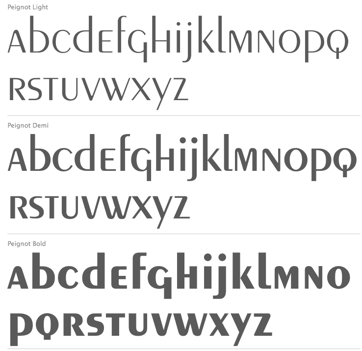
So was Peignot (by Adolphe Mouron Cassandre; Deberni & Peignot, 1937), designed, at least in theory, to be used without caps.

Don't forget Herbert Bayer's introduction of the Bayer Universal type family in the late 1920's
- Herb (not Bayer)
designed, at least in theory, to be used without caps.
Or actually, without lowercase! Since Cassandre -understandably- admired the Latin capitals, and wanted the lc to be more like the caps. But he was pragmatic enough to nonetheless implement two cases, something people like Thompson didn't grasp.
hhp
Captured from web.archive.org on 19 Oct 2013. view this capture