Dear Typophiles,
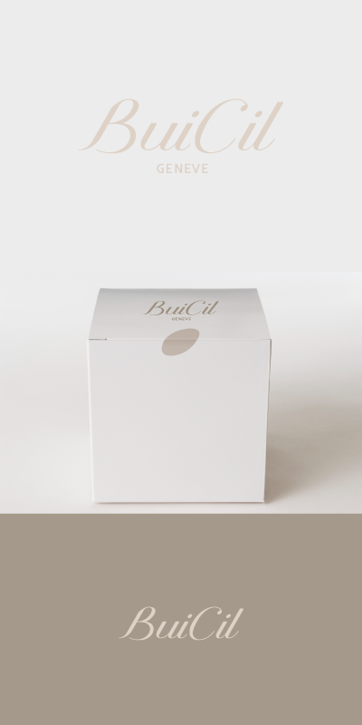
We have been working on a logotype for a luxury eyelash bar in Geneva. The clients absolutely love the solution so now it is a question of finalizing.

large view
Regarding critique we are currently debating about how the space between the "B" and the "u" work; the distance or separation between the "i" and the "C" and also the centralization of the the word Geneve.
Attached can also be found an image to display how the dot of the "i" will be used in packaging (yet to be finalized) as the sealing sticker.
Any critique or feedback would be most appreciated.
+