Typophile

Bad type = better analytical thinking

The capture this came from was cut short by the archive that made it, so the text may be incomplete.

gthompson

The July 2012 issue of Scientific American (Advances: How Critical Thinkers Lose Their Faith in God) points out that a hard to read font "...promotes analytic thinking by forcing volunteers to slow down and deliberate more carefully...". People in the study discussed in the article expressed less belief in God compared to those who read material in a "clear" or easy to read font. Maybe we have been doing this all wrong.

This is becoming a bit of a meme amongst the scientific set.
Eat your own dog food, I say.
Who will be the first to publish their research in 8pt Brush Script?
That should scare off the intelligent designers.

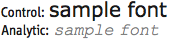
Here is the Science paper the article in Scientific American summarises. It shows (but does not say) that the clear font was upright black Tahoma, the unclear one slanted gray Courier in a smaller point size.

This is becoming a bit of a meme amongst the scientific set.

More like among hack science journalists.

Anyway, the real problem here is that nobody has noticed that readers do better with engaging content than bland content. Typography doesn’t have to be bad to be engaging. And I suspect that good writing would solve the problem even more handily—as the success of J. K. Rowling and George R. R. Martin at getting young people to read long books shows us.

James,

I suspect you're right. Just as it is a poor workman who blames his tools, it's a poor scientist who concludes that making a task more difficult somehow makes it more meaningful. If that were the case, why not print all of our school textbooks in Chinese? That ought to keep the little bastards engaged: make reading a Sisyphean task! Puh-leeze…

We've been through this before. Comprehension is going to be affected by visual readability of the text, interest of the reader, effort of the reader, quality of the writing, and time on task. As I believe those who did the study don't control for time on task and other variables, it is worthless to tell us about type.

...the success of J. K. Rowling and George R. R. Martin at getting young people to read long books...

I've known kindergarteners who read J. K. Rowling. In the case of George R. R. Martin, I hope you mean a bit older than that.

Prior research has shown that a difficult-to-read font promotes analytic thinking by forcing volunteers to slow down and deliberate more carefully about the meaning of what they are reading.
http://www.scientificamerican.com/article.cfm?id=how-critical-thinkers-l...
----

We can finally recognize the designers responsible for junk mail and ransom notes as the brilliant masterminds they truly are.

Look on the bright side.

This study, plus the other item which formed the title of the "Advances" column for the month, means that religious publications will pay more attention to having quality, easy-to-read typography! An employment opportunity!

I may mock reading science, but I do like the idea of “visual priming”, which is an important part of graphic design.

@quadibloc – One would hope so, but this is after all the lot that wants us to believe that a tome on how something happened is a denial of it happening.

"...a hard to read font "...promotes analytic thinking by forcing volunteers to slow down and deliberate more carefully...".

Are not most people with time to volunteer for studies attention challenged to begin with?

"People in the study discussed in the article expressed less belief in God compared to those who read material in a "clear" or easy to read font. "

It's news that God is a type designer?

"Maybe we have been doing this all wrong."

You don't believe what's good for most people is all right?

Would those results hold outside a controlled environment, where a likely reaction is "annoying to read, didn't bother"?

The fetish for hard data prompts researchers to ask dumb questions and jump to the first conclusion that presents itself, because everything else is hard to test for.
It gets really annoying when the supposed way forward is making things better by making them worse, in a way backed by such evidence.

There are slightly less dumb questions about the effect of type on comprehension that could be asked. E.g.:
Will large and commanding capitals improve recollection of names and proper nouns in an unfamiliar subject?
Will they disturb the flow and hinder the understanding of underlying concepts?

I ought to look through my old schoolbooks some day and check whether the ones set in bright colours and sanitised sans serifs truly sucked compared to the legacy ones, or whether the aesthetics automatically made me think "dumbed down and uninteresting".

Incidentally, it has also occurred to me that there is no need for people to start using wretched typefaces for science textbooks. After all, such tomes usually feature a large number of equations, and these will slow down the flow of reading enough that even the most beautiful, legible, and readable typeface will not result in the absence of opportunity to pause and think analytically along the way.

Once I had great difficulty reading a particular book. It was well designed, set nicely in Baskerville and it took me awhile to figure out what the problem was: fuzzy surface paper made the type very hard to read, so much so I gave up. We should get some grant money and follow up these various studies with our own and show the scientists up.

I think if you need to force people to read boring and/or poorly written content it probably makes sense to slow them down to deliberative reading with a low-readability font. But you can't do that for a long period - it's physically too tiring.

Content that a reader will enjoy is what separates the real text fonts from the pretenders, and it's where type designers can push the envelope.

hhp

I organized a beer-tasting at a party once.
The winning beer was a strong, sweet “amber” brew.
The kind of thing that tasted good to sip, but not what most people would drink by the pint.

Exactly, display beer.

hhp

If one wishes to promote analytical thinking, though, advocating the use of "ugly" typefaces won't get very far. People who produce printed materials, after all, are competing to get other people to read them in the first place, so they feel constrained to make them as attractive as possible.

Hence, we need some way of making reading more difficult that is an inherent feature of all reading materials, one that a specific publisher cannot escape from.

Unfortunately, as the essay at the beginning of The Chinese Language: Fact and Fantasy illustrates, there isn't really a practical way to write English using Chinese characters.

How about the header font here at Typophile? Attractive, yet difficult to read. Making such fonts in a variety of styles should be no hill for the climbers around here.

Let historical romance novels continue to be set in fonts that let the content be forgettable. But bring out the sharp tools for the works where it is important that the content be comprehended and remembered, not just consumed.

Science is allowed an occasional whimsy ;-)

@Nick Shinn

I organized a beer-tasting at a party once.
The winning beer was a strong, sweet “amber” brew.
The kind of thing that tasted good to sip, but not what most people would drink by the pint.

How very true. I once bought a six-pack of Samiclaus Brown—because that's the only purchase option offered—because it is one very stout brew. How strong? 24% ABV strong—about as strong as beer gets.

Unfortunately, I really couldn’t swallow more than a sip at a time, which kind of takes the enjoyment out of the process, so I ended up making half-and-halfs with a pleasant smooth ale. Well, half-and-half was better, but not ideal, so I found an acceptable balance at three-to-one. The net result was more mixer than the star of the show, and a net ABV of 7-8% or so…which I could achieved with Moretti Birra La Rossa, which tastes mighty nice right out of the bottle—if you happen to like seriously malty brews with a great finish and a bit of a kick, which I do—and costs about a third as much.

So, you live and learn. I just wish that it hadn't cost me twenty-five bucks for "the good stuff" plus the cost of the mixer—another twenty-five bucks or so—to learn that, yes, you actually can get too much of a good thing. As I recall, this guy named Aristotle figured that out a long time ago. Hey, Lozos: what's up with you Greek guys, anyhow? How come you always seem to have the right answers? Except when it comes to paying taxes…

LOL!!! Greeks all study taxidermy by law ;-)

BTW, Nick, Taxidermy, in ancient Greek, means "The Art of Telling the Tax Man to Go Stuff it"

Don't forget Taxonomy: The science of telling which species of demon the tax 'man' is.

I'll give this one more try, since there are people here who could make a real difference in people's lives.

Science is, apparently, breaking new ground in investigating how the type in which text is set can influence not only legibility and readability, but also finding that characteristics of the typeface can have a substantial impact, a significant difference, on the ability of the reader to "get" the content - to understand the meaning, to comprehend the ideas being conveyed – and to remember it.

The science is rough. So far, all that is clear is that significant improvement is possible. The body of knowledge will be refined over time to more specific statements about what characteristics a typeface should have.

This is an opportunity for type designers to "move up the value chain", to use business language: from legibility, readability, and appearance; to include comprehension, understanding, and retention. It is an opportunity that some type designers will not miss. Yet I get the impression here is that people are not interested – to the point of ridiculing the concept.

The question for a designer is, do I commit to create typefaces that promote the ability to learn? Or do I ignore the opportunity (some might say "and responsibility") and do as I please?

Among type designers there's the Art extreme of the spectrum (which tends to ridicule Science) and the Tool extreme (which tends to be too enthusiastic toward Science). This is normal, but what does remain is for scientists to at least not alienate the designers who lean towards the Tool side. Sadly there are few scientists who seem dedicated to understanding typography enough to give us faith.

hhp

Ldavidson: "The science is rough"

There are four things that nearly every reading study has in common: it does not involve actual reading, it tests a single script, the number and diversity of the subjects is challenged, and there is no typographer involved in the composition of the test materials.

How do you define rough?

I think we're, well, most people here, are being kind. And quite a few give generously of their time away from their curves, lines and clients to study and discuss these studies and discussions.

"...there are people here who could make a real difference in people's lives."

Could you elaborate on this, please?

Cheers.

Sorry, Chris—

I missed your great gag about Taxidermy. That one definitely deserved a rimshot. I wish this place had somewhere to set up a drummer. But, it's the internet…which is good and bad, depending on a lot of things.

I have a great story to tell about my misadventures in and around Annapolis—where mine goodly wife and I went to attend her nephew's wedding—but I will have to save them for another time. There may be some fonts in serious need of identification, and I gotta poke my nose into a whole lot of other stuff before I can actually do anyone else any good.

Yazoo!

Nick,

If you live in the DC area, perhaps we can do lunch some time?

Chris,

If you know a joint that would let both of us through the door at the same time, this place HAS GOT TO BE either very dangerous, or full of a lot of really screwy people.

Which some folks might think is just another way of saying the same thing, except for the fact that there REALLY is such a thing as "crazy good"…

I figure you, me, Hrant and a couple of other guys whom I shall not incriminate are on the RIGHT side of the fence.

Otherwise, this crazy idea I just came up with to bust up a certain monopoly by giving stuff away might go untested…at least, in theory. It is simply WAY too crazy to actually work. Unless there REALLY is such a thing as "crazy good"…

I hope that you are comfortable talking in circles, as well…

@Old Nick:
Linux. Or, in the other direction, Internet Explorer.

But so many fonts are already free or very cheap that I doubt that any further efforts of that nature in this area would have much effect, even if the idea in general is not crazy.

John,

What you say is true; HOWEVER, if you HAVE to buy something to GET SOMETHING FREE*;
AND, the free* stuff is REALLY GOOD STUFF;
But you have to BUY SOMETHING to get the free* stuff;
Then, I think I just might be on to something which would make "FREE*" mean precisely the same thing that is does in MOST AMERICAN ADVERTISING—which ACTUALLY means "*free ONLY if you buy something else. And quickly. Limited time offer.§"

But, you're Canadian, so you are probably relatively immune to all this downcountry B.S.

Of course, "unlimited" is completely off the table; nobody really believes that anything like a calling plan that calls itself unlimited COULD BE ANYTHING OTHER THAN unlimited, could they?

Sorry: I forgot you were still Canadian…

P.S. Chris—I am trying to con Gene Weingarten into our proposed get-together, which would be fun and quite a coup for you: you would—quite possibly but not for sure—be the sanest guy in the bunch. If Gene can con Dave Barry into showing up, you are definitely a shoo-in for the guy with the fewest bricks shy of a load.

Lucky you. Thank God Hrant lives three thousand miles away. I will keep you posted.

Thanks Nick,
Gene may find me one pun shy of a load but I am game :-)

PS: I used to play drums in a former life so I can supply my own rim-shots ;-)

For NickC:

Rimshot

Note: This replaces the browser window - you'll have to hit the back button

Note to admin: I'll be glad to delete this content if it's inappropriate...

Chris—

You—but, especially your trap drum—are the answer to my dreams. How often does that happen to YOU, Bub? Unfortunately, I have not heard back from Gene yet, but I feel compelled to drop him ANOTHER line, because his regular piece in the WP Sunday Magazine was SO spot-on, it would be a crime not to praise him unduly. I figure I show up in his inbox on an annoyingly frequent basis, he is going to do ANYTHING to shut me the frock up, even if it means "doing lunch"—the hilarious implications of which are FAR too numerous to mention—with a COUPLE of loony type guys—who are at least partly, if not wholly Greek. Capisce?

BTW, what is the Greek equivalent for "capisce," anyway? I don't want to give all the credit for snappy sayings to the modern-day equivalent of second-rate Greeks. {insert Greek equivalent here}?

Anyhow, on topic—for a change—the only problem with the premise of this post is that it suggests—at least, to me, so you KNOW it is totally nuts—that bad booze may, therefore, be expected to give you a better buzz. A better hangover, maybe—which brings up the paradoxical question: is there any such thing as a good hangover? Other than a dead hangover? Why am I asking you this? I guess, it's better than talking to myself…

For sure…

For NickC:

Rimshot

Note: This replaces the browser window - you'll have to hit the back button

Note to admin: I'll be glad to delete this content if it's inappropriate...

HVB, if I may be so presumptuous as to call you by your acronym—

Thanks. If there is any possible way to put a shortcut to this file on my Firefox toolbar, I am going to find it.
THAT is how hilarious I find myself from time to time. Frankly, it's a little too often to suit mine goodly wife, if you catch my drift…

Nick, since it is idiomatic, the translation is not exact but here are a few ways the Greeks had a word for it:

καταλαβαίνis? (or κατανοεί) or: το 'πιασες?

The first one, "καταλαβαίνής? (or κατανοεί)" is literally "do you understand"
The last one, "το 'πιασες?" is perhaps closest to mean "do you catch my drift"

ChrisL

Chris,

The latter is more my style, since being adrift is more my style. When we actually do the lunch thing, you will need to clue me in on the proper pronunciation: my English is bad enough, having grown up in Texas…το 'πιασες?

"to piahsses?"

@dberlow: "rough" in a couple of ways: in its infancy, with mistakes and gaps and the groping that usually occurs during that stage, and because the relationship is not being directly investigated, to be understood, refined, and used, at least in the few studies I've seen. Gray Courier on white is not where this will lead.

"Make a real difference" because I think the effect they see is real, i.e. there is a significant relationship between a typeface (and its setting, and page composition) and comprehension and retention. And the relationship is not pretty&smooth = better. Given that, people who love type could be:

1) engaging the (few) science-ish people active in this area: providing feedback, exchange of knowledge (I know, there needs to be funding for serious work), in general furthering the science to get beyond the very primitive position of today - like addressing the 4 items you mention.

2) once it's better understood how to support comprehension and retention by type design, embracing those concepts and applying them to at least some typeface designs and promoting their use when appropriate.

I would not be surprised if testing showed a 10-20% improvement in learning, given a design based on a sophisticated understanding of how type influences the mind. There aren't many occupations in the world that can do that much direct good for large numbers of people.

ldavidson: "in its infancy, with mistakes and gaps and the groping that usually occurs during that stage, and..."

Oh, I thought it's been going on for 125 years or so.

..."because the relationship is not being directly investigated, to be understood, refined, and used, at least in the few studies I've seen."

As I pointed out in a long-ago thread, directly investigation via strict scientific method is impossible. To summarize — if only one variable can change per read of the the same text by the same subject, then either the font can't change, or the reader must read the same thing twice. And then, comes the testing of comprehension and retention. No one has a study, or will. That's why it's the all-time typophile subject.

"And the relationship is not pretty&smooth = better."

What's pretty? where's smooth? who said it was = to better? and what's one study against 400 years of organic humano-typographic evolution?

"There aren't many occupations in the world that can do that much direct good for large numbers of people."

Oh I agree but I'd "ain't" instead of aren't. By-and-large, these issues started popping up in the realm of normal-people-reading screen fonts, screen legibility, screen readability and screen resolution — upon windows. What's been done there is a tragedy, as one former MS employee has clearly stated, and the type design community has spent millions of dollars helping windows users to, not comprehension and retention, but less gag reflex if they must read, and hopefully less printing of email.

In general, outside of the windows or any other resolution/politics-based tragedy, I'm pretty sure comprehension and retention is 00.01% a type design issue and 99.99% an issue of type selection and type composition. And I think those latter two activities just need smarter fonts and smarter apps, and not smarter studies, and certainly not smarter users.

But type selection cannot be done well enough yet, because type design isn't there yet.

hhp

... Bad type in place of good information design is what I think is being discussed.

There has never been a scientific study that indicated that "type design isn't there yet". Studies compare existing faces by "attempting [badly] " to isolate variables. Since science has never had a typeface that is the "dog-gonned best possible ever" to use as a benchmark for all the others, there is no way to know that the types we have available now are not good enough to read well. I think the best tests to do would be those that compared READERS to each-other instead of typefaces. Why do some people read so much better than others? If we could isolate the perception and comprehension variables that make people read better, then we might have a clue as to how type must be designed better for reading [if need be]. In medical science, we compare well rats with sick rats to see what makes them resist a sickness. Then, the knowledge gained is used to develop cures or vaccines. We don't compare collections of mixed diseases to see which is the least harmful to a given organism.
Other than dyslexia and other physical/neurological conditions, we really have done little to differentiate between perception/interpretation conditions that may exist in what we might call normal spectrum reading sample populations.

Yo, Chris—

Thanks for the lame attempt: no matter what, it's better than ANYTHING that I could have done.

Anyhow, bad design sometimes SIMPLY DOES NOT WORK. Like, the other day, when I am doing the crossword puzzle, whose clues are in a condensed sans-serif type. Which is a little too small.

I READ the clue as "Mail tenant," which makes no sense—even to me. However, later on, when I really need the right answer to finish up, it STILL makes no sense UNTIL I READ "Mall tenant"—which DOES make sense, and S-T-O-R-E makes PERFECT sense, and I finish up 1-2-3, and I am outta here.

So, screw what the studies say: sometimes, poor design simply does not help. Or, a better choice of typefaces—like a nice serif which disambiguates a bit better—would solve this stupid, unnecessary annoyance.

IMHO…

Scientists and their adherents have a naïve view of typography if they think that psychological testing can be used to improve it.

It’s one thing to explore the physiological process of reading, quite another to attempt to optimize reading by applying scientific theory.

But designers who are predisposed to rejecting Science even when there's a glimmer of merit aren't really designers at all.

hhp

On the other hand, Nick, insights from the exploration of the physiological process of reading can suggest typographic experiments, i.e. not applying scientific theory to optimisation of reading, but applying new typographic hypotheses to design. And because design is not science in the modern methodological sense -- although, in the mediaeval sense, inter scientias non minima est typographica --, the experimental strictures are looser (hopefully tighter, though, than those of the 'experimental typography' of the mid-90s, which mostly lacked even hypotheses, let alone observation or conclusion).

.

… insights from the exploration of the physiological process of reading can suggest typographic experiments…

Such as?

Jeez, guys—

Show a little humility: we got a lot of good ideas bouncing around here, but nobody is absolutely right, all the time. Except deluded narcissistic sociopaths. This is NOT Craigslist, y'know? Capisce?

hpp:"But type selection cannot be done well enough yet, because type design isn't there yet."

I'm rolling, wise and all-knowing agitation general. Were you born yesterday? Or just bored?

If reading comprehension has been a serious issue, in need of scientific research to solve, for everyone, since the beginning of type, not just for windows users like yourself;) then we'd have known about it by 1860 or 70 and switched to french or script or something harder to read. On the other hand, if information, comprehension and reading are thriving, maybe there is not much of a case for your opinion there.

JH, sure, but practically pointless 90's experimental type is exactly what this study recommends for nuclear power plant signage and manuals, right? So we were ahead a little, again, in providing solutions based on organized discordance in a variety of hues.

And according to an utter great scientific study, an Helvetic e is too simple to recognize relative to a Garamondic e, so we don't put those Helvetic e's in text faces often. We lern and lysun.

Show a little humility

That came right after a post of mine, so I presume it’s addressed to me—but what’s un-humble about asking John to illustrate his statement with examples?

Humility is indeed an issue, which is why I always chime in against whatever the latest bizarre hubrisitic scientific pronouncement on typography happens to be. I’ll say one thing for the reading researchers though, they do push the envelope: “Bad type = better analytical thinking” will be tough to improve upon.

I’ll say it again: the emperor has no clothes—well OK Hrant, perhaps a small thong.

Nick, you just want everybody to leave in disgust, don't you. ;-)

David, what I was saying (and maybe it wasn't actually a counter to what you were saying, but I can't tell - and I don't think anybody else can :-) is that type selection is critical, but to me there isn't the right stuff to select from. Which is why type design does have important work to do - it's a lot more than that tiny percentage you stated.

And I don't agree there's no big problem to be solved, just because most people don't notice it. Quite often it's after something is invented that people can't grasp how they could have lived without it. That said, the size of the problem depends on what turns an individual on: to most people improving page layout (much less type design) is a pointless endeavor. But to us even the shape of serifs matter, and we can -hopefully- justify that preoccupation beyond "it turns me on". Sorry to refer to what Nick wrote again. ;-)

hhp

But to us even the shape of serifs matter

That’s why scientific theories derived from pitting Brush Script against Arial are so annoying.

Humility is indeed an issue, which is why I always chime in against whatever the latest bizarre hubrisitic scientific pronouncement on typography happens to be. I’ll say one thing for the reading researchers though, they do push the envelope: Bad type = better analytical thinking is the most absurd yet.

They don’t. It is incorrect, I think, to attribute this absurd equation to either Daisy Grewal, the author of the summary in Scientific American, or even Will M. Gervais and Ara Norenzayan, the authors of the original study. I at any rate couldn’t find anything remotely similar to ›bad type = better thinking‹ in their texts and certainly nothing that translates to ›Start designing hard to read fonts‹. What they say is: In a controlled lab context, artificially slowing down readers during information processing makes them switch to a different (not: better) mode of thinking that yields different results. As far as I can see, Gervais & Norenzayan weren’t interested in typography at all and not even trying to make any contribution to the debate about what a legible typeface should look like (or whether illegible typefaces would promote content comprehension). It is simply that their means of choice to slow down the subjects happened to be a type setting that was difficult to read. The stance you’re criticising is one that actually nobody, at least none of ‘the scientists’ in question, took.

Nick, I'm experimenting with looser spacing in my new sans serif type than I have employed in the past, in response to discussions with Kevin regarding studies in which looser-than-typical spacing of letters resulted in improved word recognition.

And how will you know if it's working? By relying on the same sort of flawed testing that yielded that half-baked hypothesis?

hhp

I'll judge whether it is working in the same ways as I make judgements about any other aspects of typography. As I said above, the experimental strictures of design are looser than those of science. My point is that science can provide ideas and starting places for design experiments and, at the very least, these are as valid as any of the other sources of ideas that inform new design work.

Your understanding of the experimental method seems to be backwards: hypothesis necessarily precedes testing because it is what is tested.

Note also that this is specifically a sans serif project, and I am not simply taking the idea of looser spacing as some sort of scientifically arrived at given, but am exploring a number of ideas I have about sans serifs, one of which is that they are usually too tightly spaced (for text).

I certainly agree that:
- Science can suggest new design ideas.
- Hypothesis comes first (and I believe it doesn't even need to be tested -or even testable- to serve as a basis for new design ideas). Hypotheses, after all, come largely from intuition (which is not itself Science).

However:
- The science that recommends experimenting with looser spacing is the same science that says serifs don't help (and that they probably hinder). And if you don't believe that last bit, then you have no basis for believing the first bit. Do you believe the last bit? Do the whites of letters not talk to each other, even though the blacks do?
- The only way you can gauge the success of your loose spacing is by using the same testing methods that supposedly confirm the merit of the idea. This is self-fulfilling, hence invalid.

hhp

Hrant: The science that recommends experimenting with looser spacing is the same science that says serifs don't help

Really? Can you point me to the study? I got the idea from a conversation with Kevin, and it is the idea that interests me, rather than the particulars of the methodology.

There's a longstanding anecdotal belief that sans serif type is less readable / less suited to continuous text than serif type. But I've thought for some time now that this is a problematic assertion because almost all sans serif types were not designed for text, and hence it shouldn't surprise us that they perform less well. But people seem quick to presume that the reason has something to do with the presence or absence of serifs, and I reckon that's not the case or, at least, far from the whole story. And one of the reasons I think this is because Legato is so darn readable in continuous text. So I know that there's at least one way to make a sans serif that is highly readable in a text setting, and I think there may be others. Over the years, I've worked on a number of sans serif projects, but they've all involved either starting from an existing Latin sans, a particular historical model, or have had to operate within a set of technical constraints. And they've all been initiated by clients with a specific brief. So recently, as a weekend project, I started designing a sans serif from scratch, in which to explore my own ideas about sans for text, and one of the first things I've done is to make the spacing somewhat looser than a) most sans serif types and b) looser than I was initially comfortable with, i.e. I went against the instincts that years of looking at sans serif type have left me with. So this is an instance in which an idea from reading science -- and for this purpose it hardly matters whether it is good or bad science -- served as a kind of mental liberation. The really interesting thing for me was that it took about two days of working on the design for my mind to adjust, and now I find the spacing very comfortable to work with.

The only way you can gauge the success of your loose spacing is by using the same testing methods that supposedly confirm the merit of the idea.

That's not even logical: there are almost always multiple ways to test the same hypothesis. But I'll gauge the success of my spacing the same way I would gauge the spacing of any other typeface: does it set well and is it easy to read at the intended size range. All I've taken from the science is an idea: I'm not committed to a programme and I'm certainly not setting out to reproduce some particular experimental result.

So far, so good. I reckon my new sans is very readable, and one of the reasons for this is that it is what I now think of as 'spaced for text', which is a concept I think most of us understand very well when it comes to serif type, but about which I doubt we'll find much agreement when it comes to sans serif. It isn't by the way, simpler 'looser', i.e. you can't achieve the same thing by tracking out a typical sans.

It is simply that their means of choice to slow down the subjects happened to be a type setting that was difficult to read.

What they said was that Verdana is an easy to read font and Courier Italic is hard to read. Nonsense.


A group of participants (undergraduates) were shown two settings and asked to rate “fonts” (settings, actually) as either “typical” or “hard to read”. A leading question if ever there was one! They rated a large sans serif (Verdana) in black as “typical”, and a smaller Courier Italic in grey as “hard to read”. That’s lay opinion on readability, hardly science.

The theory is that cognitive disfluency primes analytic thinking, as opposed to fast thinking.

In this kind of test, the scientists have jumped to the conclusion that a plain setting is easy to read, and an inappropriate setting is hard to read. A distinction predisposed to the theory of cognitive disfluency. What is the axiom here?!

Another conclusion from the results, one that an experienced typographer might make, is that subjects presented with a setting appropriate to a questionnaire will breeze through the questions, but an inappropriate setting will be perplexing.

Bear in mind that these are fluent readers, familiar with the conventions of typographic layout.

Any cognitive disfluency is caused not by hard-to-read fonts, but by settings which are recognized by the readers as inappropriate to the document.

hpp "David, what I was saying (and maybe it wasn't actually a counter to what you were saying, but I can't tell - and I don't think anybody else can :-)"

It's pretty simple. If I put your initials before what I say, or what you say, I'm talking to u. Got it? Watch...

hpp: "... is that type selection is critical, but to me there isn't the right stuff to select from. Which is why type design does have important work to do - it's a lot more than that tiny percentage you stated."

Really? I said 99.99 done vs 00.01 future. If more than 1/10,000 of all compositions failed to produce comprehension and needed a special font that does not exist, I'd know about long before you, darling :)

@hrant:
The only way you can gauge the success of your loose spacing is by using the same testing methods that supposedly confirm the merit of the idea. This is self-fulfilling, hence invalid.

While the rest of the post from which this came was largely valid, I believe this is in error.

It certainly is true that one has to carefully avoid situations where we "prove" a hypothesis by methods that are not really valid.

While this means that it is important to apply multiple independent types of tests to hypotheses whenever possible, this doesn't mean that if we have only one way to test facts about the readability of type that it can teach us nothing.

It is not the case that the results of measurement, in general, tend to be so random that with only a single technique of measurement our observations will be little more than random noise. Test how long many people take to read texts typeset in different ways, and how much they remember and understand afterwards, and you will indeed learn something useful about how well different approaches to typesetting, or different typefaces, work.

John, I think that tightness of spacing affects readability, but it can't be evaluated apart from rhythm and color. Tracy writes that best spacing is a function of the width of the counters. I think that's correct, which is my problem with Helvetica. Its circular forms have a lot of counter space within the 'o' for example, but the space between letters is much less. I think that the space between and within letters needs to be visually equal in area for good color and rhythm.

A face that is overly tight by these standards is not a problem for display, but I think it is less readable in extended text.

Serifs among other things help you get even color with adequately roomy spacing. When you chop the serifs off a seriffed font and leave the spacing as is, the color is hurt, and the words seem to fall apart. Hence, as Tracy says, the sans letter spacing needs to be tightened, stem to stem. That becomes a problem with faces based on the circle, but less so for those based on the oval, because you have harmony between counter and spacing, and more even color. That's why 'humanist' sans like Frutiger work better in text than Helvetica. One of the sans I find most readable in text, Vesta, is also narrower and also 'cheats' by having more stress variation, and less of a monoline appearance.

IMHO, the problem of spacing and color is never ideally solved for sans, if what you want is maximally readable extended text. That's one reason I think seriffed fonts are inherently superior for text.

In sub-par conditions such as low resolution screens, all this seems to matter less, but then text is less readable (more fatiguing) on low res screens anyway.

I said 99.99 done vs 00.01 future.

Well, I don't agree with that either, but what you did write was "I'm pretty sure comprehension and retention is 00.01% a type design issue and 99.99% an issue of type selection and type composition." I can see how one could lead to the other. But your new statement is even more depressing.

failed to produce comprehension

You can't be saying that's an all-or-nothing deal. What I'm talking about is simply an improvement in performance, of any kind really; and I think "1/10,000 left to do" is impossibly low. No aspect of human culture is that "saturated" in terms of future possibilities.

Lee suggested a possible "10-20% improvement in learning", while I simply stick to speed, where I see comparable possibilities for improvement. I would so not mind helping millions of people read just a little bit faster (because that gives them time to do other things, including maybe read more stuff). Not all by myself, mind you, but by spreading ideas that others might adopt and implement. And one central tool is Science.

hhp

John (H), the way I used "science" in "The science that recommends experimenting with looser spacing is the same science that says serifs don't help" could have been misleading. I'm essentially referring to the origins of both "conclusions" (and origins are always there - results never come from a vacuum) in terms of denying the binding of letterforms. As I suggested to Kevin before, in the face of powerful, long-standing anecdotal evidence (I'm using the positive, layman terminology here) one must actively doubt one's own hypothesis, and basically try to disprove oneself. If you fail, then you have a powerful tool. And your recent counter-intuitive experience that you describe is exactly that sort of commendable mentality.

Concerning serifs, I certainly agree that thinking of this in terms of sans-versus-serif is oversimple to the point of fallacy. I have long felt that serifs aren't merely appendages you slap on, they are in fact structural. In terms of this discussion serifs are sort of a proxy for the binding of letterforms into clusters, since they do promote that. But as you say there must be more to it than that, especially concerning the binding of the whites, as I agree Legato aptly demonstrates.

The problem is the suggestion of loose spacing is coming from the same bad place as the suggestion to ignore serifs; so if loose spacing does help you, it's just dumb luck.

there are almost always multiple ways to test the same hypothesis.

this doesn't mean that if we have only one way to test facts about the readability of type that it can teach us nothing.

Agreed. What I meant was, on the ground, there's no more sophisticated way of testing readability than the sort of thing Kevin does, but since that's so deficient it's more misleading than anything else to rely on it. So you're guaranteed to get "validation" of your hypothesis since it's all coming from the same place.

hhp

Bill, I mostly agree with what you've written, and obviously with regard to the relationship of spacing to rhythm and colour that involves proportion and internal space. Hence my comment that simply tracking out a typical sans won't magically make it more suited to continuous text.

...the problem of spacing and color is never ideally solved for sans, if what you want is maximally readable extended text. That's one reason I think seriffed fonts are inherently superior for text.

This is where I disagree with you somewhat. I would rather say that the strategies for solving the relationship of spacing and colour in sans serif for text setting are much more constrained and limited than in serif type, so while there will be thousands of serif text types of various constructions, stroke models and proportions, there will be a relatively small number of sans serif types that work well for continuous text because the strategies that make them work permit only a limited range of variation in construction, stroke model and proportions.

"One cannot prove a hypothesis, one can only fail to disprove it." (No idea who said it first)

It sounds like something from Karl Popper.

Té—

Well, maybe you don't recall who said it, but thanks the hell for bringing it to the front burner.

I m about to Google like hell…and find out. Because, whoever he—or she—is, is going to get full credit for being the genius he—or she—is.

Unless, of course, it's somebody who EVERYBODY KNOWS IS A SCREAMING FREAKING GENIUS!—well, may be—just maybe—the trhill of victory might not be so…oh…what?…thrilling?

What the hell: I AM DYING TO KNOW! I'll pass on the info, gratis…

Because THAT'S THE KINDA GUY I AM. Yup: completely nuts. You have been warned…

Oh, hell: I just pasted the quote with quotes into Google, and I hit the jackpot: a Googlenope. Yep. According to Google, NOBODY IN THE WHOLE FREAKING WORLD SAID THOSE EXACT SAME WORDS…

but…

REMOVE the quotes, AND…you get OVER FIVE MILLION HITS.

Sorry: that is just WAY TOO MUCH CRAP to sift through, simply in order to satisfy my own curiosity.

That is…a Nicknope. Yup.

HRANT!!! Top THAT!

It'll be interesting to see if @Hudson's idea of spacing sans-serif fonts in a way approaching serif fonts bears edible fruit.

Popper is the originator of the idea that scientific theories need to be testable, and that they can only pass tests, attempted refutations, but never be proven. I did my PhD under Popper, and Here's my book about his ideas on learning and scientific method. (There's also a German edition.) As an intro to Popper, I recommend his book Conjectures and Refutations.

John, I agree with you that there are more constraints on a sans. I just think they are never as good for extended text, at least for high resolution text. I would be delighted for you to refute me :)

It's an ancient truism that one can only prove that something exists and never that it doesn't.

hhp

Damn! another tree just fell in the woods and I missed it ;-)

I still want to obtain an avo attachment that lets me test for the existence of $DEITY.

Screw Popper, would you? He DID NOT SAY THOSE EXACT WORDS!

Té did. And, according to Google, he is the only person on the whole freaking planet to say it EXACTLY THAT WAY!

My Liege! I stand in awe of your…well…I WOULD say “awesomeness,” but…

THAT word is UTTERLY MEANINGLESS anymore. Really. Cripes. Bummer.

So, with nowhere left to go to find the words to express how TOTALLY COOL that some guy…I kinda know…came up with a FREAKING GOOGLENOPE? That…that…that…

is twenty-three skidoo in my book.

Props to the man. Or the GUY. Why? Because HE is THE guy…or THE MAN. Or THE GUY…

If this makes NO SENSE WHATSOEVER, read it again, then get yourself committed. Like me.

Hrant! I'm waiting!

Warning! I dressed the part today! When I look screwy, I AM screwy! Watch out!

P.S.: Té—
the $ is a given; this IS, after, the U S of A. Which, oddly, means that the DEITY part is pretty much assumed…

ass·u·me? I think not. But, then, I do…occasionally…

Good grief Nick (Curtis), give that annoying persona a rest!

It'll be interesting to see if @Hudson's idea of spacing sans-serif fonts in a way approaching serif fonts bears edible fruit.

I don't think I would describe the idea in quite those terms, because it might be misleading. The presence of serifs shapes interletter space in ways that play an active rôle in the perception of spacing. When spacing letters without serifs, a different approach is called for, but Walter Tracy's advice that sans spacing needs to be tighter is too much of a simplification, and I also think he was looking almost exclusively at sans serif type outside of continuous text.

The sense in which your summary of the idea might be true is that my idea is that sans serif types can be designed for continuous reading if they are able to establish more even rhythm between interior and exterior space, which is indeed what we generally do when spacing serif type.

Here's a useful exercise: do a search on MyFonts that turns up a lot of sans serif types, e.g. 'sans' and view the search results with a good text string for looking at spacing, e.g. 'nihilim millioon'. Except in the case of condensed faces, you will see that in almost all cases the types are spaced such that there is considerable, and in some cases extreme, unevenness between interior and interletter white space. From this I conclude that pretty much none of these sans serif types has been designed for continuous text. For contrast, view the same test string in Verdana and in Legato, which for slightly different reasons have notably looser spacing than most sans serifs. These are sans serif types that were designed for continuous reading.

Is Legato functionally looser than other sans fonts intended for text?

BTW, Aicher was a fan of looseness (which to me is in effect the only serious flaw in Rotis). I'm curious what you think of Rotis Sans and/or Semi-Sans.

hhp

Hrant: Is Legato functionally looser than other sans fonts intended for text?

I'm not sure what you mean by 'functionally' in this question, but in any case I don't think there is a sufficient comparison set of sans types intended for text, and those that do exist tend also to solve different problems. I mentioned Legato and Verdana, but I don't think they can be directly compared because of the different media for which they were intended, which in the case of Verdana strongly influenced the spacing. The most one can say, I think, by way of comparison is that Legato has more even rhythm of internal and inter-letter spacing than Verdana: a function of having narrower counters.

I've not had a chance to work with Rotis Sans in text, which I think would be necessary to make a proper judgement. The more significant problem for text might be how narrow and vertically stressed the letters are. Another of my ideas about sans for text is that they need to be fairly heavy and with strong horizontal features to overcome the picket fence effect of the verticals. Interestingly, while Rotis Sans appears very loosely spaced, especially if looked at large, Rotis Semi Serif seems to me too tight.

[At this rate, I'm going to express all my ideas about sans serif types here instead of in my typeface!]

This thread makes me think of a fancy that sometimes runs through my mind.

Look at a slide rule, a fancy one with log-log scales. Think of how mysterious and awesome it seemed before you learned how to use it.

Or think of a radio with a dial with scales for several short-wave bands.

Or - and here we get to my point - think of a book in an unfamiliar script. To a Latin-alphabet user, a book in Amharic, or Georgian, or Chinese... if tables, layout, or illustrations don't make it obvious that the book is prosaic in nature... one might be tempted to imagine that it contains profound mysteries not to be found in any book one had encountered in one's own language.

And so the fancy is that one could make a script which was reasonably easy to learn, but which would look imposing, and provide that aura of mystery to things presented in it. Perhaps using the Korean script as a basis...

Of course, that's a vain fancy, since as soon as one does know the secret of a script, as soon as one can read texts in it with any facility, the illusion is shattered.

And so the fancy is that one could make a script which was reasonably easy to learn, but which would look imposing, and provide that aura of mystery to things presented in it.

C.C. Elian's Elian script has these qualities, especially in her vertically arranged calligraphic works.

I use it for scribbling private notes sometimes; my wife can read them, but not too many other folk.

By "functionally" I mean looser "with intent", to help reading. Noting here that Aicher's aim with the loose spacing was -as yours seems to be- functional, not aesthetic.

strong horizontal features

I wonder if "Semitic contrast" would help... Which interestingly is a running theme in Bloemsma's work (although some people claim he copied that from Excoffon).

one might be tempted to imagine that it contains profound mysteries

Indeed. I used to watch the most pointless Spanish-language shows, and be riveted. Then I learned Spanish, and could no longer watch. Now I watch Korean and sometimes Mandarin, but the former is too often subtitled here, which of course is even worse than understanding the dialog. I remember once watching Kurosawa's "Ran" and calling the TV station angrily demanding they turn off the subtitles. I left a message.

To me Korean is functionally amazing, but not visually awesome. Tibetan and Mongolian are two scripts that feel supernatural to me. Arabic probably would too if I couldn't read it. And the Elian script looks quite interesting.

hhp

Nick Shinn's hypothesis "Any cognitive disfluency is caused not by hard-to-read fonts, but by settings which are recognized by the readers as inappropriate to the document" may or may not be correct. It is irrelevant to my original point, as is the entire theory of cognitive disfluency. The rule "Use an inappropriate font" is just as useful as "Use a difficult-to-read font".

For whatever reason, the typeface used made a substantial difference in the ability of the reader to comprehend the information. The rest of the paper, as far as I'm concerned, is irrelevant.

This is not religion; it may not be science. It is straightforward to find what makes a difference and what doesn't. For example, in outline:

Get the help of one skilled in the art of experiment design. Get access to a large number of SAT reading comprehension test passages, with the accompanying questions and answers. Mark up the passages with html like < idea> and < easy>. Get a large number of test participants. The typeface and typesetting parameters are the varying parameters. If the comprehension scores and time used are invariant across a range of values for a parameter (size, case, leading, slant, contrast with background, serifs, descenders, lower case height, Nick's "inappropriateness", ...whatever) then those are not of interest. For whatever reason, however poorly understood, there is clear evidence that that won't be the case for all of the values for all of the parameters.

This particular test is as useful for its purpose as the SAT reading comprehension test. Other tests of reading comprehension could be similarly adapted.

Understanding "why" may take a lot longer.

ld: "The typeface and typesetting parameters are the varying parameters"

So the subjects read the same text repeatedly?

First with that exact wording on the Google-discovered Web? Bully beef for me, weizenbier for you.

'Course a google(theory prove disprove) returns a shipment.

@quadibloc – Think of a radio? Agh! The clunk-clunks of the VEF204's waveband switch are back!

dberlow: "So the subjects read the same text repeatedly?"
dberlow: "As I pointed out in a long-ago thread, directly investigation via strict scientific method is impossible. To summarize — if only one variable can change per read of the the same text by the same subject, then either the font can't change, or the reader must read the same thing twice. And then, comes the testing of comprehension and retention. No one has a study, or will."

No. Your summary is incorrect. Scientific method does not require you to kill the same rat twice.

Do you think the SAT (or ACT, or...) have to use the same passages and questions for every test taker in any given test cycle to be valid? (Hint: they do not do this.) Do you think they have to keep the same passages and questions forever for the results to be valid, both for one individual who takes the test twice or three times in high school, and across a large population over time? (Hint: they do not do this.) If you do, then you are almost alone in your opinion, and I do not wish to waste your time and mine trying to convince you of your error.

dberlow: "There are four things that nearly every reading study has in common: it does not involve actual reading, it tests a single script, the number and diversity of the subjects is challenged, and there is no typographer involved in the composition of the test materials."

These obvious faults are easily addressed. Even my simple outline addresses them.

dberlow: "I think we're, well, most people here, are being kind. And quite a few give generously of their time away from their curves, lines and clients to study and discuss these studies and discussions."

Thank you for your kindness and generosity.

Scientific method does not require you to kill the same rat twice.

That is the best thing I've read this week.

hhp: "Lee suggested a possible "10-20% improvement in learning", while I simply stick to speed, where I see comparable possibilities for improvement. I would so not mind helping millions of people read just a little bit faster (because that gives them time to do other things, including maybe read more stuff). Not all by myself, mind you, but by spreading ideas that others might adopt and implement."

Out of personal curiosity, I (an amateur) did some reading on reading speed. My conclusion, from the studies I found, is that there is a wide range of values for most choices that make little difference, once within fairly wide threshold values. For example, once contrast above background reaches a minimum, then changes in level of contrast (or colors, for most people) don't matter much. Line length, between about 40 and 100 characters doesn't matter much. Leading doesn't matter much. Serifs v. sans doesn't matter much. By "matter much" I mean two things: they are not close to being the most significant effects, and the effect they do have is quite small, a few percent or less. (Of course, optimizing several small effects can have a substantial impact in total.)

The two factors that did consistently make a significant difference (>10%) in reading speed were letter size and familiarity with the font.

Text is commonly set too small for maximum reading speed, and an easy way to increase speed is to simply make the text larger, until you run into line length problems.

A reader that is familiar with a font has adapted to read it at close to that reader's maximum speed, faster than that reader can read an unfamiliar font; even if the unfamiliar font has characteristics that we think are more condusive to fast reading. Once the reader is familiar with the new font, the two are read at about the same speed. Our brains' base reading functions seem to learn to accomodate a wide range of styles and shapes without significant impairment - with sufficient exposure.

Accepting these results means that a reader should be able to choose the font(s) they prefer and have them be applied across a wide range of disparate reading material; and that text size defaults should be increased, and the reader should be able to further adjust the size. With those two things, general reading speed is close to maximum.

What caught my attention was the ability of a typeface to significantly affect a reader's comprehension of a concept. I had not considered this possibility. I will accept an increase in reading fatigue if the cause of the fatigue is that I am better understanding the content because my mind is engaged more effectively.

As I think I said in my first post in this thread, because they didn't control for time on task I don't think the result is sound. If you get students to spend more time on the same material, in another way than making it difficult to read, I think you will probably get still better results.

On fatigue, I think that is a combination: quality of the writing + difficulty of the material + more or less inviting aesthetics + more or less fatiguing typography. To get at the processing cost of typography you have to control for the other factors, which Luckiesh did in his blink rate tests.

…the ability of a typeface to significantly affect a reader's comprehension of a concept.

Hence typography and typefaces.

doesn't matter much

Sort of in the same way that ordering a diet soda to go with your XXXL burger at Fatburger doesn't matter much. But in "lean" conditions the little bits do add up. So for example a highly readable font won't help unless the conditions are just right, but when they are, that's when the time spent acquiring and deploying a grasp of readability does very much matter. Not in an earth-saving way, but hey, not everybody wants to rule the world.

familiarity with the font.

Familiarity is actually a very complex and ill-understood (including by me) issue. I for one certainly don't buy the view that simply reading more of a font makes it optimally readable.

Once the reader is familiar with the new font

But ah, how long does that take?...

a reader should be able to choose the font(s) they prefer

No can do. Just like a car driver does/should not need to decide on the engine's compression ratio. Readers just read - they don't need/want/have to understand the mechanics. In fact they will always choose a font that reduces readability. Just like when a doctor asks a patient to "breathe normally" (which for good reason they no longer do; what they do do is in fact distract you from the act of breathing when they're measuring it).

reading speed is close to maximum.

If there is a maximum it can best/easily be shattered by fixing some foundational things: the alphabet; and the way text is displayed, which is currently based on a long-dead technology. We need to start displaying text dynamically (by which I do not mean letters flying around) aysap.

hhp

A text face is like a sports car: The tweaks gotta be just right or it won't go.

-or-

A text face is like a cat: Get the strokes right and it will purr.

Hrant: I for one certainly don't buy the view that simply reading more of a font makes it optimally readable.

No, but that's not the real implication of familiarity. The real implication is that for two typefaces, one of which might perform better than the other given equal familiarity, i.e. be more readable because of some features of the design, it is strongly possible that the other typeface will perform better if it is more familiar to the reader. In other words, familiarity is what might be called a strong cultural bias in readerability. This certainly explains why alphabet reform tends to go nowhere, even when focused on trying to improve readability: who wants to have to learn to read again?* Hence text type design operates in a narrow conventional field, in which even novel designs seek to leverage the familiarity bias in various ways.
_____

* There will always be a small number of enthusiasts, of course. These are the people who taught themselves Shavian script, and perhaps have decided opinions on Esperanto versus Ido. The vast majority of people just don't care: they read, they read reasonably quickly and accurately, and they are not interested in learning new systems.

[Hrant] “Familiarity is actually a very complex and ill-understood (including by me) issue.”

What is your basis for saying this?

Are you familiar with the font-tuning work done — somewhat independently from eachother — by Thomas Sanocki and Isabel Gauthier and Peter Walker? This research was reviewed recently in a paper Thomas Sanocki co-wrote with Mary Dyson. See: http://typophile.com/node/86855

I'd like to respond to many comments of interest to me, but will pick my spots.

William Berkson "...they didn't control for time on task I don't think the result is sound. If you get students to spend more time on the same material, in another way than making it difficult to read, I think you will probably get still better results."

You are right, the study is inadequate. More work to determine if the time/comprehension trade is a good one is needed. I also agree there are other ways, maybe superior in many or even most cases, to increase comprehension. (I am thinking of alternatives like graphics or other non-text media.) I still find the idea of manipulating the representation of the words themselves appealing, as an efficient in-line method that has potential elegance in its simplicity, working its magic at the reader's subconscious level.

hrant " I for one certainly don't buy the view that simply reading more of a font makes it optimally readable." & "But ah, how long does that take?..." & "no can do"

Nobody suggested it did, at least in this thread. But it seems the reading mind is quite accomodating - there will be costs; but within the mentioned bounds, not a substantial cost in speed, which was my comment on your comment on speed (not readability, a broader term)...When I used the term "familiar", I meant it as you seemed to understand it: personally familiar, not John Hudson's meaning of familiarity - although that may also exist. For what I was describing, my understanding is that a good dose of recent exposure (say a few novels' worth in a month) produces, from scratch (0 exposure), an increase in reading speed...As far as "no can do", I'd prefer you felt otherwise, but on reflection it probably doesn't matter much. Increasingly, in OSes, browsers, e-readers, iDevices, and Android, the reader can already choose for themselves - whether or not the typographer would wish it so. And, increasingly, those are what people use to read.

ld:"If you do, then you are almost alone in your opinion."

If we were talking about SAT tests I'm not really interested.

ld: "Scientific method does not require you to kill the same rat twice."

Don't be silly. Rats are bred in huge batches to be identical, so science can kill the same rat 1,000's of times. Readers are bred in tiny batches to be unique, so science can scratch its head. And type designers are bred in even tinier batches so science won't have any trouble publishing reams of bullshit about type.

ld: "The two factors that did consistently make a significant difference (>10%) in reading speed were letter size and familiarity with the font"

Believe me, these two, for normal readers, are all that matters, and the second thing really translates into "familiarity of the font specifier with the audience".

If you're genuinely concerned that reading two different pieces of text is going to skew speed and accuracy results, that hypothesis can itself be tested by isolating just the difference in text. Do it a few times, and you'll easily establish a baseline of average reading speed and accuracy for different texts of similar lexical and stylistic complexity*, not only that, you'll have measures of the variance from that average and can weed out test subjects whose individual results vary too far from that of the majority of participants. Then you can start varying other factors such as type size, etc. and compare the results to the established average.

*Bear in mind that word processing software has been able to automatically rate the complexity level of prose writing for at least twenty years, so its not like you even need to base the text selection of subjective judgement. And there's this thing called the Internet that is a vast repository of text, examples of which can be located and selected based on common level of lexical difficulty and stylistic complexity.

i didn't read the entire pdf. but could it be that since the type is difficult to read, the reader subconsciously starts rejecting some of the material since their mind is having a hard time making sense of what is being read?

That wouldn't make sense of the results, which are rather the opposite. The stuff that is harder to read has more impact.

Thomas,
Do you mean something like this comparison?

Heh. Why, yes.

:-)

.

Of course, that is pushing towards actually being illegible... there's some sort of cliff where type ceases to really communicate, except on an emotional level.

Yes, when it becomes a sign of its own.

Captured from web.archive.org on 11 Oct 2013. view this capture