
Sorry if that is an odd question. I need some ideas for my website logo. I want it to be simple, timeless, and pretty geeky as the site is about transcribing the spoken word and trainspotting details of broadcasts.
Sorry if that is an odd question. I need some ideas for my website logo. I want it to be simple, timeless, and pretty geeky as the site is about transcribing the spoken word and trainspotting details of broadcasts.

What does shorthand have to do with riding the rails?
I do not understand.

HVB thinks that you are using the term 'transcribing' for the operation of turning shorthand into longhand.
In the context of your other posts here my guess is that you are building a website where you show samples of type from old tv-shows and such.
In case you want to emulate a specific period, research that and choose the one that evokes it best.

Trainspotting means hobbyist collecting of meaningless data.
BV - close - I think of transcribing as converting sound to print in the first place - i.e., taking shorthand.
Nick - Thanks for the explanation. I'd always associated it with the broadgauge equivalent of birdwatching. (Do you have a Raritan River 0-4-0 in your collection?)
In other words, my original comment really meant exactly the same as what Liam said later: "I do not understand"!
- Herb
Yes basically I want to trainspot the contest. It has never been done before. But now I need to find a logo for my website where I publish my findings! Thank you all so much for your help. This place is a lot of fun. I love reading other peoples research too.

It’s a bit unclear to me what it is you want to do. Is this mainly about old Eurovision TV shows?
Yes it is all about the contest. I just wanted to say these two words on the forum and see what came to mind for you guys as you are so creative. But now I think I will use a font from one of the first shows to make my logo.

@Nick Shinn
Well, collecting meaningless data might be one way of looking at trainspotting, but the “sport” itself makes an excellent premise for a delightful— if rather small in a number of ways—film...

@Nick – At least it keeps the anoraks outside.
@goodeveningeurope – Do you think that steven j. lundeen's (emerald city fontwerks')Decadence would suit your ESC-positive persona?
I actually know a guy who participated in and won a gameshow on the topic of Eurovision. Funny bloke. Anyway, I would consider hiring a lettering artist to come up with something evoking of the Eurovision glamour. Not too flamboyant or overly dated though. Eurovision might be tacky now, but some of those oldies really had style.
I’m still a bit confused. You seem to be looking for something retro, but your original post says otherwise.
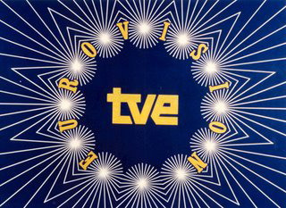
How about something inspired by the original Eurovision logo? (I always liked the way the converging lines would kind of shimmer…) — this one is a modernized version:
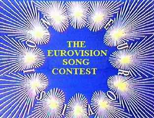
An older one — apparently this has been in use for 30 years:
That was why I thought of Decadence.
When Sandie Shaw won in 1967 with Puppet on a String, it was like none of her other songs, a real sell-out tailored to appeal to square Europeans, or it seemed to teen mod moi. As Sandie said, “"I hated it from the very first oompah to the final bang on the big bass drum. I was instinctively repelled by its sexist drivel and cuckoo-clock tune.”
As well as being simple, timeless and geeky, Comic Sans is a guaranteed crowd pleaser for people who don’t know any better, and don’t care. You could increase its appeal with a bright RGB color and dropshadow.
Comic Sans... with... oh my God please tell me you are joking! I am impressed by your Sandie quote though.
Thank you all for your lovely replies.
Yeah, 'Puppet' is utter E-pop. IIRC, it's also one of those ESC songs that gained Icelandic lyrics, some others being 'All Kinds of Everything', 'Non ho l'età' and 'Après toi'.
Captured from web.archive.org on 17 Oct 2013. view this capture