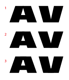
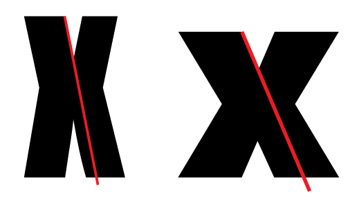
Current progress:

Original post:
Here's a little project I've started recently. At present it's just uppercase: all the standard Latin (except S) plus a few Greek and Cyrillic caps I was able to start easily from Latin. There are a few alternates in there too. Any general observations are welcomed, and I'm particularly interested in the Cyrillic И. The current glyph (which is simply the alternate N reversed) doesn't feel right to me, but I can't really tell why.

Spacing is, as you can see, nowhere near complete. And no kerning is shown here.
| Attachment | Size |
|---|---|
| PDF Sample 2012-06-30.pdf | 43.75 KB |