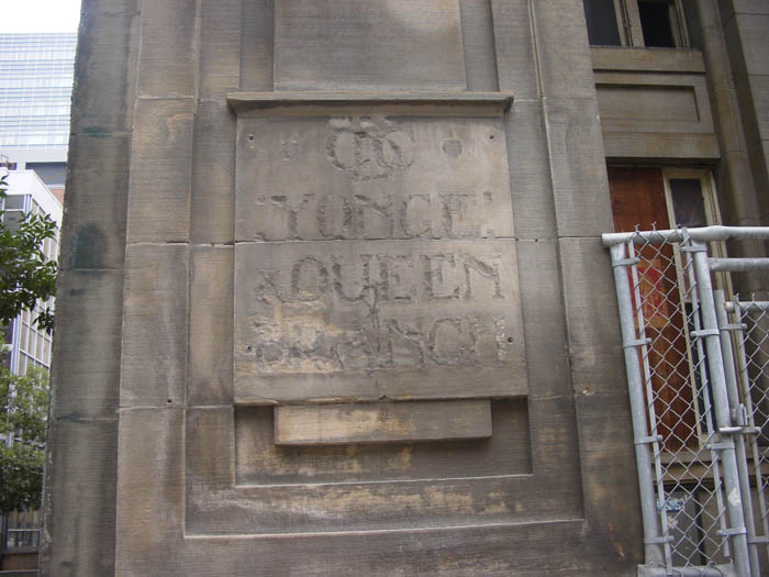
I popped accross this sign recently in a blog (of course laughing at the copy editing):

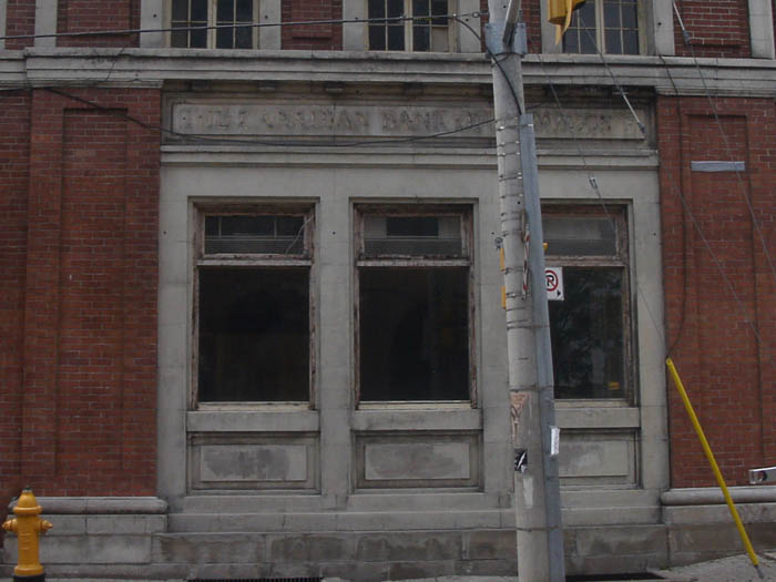
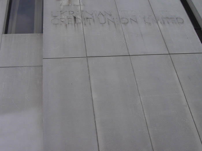
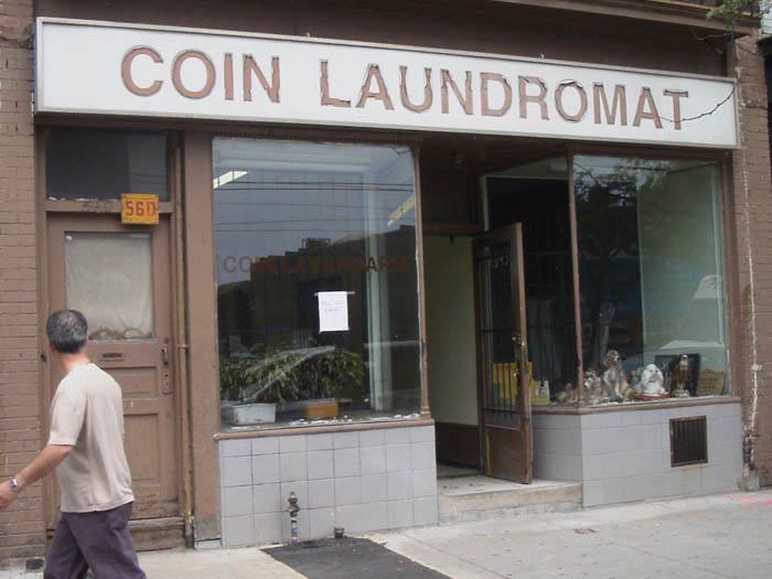
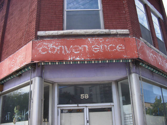
And I think it's rather neat how time has turned what started as some kind of garalde into something... quite appealing. At least in parts, mainly the condensed bit. Sort of Vojtěch Preissig-esque.
Some sort of "aestethic of failure" seems possible here, aikin to glitch music - I know we've had some threads on digital artefacts and the like here recently, and of course there are grunge and "letterpress-simulating" typefaces out there, but I'm wondering what other directions "deliberately failing" typefaces could take.