
Hi, I have a font here that I've been working on and would love critique. Ideas for improvement? Just chuck it in the trash? Thanks!
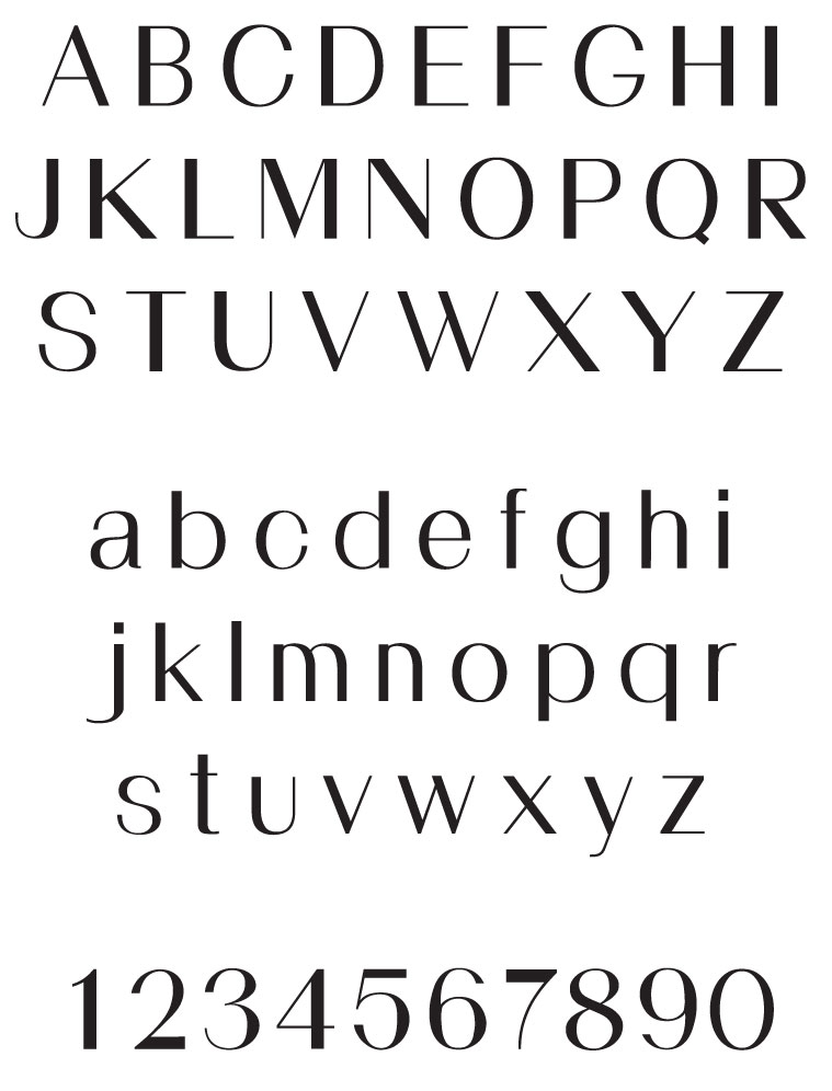
Hi, I have a font here that I've been working on and would love critique. Ideas for improvement? Just chuck it in the trash? Thanks!

Some good thinks in this. At first glance I find the /f,t,y/ terminal too short. The spin of the /Ss/ is too squeeze in the middle, the horizontal of the /2,7/ is too thick and probably the stem of the /1,4/ too also too thick. the /m,n/ should be copy from the /h/ where the stem meet the curve. I prefer the shoulder of the /h/ compare to the the /m,n/. /bdgpq/ seems too wide compare to the /o,e,c/. Finally, compare the terminal of the /c,e/ it should be in the same way. Keep going.
Hey, Sim - thanks for you time and comments! I'll get some more work done on it and re post soon.
It's really amazing how you can look at something for so long and then someone points out an obvious flaw that's been there all along and you think "how could I have missed that?" Thanks again, Sim for the feedback - some of the items you pointed out really made me redo quite a few letters and I like it better. Would love any other comments big or small - very helpful. Here's the updated font.
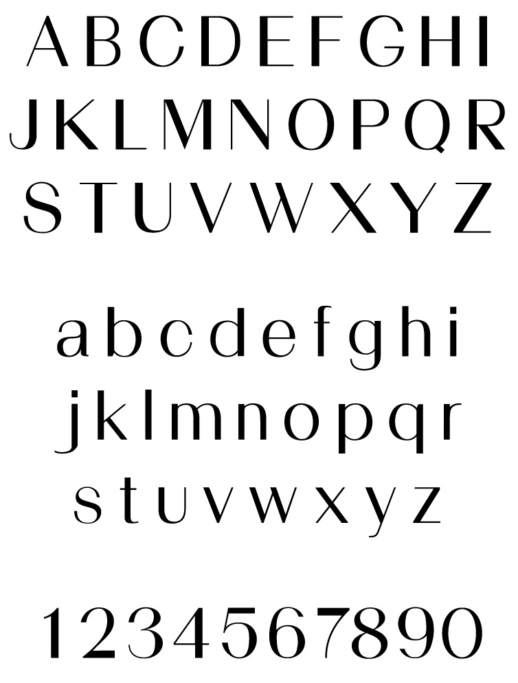

You still have some wildly inconsistent stroke widths. For instance, the thick parts of the round strokes as in |o| are much lighter than the thick parts of straight strokes as in |l|. Also compare the diagonals in your |V W X Y| — they all look different.
Check this out: http://66.147.242.192/~operinan/2/2.3.2a/2.3.2.05.verticals.htm
Captured from commoncrawl.org on 26 Apr 2015. original URL