
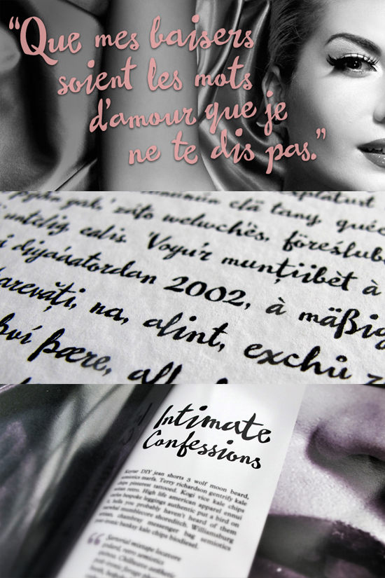
Happy to announce that my new font, Pastiche Brush, is now available on MyFonts.
It's inspired by the film titles of Imitation of Life. The aanyas.com site is a great source of inspiration.
Thanks for looking,
Dave
Happy to announce that my new font, Pastiche Brush, is now available on MyFonts.
It's inspired by the film titles of Imitation of Life. The aanyas.com site is a great source of inspiration.
Thanks for looking,
Dave
Here's some samples

Nice one :-)

lovely, great work!

Well done Dave - nice and bouncy, and looks convincing as lettering.
Thank you very much. It was a fun one to make!

Not bad!
The alternates are really effective and the joins seamless.
However, you might consider adding a high-res/display version.
Veneer is a marked improvement over Anodyne, for example.
For glamour, one can never be too fine.
As an aside, it would be interesting to know which Olicana has been more successful, rough or smooth.
you might consider adding a high-res/display version.
[…]
For glamour, one can never be too fine.
Seconded: there’s no such thing as too much contrast ;-)
However, you might consider adding a high-res/display version.
Do you mean a higher contrast version or more detail in terms of the roughness of the outlines? I tried to keep the outlines smooth to give a wet paint sort of feel, but I suppose a rougher edge could also be nice. I might give it a try.
more detail in terms of the roughness of the outlines
Related: http://typophile.com/node/70427?page=7#comment-512549
I think a display cut could/should have a higher contrast too.
.
If brushstrokes are being represented, there’s no reason why the strokes can’t taper off to really fine, as in the Imitation of Life titles that you linked to—and that would increse the contrast. Actually, that does occur in some letters already. Also, by spacing out the strokes you have lightened the overall effect of the original, reducing contrast.
Hi Nick - in answer to your question, as you may have guessed; Smooth, followed by Fine then Rough.
Nick (Cooke), do you make the rough first and smooth it, or the smooth first then roughen it?
The Rough was the first as it was my actual handwriting. Then I drew the Smooth from scratch. I wouldn't do a 'roughed-up' style as I don't find those filters very convincing - too evenly rough if you know what I mean.
Captured from web.archive.org on 16 Apr 2015. view this capture