Typophile

Positioning logomarks on business cards

mike.j

Hi guys,

Ive been wondering about how other designers center-position their logo marks.

Most of the time, I myself treat the entire logo incl. subtag as a block, placing that block slightly higher than 'dead center'. It seems more visually appealing to me.

What's your take on this? Do you go by mathematics, purely by sight, is there a general consensus, any set rules, or does it vary on the logo you are implementing?

thanks!

If it looks good it is good.

Always by eye.

The optical centre is indeed higher than the mathematical centre, but then again a logotype shaped as an upside-down pyramid might even things out because a pointed shape is optically smaller (lower) than a squared shape (like the apex of A that needs to ascend slightly above H to look equal).

Indeed, I agree with all of you..

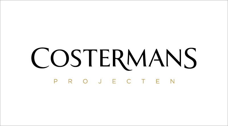
For example the card I am working on right now has a large wordmark with a subtag which is in a subtle color and doesn't bring much 'weight' to the overal composition, therefor i think it doesn't need to sit much higher. I would place it slightly higher if the subtag was more substantial.

(card will be screenprinted on tick black paper, wordmark white, tag gold foil)

It may look different in black/white/gold, but to me, "PROJECTEN" looks off-center, but not enough to appear to be deliberate. It also looks disconnected, but the tail on the /R does tend to push it away. I'm disturbed by the slope of the trim on the left leg of the /M. My eye keeps trying to make it parallel with the \R's tail and failing. Just my two centimes.

I would be more concerned with the letterspacing of the wordmark.
It is uneven—scrunched in the middle and tenuous at the left, contradicting the symmetry of the layout.
It’s a mistake to make a single feature in the middle of the word, which is not where the intial attraction should be.
Was just mentioning Cassandre’s YSL logo in another thread:


Now, this style of letterpacing might not be au courant, but at least the density is evenly distributed.

Captured from web.archive.org on 18 Oct 2013. view this capture