
Hello,
For my portfolio site I will make use of a woodcut image. I want to find a serif typeface that would be historically appropriate for it and/or an interesting choice (for whatever reason you find it to be so; but please explain that reason). I can't give too much information about the site, but I'll just mention this: I plan on designing custom blogs for Protestant Christian writers, so a typeface that references the Reformation period (or is in any way relevant to the Reformation) would be a bonus.
Requirements for the typeface:
* It must be available as a webfont, preferably through Typekit or Google Webfonts. But I'm open to other suggestions as long as I don't have to host the file(s) myself.
* It must have both a regular and italic style. (I'll be loading only these two styles of the typeface on the page.)
* It must be suitable for both display and text use. I know, it's not ideal, but since this is for the web, I can't load too many fonts on the same page. However, text size in this case will be somewhere between 16-20px.
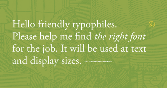
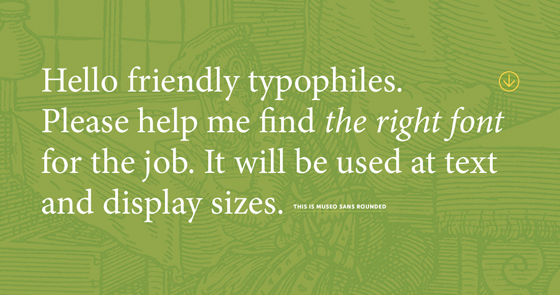
Here's what I've played with so far. My favorite for the big text is Adobe Garamond, but I'm having a hard time making it work at smaller sizes, as it looks rather fragile even at 18-20px. (Please check out the links for a full view.)
Adobe Garamond ↓ (FULL VIEW)
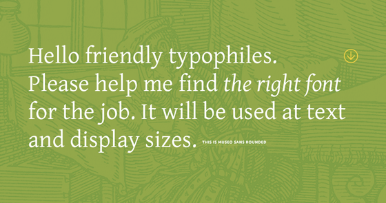
Gentium ↓ (FULL VIEW)
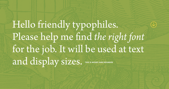
Arno ↓ (FULL VIEW)
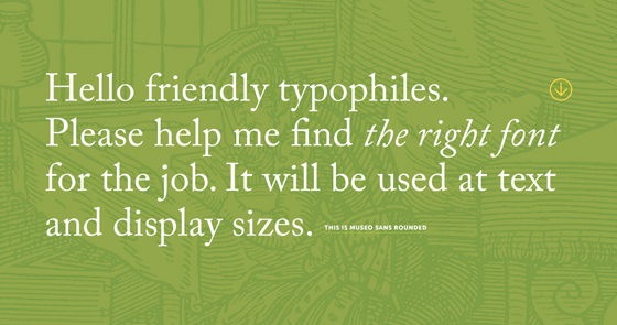
Adobe Caslon ↓ (FULL VIEW)
Chaparral ↓ (FULL VIEW)
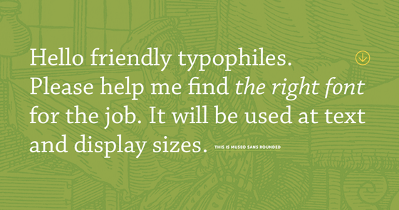
Calluna ↓ (FULL VIEW)
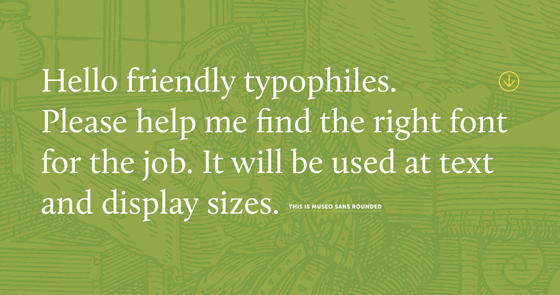
Cardo ↓ (FULL VIEW)
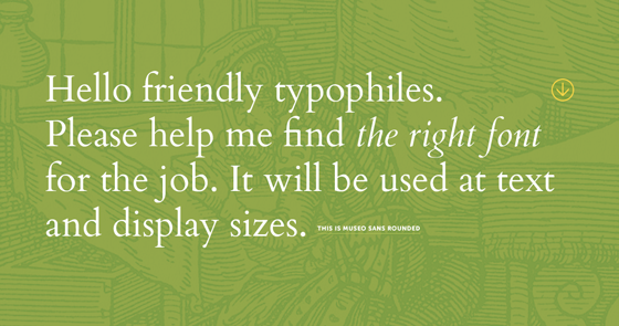
Fell Double Pica ↓ (FULL VIEW)
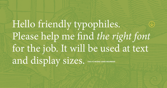
Minion ↓ (FULL VIEW)
Thanks for taking the time to look at this.
PS - I'll be using a heavy weight of Museo Sans Rounded for small text, mostly in all caps. See full images for an example.


