
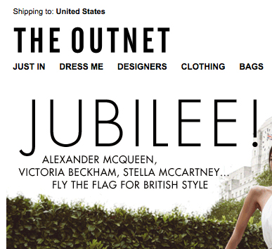

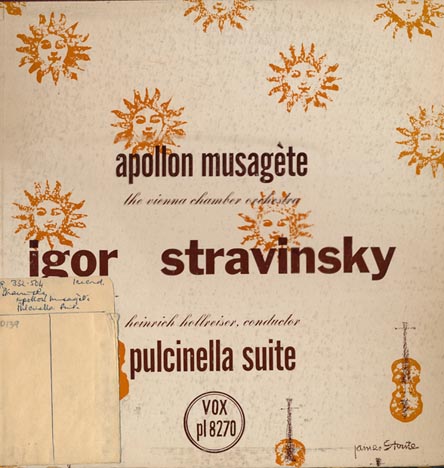
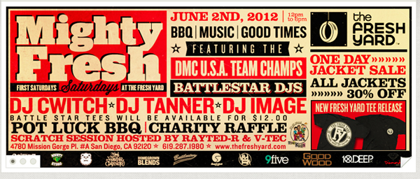
What are your thoughts on this type of typography? All capital on everything.
And why do you think this is so popular?
My answer is,
I think this is popular because its an easier way to make decent looking typography.

The sample you show are advertising.
In advertising the act of SHOUTING is pretty common.

Plus it's just easier to make straight lines with.
hhp

A similar comment based on those examples could be, "Why is sans serif preferred in advertising?" Or "Why is black text so popular?"
Correct me if I'm wrong, but it even seems all of it is in Futura. Is that a "trend" as well?

Black text is overwhelmingly popular in advertising because its rich hue suggests the darkness of a hole, sucking the consumer in.
And not, for instance, because it's been the default for 500 years.
And capitals were the default long before that. Has there ever been a time when capitals were out of favor? And are they really, now, more popular than u&lc? I doubt it.

Has there ever been a time when capitals were out of favor?


I doubt you could get dental floss through that kerning :-)
Clearly the wisdom teeth were removed, but it was too late.
hhp
That’s the cover of a book which reproduces ads from the 1960s at 100%, so it would be around 8½" x 11".
The kerning is in proportion to the size of type.
It was published in 1984, just about the end of the Tight-But-Not-Touching era.
During the 1960s, American ad copy was written in a (feigned) friendly, second person singular, conversational style.
Headlines were set as if they were blow-ups of body text, to continue that casual, informal theme.
So: paragraph indent, flush left, upper and lower case, like this from 1965:

An email or web post in all caps certainly looks like shouting, but I don't think that a few all caps words in an ad always creates that impression. Depends on the font, the overall design, etc.
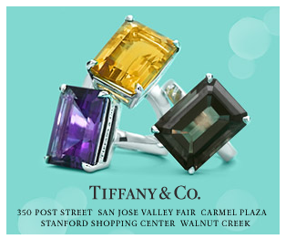
Do you think the way graphic designer's see typography is different from how typographers see typography? I think the ALL CAPS style is mostly done by graphic designers because they see the groups of words as rectangles and it looks neat. While typographers see typography more like language that is typesetted so it wouldn't make sense to make everything ALL CAPS.
Is the average graphic designer's typography a different breed, or is it just not as sophisticated as a typophile's? I'm talking generally.
Black text is popular because that's just a standard color for text

It is not just the shouting — I would like to point out that blocks of cap type are just that: blocks. Tighter, more defined than a bunch of lowercase letters, and thus a lot easier to turn into a layout that is ‘beautiful’. Maybe there is a lesson here: are you a better designer if you can do good work with U&lc instead of all caps?

In ads like those, all-caps is quite allright because of the varying weights and sizes. But an all-caps multi-paragraph setting (read: disclaimers) is guaranteed to drive me all "HULK SMASH!!!!!" and demanding that the offender be hung, drawn, quartered and nuked from orbit.
DTP shook things up, big time.
After twenty years of sloppy layouts, things are starting to tighten up.
Good graphic design isn't about making a layout beautiful. It's about finding an effective way to visually communicate a message on behalf of a client.
Setting paragraphs of type in all caps is not a good idea in most cases since it's difficult to read, but none of the examples shown do that; they just show a few words in caps, which certainly is nothing new. You can find ads from the 1800s (and probably earlier too) that do the same thing. Is it good design? Depends on the ad.
Good graphic design isn't about making a layout beautiful. It's about finding an effective way to visually communicate a message on behalf of a client.
So this is good graphic design?—
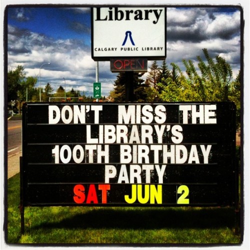
Image swiped from: http://www.uppercasegallery.ca/
BTW, it’s all caps!
Point taken, Nick. I didn't phrase it well. Certainly a designer wants his/her layout to be attractive. I'm just saying that good graphic design isn't just a veneer of attractiveness. If a design looks beautiful but does a poor job of communicating the intended message, then on some level it's a failure.
To answer your question about the photo, it does communicate clearly, but obviously it's not an attractive design.

@Nick: Of course, those fast-food-marqee style signs are all caps because there's no place to put any descenders.
@Etah: Research shows that when people read, they don't decode the text one letter at a time; they decode words, which they recognize by the distinctive contours formed by the ascenders and descenders. If I have copy that I really want my readers to decode (Here's why my client's solution is the best!), I'll use caps and lowercase.
If the words serve less to convey information, and more as a badge or banner, I'm more apt to use all caps.
Capitals are also very handy for large blocks of text that you want to prevent people from reading, such as software license agreements.
Research shows that when people read, they don't decode the text one letter at a time;
No, research shows that we read letters not words.
As per Kevin Larson, Typophile poster.
Kevin is wrong. It's quite obvious.
hhp

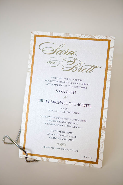
I did a wedding invitation similar to this recently - Does this seem like it's shouting in all caps? I feel like I see all caps in wedding invitations often.
@Special-K – If it's shouting, it is 'town crier', not 'squealing bullhorn'.
@Nick, @Mojo – Blind men and elephant, someone?
Familiar with the Elephant font, but not Blind men.

Has there ever been a time when capitals were out of favor?
In Dessau in the mid-1920s.

I think the typography in the Marlborough ad is rather terrible . I am all for paragraph indents, but not when the paragraph is comprised of one sentence. And then leaving the "is" all alone down there. And then using full sentence punctuation in the first sentence and not in the second.
I think the mad man who set that doesn't have too much on the typesetter for the library letter board. (It is almost centered)

If all-caps looks good, what's the problem? It’s a positive boon where vertical space is at a premium. Also on the upside: it obviates the need for proper capitalization…
I think the mad man who set that doesn't have too much on the typesetter for the library letter board.
I think you’re missing the point.
There was a culture of this style, with subtleties that this ad plays to.
The orphans are intentional, creating dramatically asymmetric paragraph shapes which may be manipulated as part of the overall flat graphic, in a way that filled-out paragraphs don’t.
In particular in this ad, which is all about vertical flow (riffing off the condensed type style of the brand name), “is” reads straight down to the adjacent “Come”, requiring no disruptive eye backtrack (regressive saccade?)
Continuing the flow, the absence of a final period references newspaper style, easing the reader’s passage into the body copy.
Speaking of vertical flow and Mad Men, the real deal:
http://www.georgelois.com/pages/milestones/mile.coldene.html
Lois would have pissed on anything as lame as “At last. Something beautiful you can truly own.”
And still would.

Nick, it's an ugly ad.

no it isn't.
everywhere
Thanks Nick, that is a really great description of the era and culture and the design methodology in use. It does make sense if you think of how the designers of the ad were reacting to the way type had been used in the past or the way type was thought of at the time, and setting it in a different way. I actually do understand it as experimental typography now, I guess I was just unaware of what experimental typography of 1960's Madison Ave. looked like. I was definitely drawn to it as a kid looking at my parents old magazines though.
Nick I think I was rude to you, I just see many after rationalizations about a type treatment that seems too stiff for me, maybe I'm totally un contextualized to this style.

...
About the queerest bit of u/c typo I ever saw is in my old Borland (TP5, TC2, TDB1) manuals. The word 'chapter' ('appendix', 'part') is set all upper in ca. 10pt Avant Garde and letterspaced to fill the line. There is a full-width bar a line height or two below and right underneath that comes the identifier flush right in ca. 24pt Palatino. Reckon you can see it for yourselves if you snag one from Bitsavers or one of their mirror.
Captured from web.archive.org on 19 Apr 2015. view this capture
