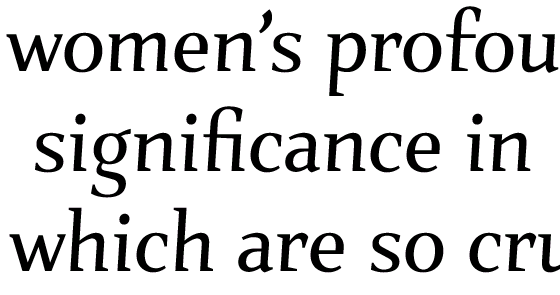
Hello! It's been quite awhile since I posted anything on this lovely site. I need some research help.
I started a new job a few weeks ago, an in-house job with an online glasses retailer. They're in the middle of re-branding, and they say they hired me to push it to a more fashion-forward, couture look. Well, they're far enough into the redesign that they're already set on a logo, typefaces and colors. I think I can live with all the choices they've made so far except the typefaces.
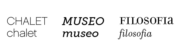
I'm fine with Chalet and Museo. But Filosofia? Don't get me wrong, I think it's beautiful, but when I see it I think of book covers from the late 90s/early 00s. Especially since they like to use the unicase. Anyone ever see it used in a "fashion-forward" way? Can you show me something that will make me fall in love with it?
I think I'm going to bring up my concerns with the CD, but I want to make sure I'm well versed in Filosofia before I put my thoughts out there. Thanks!