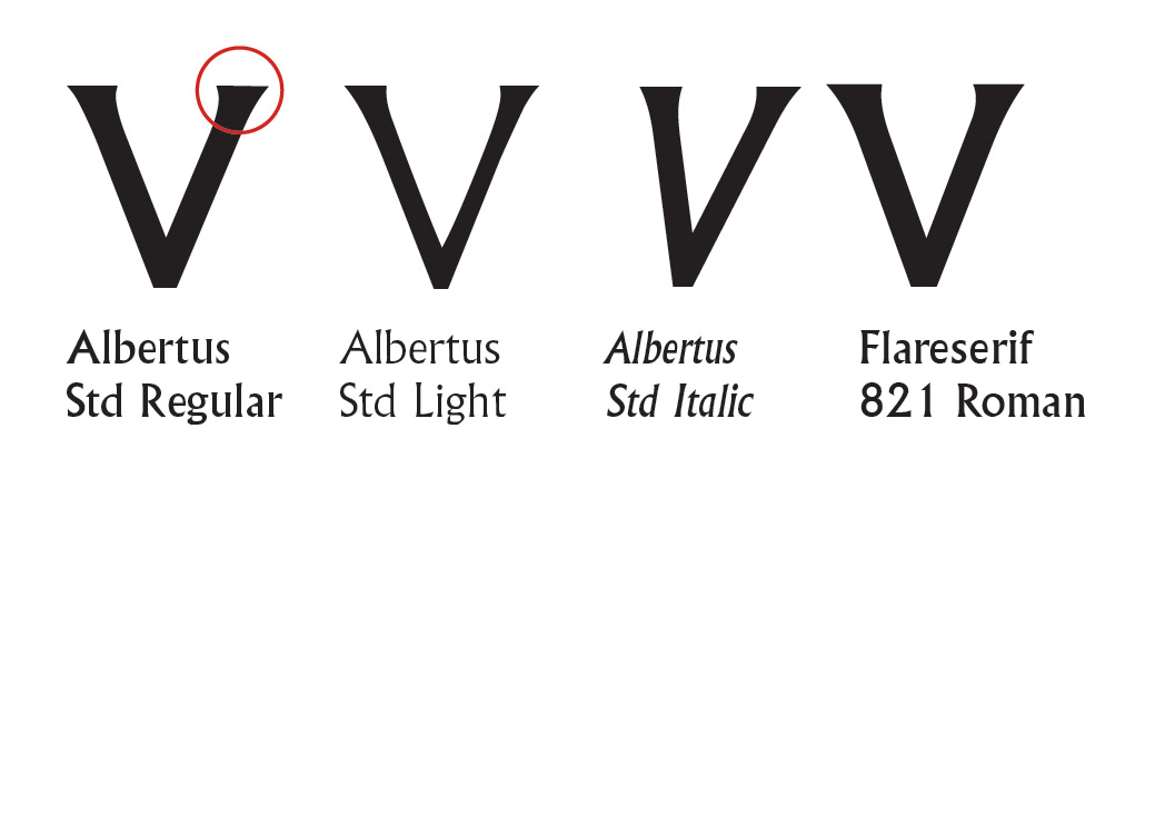
I was typing out a heading in Albertus (Albertus Std Regular, the Monotype Opentype file) but with the V I noticed something odd. I zoomed in and saw the right serif has a sort of slope to it. When on the Light and Italic of the same family, it is not sloped.
Additionally, the Bitstream Flareserif 821 has not got this slope either.
Is this a defect in the file, and should I go back to the distributor or is it a quirk that's been there for a while? Is it only this newer Opentype one that has this or was it on the older files too?
| Attachment | Size |
|---|---|
| albertus_defect.jpg | 64.56 KB |