Hello;
The title of this topic is the title of a research that I am making about typefaces and typedesigners that, for some reasons, were lost in the history. Because of their designs or not, some typefaces are called UGLY by graphic designers (and other people), because they not follow the common shapes of regularity. Texts like "Cult of the ugly" are descriptions about the bad taste of this non-commercial flavor.
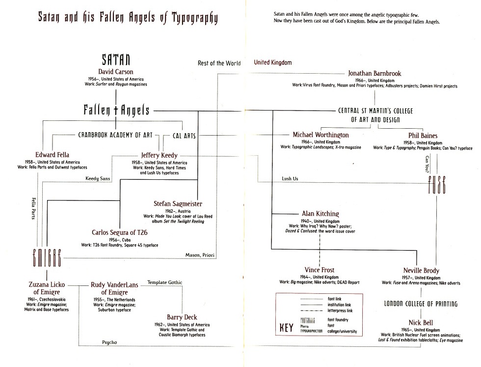
When I listen the word "non-commercial" I always think in beautiful works; things like Zuzana Licko typefaces, Ed Fella, Jeffery Keedy and others alike. My search led me to things like Calson Italian Grotesque, Jean Allessandrini type experiences, Raffia Initials by Henk Krijger, FF Blocker, "du chiffre" book of Jérôme Peignot, Preissig Antikva and some other examples.
I dont know what you think about this examples, but I love them, and this experiences with type fill me with ideias that I want to put in my research.
What I need [now] is that you fill this topic with this kind of experiences in type that I miss. I know that exist a lot of experiences in history of type design, but I need your help to find them all :). [Past Present and Future (if possible)]
Best Regards
Fábio Santos