Hi,
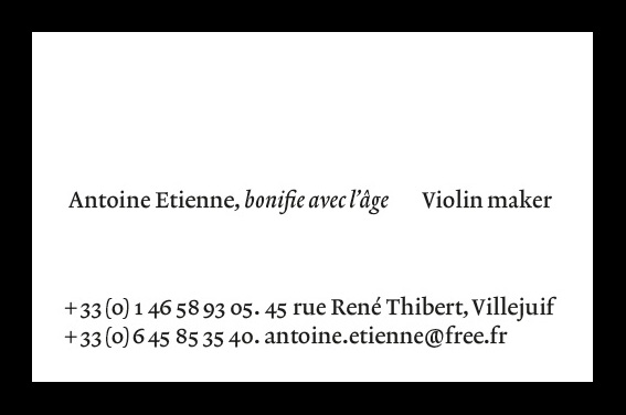
Long time lurker, I finally have a request to post here: I would very much appreciate a critique of a business card I’m designing for a violin maker.
The typography is loosely inspired by the stamps used to make violin labels in late 17th, early 18th century Italy. Janson, Kis and the like didn't feel quite right so I treated myself to Lexicon, so far this is the only irrevocable decision.
The frontside of the business cards would be letterpress’d from polymere plates (the tryouts I made look fairly good). Everything inked except the f-hole which would only be embossed. The backside printed with varnish on a paper similar to Royal Print containing wood so it gets colored by daylight rather quickly.
Any feedback would be greatly appreciated!