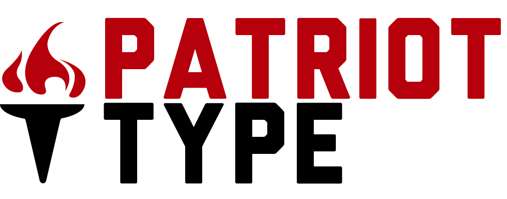
I am going to start an internet business that sells and designs posters and t-shirts that display American ideals. The designs will focus on the concepts of liberty and freedom (which is why I chose a torch). I wanted to keep the logo simple yet interesting. Let me know what you think of what I've done so far. Also, let me know if the typeface is a good one to use. I was thinking about using an older, American Revolution era typeface but this one was more bold and fresh. The other older font types didn't give of a powerful, inspiring feel. Be brutally honest; I want my logo to be the best it can be.
Target Market:
Liberty loving 18-45 year olds
| Attachment | Size |
|---|---|
| logo2.jpg | 112.79 KB |