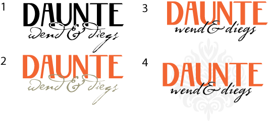
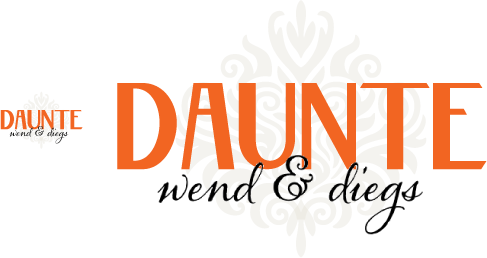
This is for a design firm focusing on historic interior design, with their main style being early 1900s Arts & Craft, Art Nouveau, etc. The designers are women, however they don't want to alienate male clients, thus do not want anything too feminine.
The san serif for Daunte is set in stone. Please don't critique that. Please don't critique the name. Or kerning. However, I'm looking for opinions on the script. Does the overlap work? What about style of script? Any thoughts on the script with the san serif is appreciated, or suggestions for better scripts.
What about the color scheme in #2? The others are just randoms.
The logo will be a text only logo. However, at times it may be set over the ornate watermark. Too much?