Hello Typophiles,
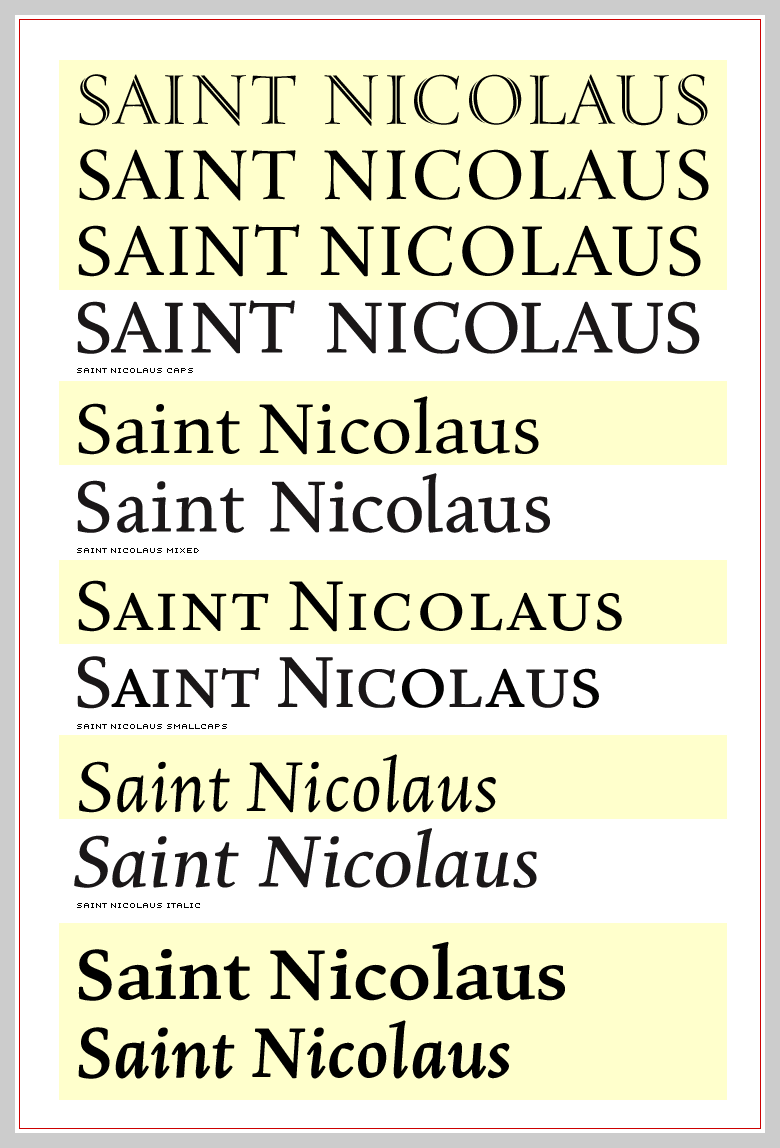
Just writing to tell you that things are moving along with Eason (formerly Saint Nicolaus). I've made many modifications to the roman, completely redrawn the italic (and am doing so again), and added titling and inline caps. Progress is being hampered by non-type work, but I am hoping to scrape together a useful opentype family sometime in 2005. I still have to rework the bold, based on the changes to the regular and flesh out the variations on the figures. Fonts are a black hole that you toss your time into, happily. Anyhow, here is a preview. All suggestions welcome.
Oops, I just noticed the inline S. It looks odd because the outside line is defining the curve instead of the inside, like it does everywhere else. See the B for example. I'll post that fix shortly.
R