Greetings!
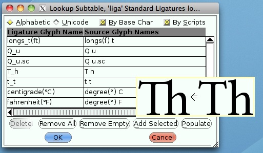
I'm new to this forum so be gentle! I'm wondering what the general feeling is about the 'Th' ligature in body text. It seems that many of the Adobe OpenType fonts (WarnockPro, Jenson, etc.) have this ligature, and I'm not convinced it's easier to read.
Is this a "feature" for the sake of a feature, or are there appropriate (and inappropriate) place for this ligature?
Thanks!
Chris Swingley
University of Alaska Fairbanks