
Hi,
This is from a Richard Long poster in an art gallery - does anyone know a matching version of Gill Sans - all of the versions I have are wider (most notably on the Ns and Ms)
can anyone help???


Hi,
This is from a Richard Long poster in an art gallery - does anyone know a matching version of Gill Sans - all of the versions I have are wider (most notably on the Ns and Ms)
can anyone help???

Depending on how old your sample is, it may be Intertype’s San Serif No. 2, which is based on Gill Sans, but has a narrower M and N, and a somewhat straighter leg on the R.
I’m not aware of a digital version but, then, I’m not all that hep to this interweb stuff…

Have you tried with Gill Sans Std Roman (http://www.myfonts.com/fonts/mti/gill-sans/gill-sans-std-roman-116368/)?
Thanks, but still too wide (see below)
I tested out manually condensing to about 97% - that seems to match up the width (also see below).

How about a close-up of an R. I’m still stumping for the Intertype clone…

Is this an old document? Because the original Gill Sans (or even a previous-era clone of it) had optical scaling, and one thing that larger sizes would be is narrower. Ergo: you might not find a digital version of this.
hhp

Nick, the samples are links to much bigger images:
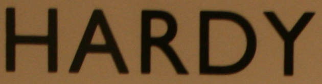
The join of the leg on the R is smooth in your sample, and definitely not in the Intertype face. The homogenized widths led me to believe that this might be a hot-metal face, but Linotype didn’t offer a Gill alternative, and I’m not hep to the scooby-doo about Ludlow.
In which case, I would have to agree with Hrant that it’s probably a predigital version, with the width finagled for the particular size of this font.
Captured from web.archive.org on 2 Jul 2014. view this capture