
Thanks for the input.
| Attachment | Size |
|---|---|
| sans.jpg | 285.58 KB |
Thanks for the input.
| Attachment | Size |
|---|---|
| sans.jpg | 285.58 KB |

You should move the thread (using the "Edit" link) to the Type ID Board proper.
Proxima Nova Light is close, but as you can see the "a" & "t" are slightly different.
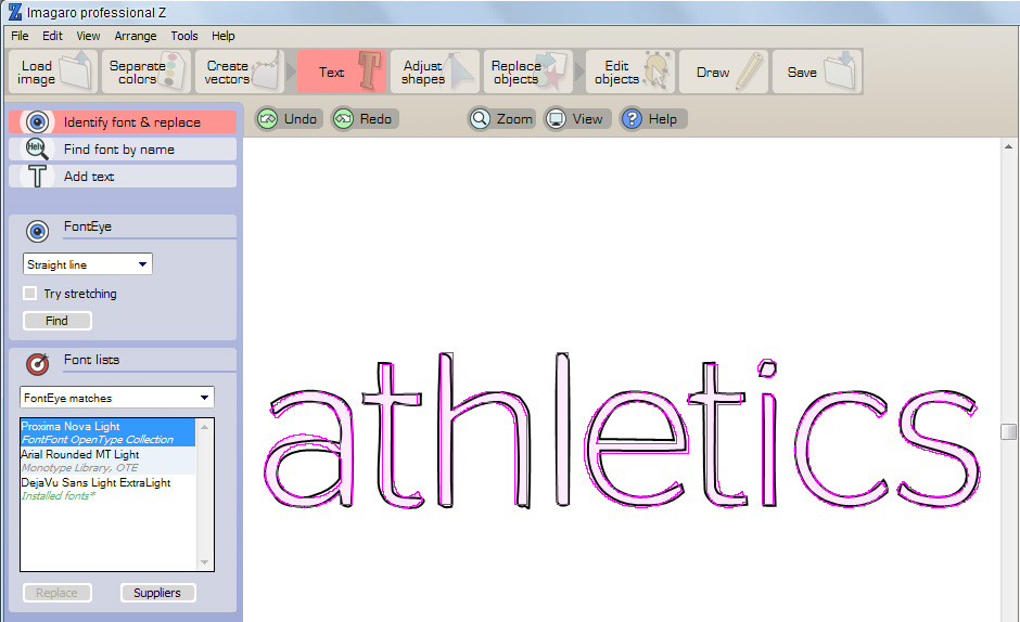

Around here that's not "slightly", that's a continent.
hhp

Maybe closer: Schwartzco/Christian Schwartz/StagSansRound-Light
http://www.christianschwartz.com/stagsans.shtml

Captured from web.archive.org on 14 Oct 2013. view this capture
