
Have you, guys and gals, seen this - http://iotic.com/averia/ ?
Have you, guys and gals, seen this - http://iotic.com/averia/ ?

Briefly referenced in some threads, for example:
http://typophile.com/node/87045

The thing is, the average font is never going to be rounded and blobby at the joins. Since he's modified the letter shapes anyway from the rendering, wouldn't an interesting and possibly fruitful avenue be to look at the result and try to create regular font outlines based on the proportions and shapes? The font would be far from average (the cut-and-curve a, for instance, would be interesting!), but perhaps fun.
Johan, a similar approach is envisioned by Marcin Frontczak in this thread:
http://typophile.com/node/85705#comment-478353

Whatever the rationale, the end product is pleasing at least to my eye. Its soft edges and loose spacing convey a feeling of warmth and sincerity, and are a simple joy to read.
Whether or not my perception is clouded by reading too many old letterpress-printed books—where such rounding occurs through wear and ink accumulation—or that the forms themselves are simply more optically inviting is a question I will leave to those far more knowledgeable than me on such subjects.

Interesting that you mention old letterpress.
When I developed Paradigm, which was based on the really awful (by later standards) printed quality of a “blobby” Sweynham & Paanartz' 15th century face, I decided to rationalize/stylize the serif treatment, with convex flares, but giving them a slight sharpness.
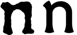

Shoulda called it "Apothecarist". ;-)
hhp

@Birdseeding – It is safe to assume, then, that you have rerun the Avería experiment for yourself?
Nick,
A most apposite and felicitous interpretation. Those curves would give Jessica Rabbit a run for her money…

I'm amazed that nobody has said boo in that:
1) The creator of the font freely admits to accessing the outlines of all of the fonts on his PC - and thereby breaking the license terms (presumably) for almost all of them.
2) Does not give credit to his sources.
Why no list of fonts? Why no credit where credit is due?
BTW - I haven't looked yet, but who's listed as the designer?
What a world.
Richard Fink
Blog: Readable Web
Font Director: Kernest/Konstellations
The licence situation has been drawn to the designer’s attention, and he will be moving on to average Google’s web fonts.
Well, in Lake Woebegone, all the fonts are above average.
> he will be moving on to average Google’s web fonts
If you are referring to one of the comments on that page, then it was made 5 months ago.
@Richard – The impression I got from the Avería post above was that the glyphs were rasterised to bitmaps before being operated upon. If that is an illegal access to outlines… well, I guess it's back to the Hershey and SAIL fonts, then.

Well, the bitmaps were averaged first, but then to get a better understanding of what proper averaging would be, the article notes that he looked at the outlines.
So it's not clear that he went on afterwards to average the outlines instead of the shapes - which would have potentially led to a licensing issue.
Yeah, the latter would be troublesome.
@Té Rowan: Hmm, no, but I have taken a quick survey of the fonts on my hard drive and while some are in fact rounded, they appear to be in the minority, and almost none of them are thicker at the joins than at the rest of the stems. ;)

The licence situation has been drawn to the designer’s attention, and he will be moving on to average Google’s web fonts.
The Serif is quite nice, surprisingly legible in smaller sizes - http://www.google.com/webfonts/specimen/Averia+Serif+Libre
Captured from web.archive.org on 18 Apr 2015. view this capture