
Browsing through the ‘What’s New’ section at MyFonts, I happened upon a typeface family called Liber. It reminded me strongly of Luc(as) de Groot’s Floris, which is mentioned as having “inspired” Liber.
I started to compare glyph forms and found some to be strikingly similar (white is Floris Text, as shown in the type tester on lucasfonts.com, black is Liber, as shown in a PDF from the foundry website):
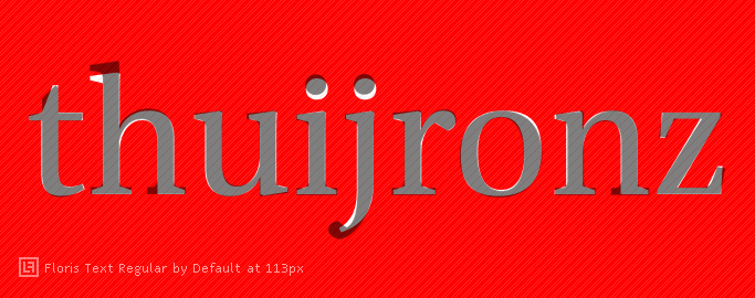
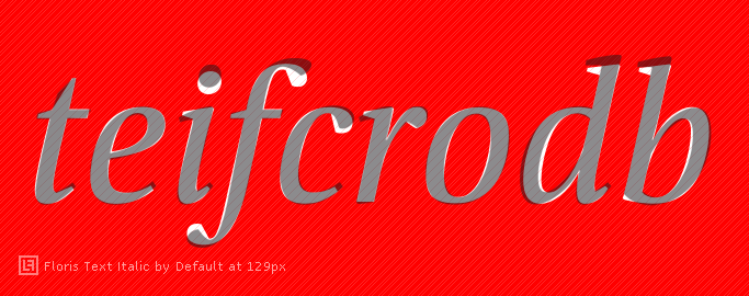
Is this what you typically would get when one typeface inspires another? The serifs and ascender/descender length obviously differentiate the two from one another, but I was wondering whether it is advisable to stay that close to the source. Or am I underestimating the importance of these variances? And: Is it allowed to create ‘version 2.0’ of an existing typeface?
I would like to hear some thoughts on that. Thanks!


