Hi, guys,
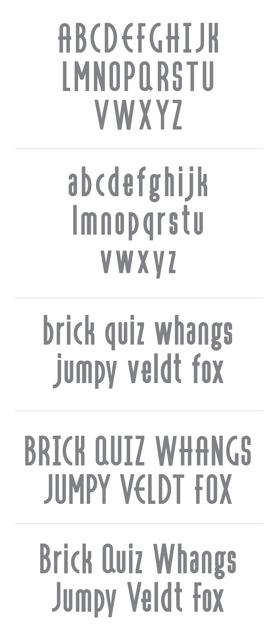
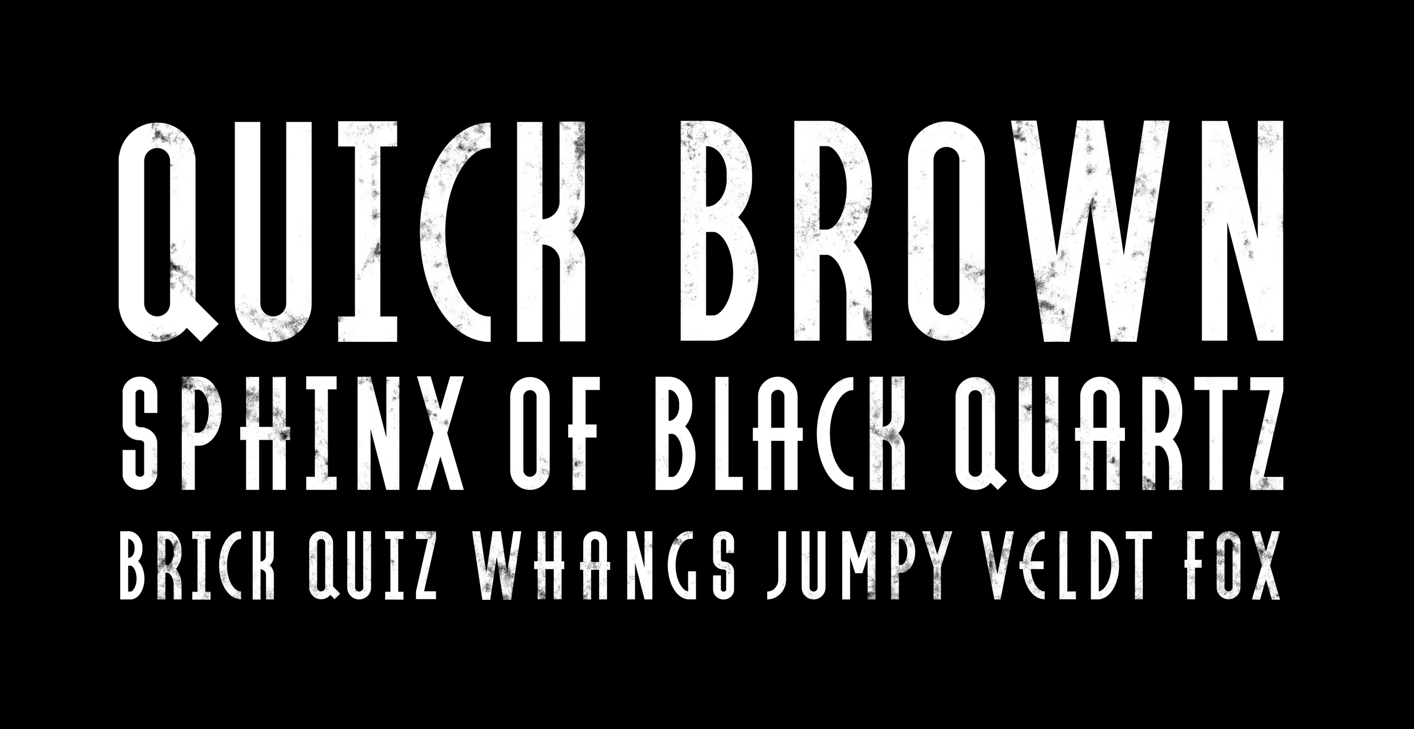
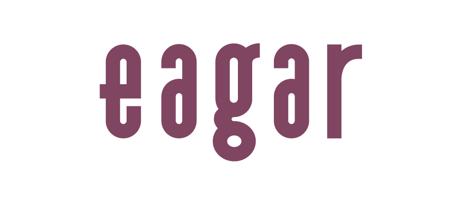
I am looking for some critique on this project. It started as a sketch of the uppercase characters & developed into lowercase. I am wondering whether to introduce some weight to this project as the negative space in some of the lowercase glyphs contrasts a lot with the uppercase.
Does the x height of the lowercase fit the cap height ok? I looked at Gotham Condensed Bold for some guidelines on vertical proportion.
Would appreciate any feedback from you experts out there.
Regards,
Harrycb
| Attachment | Size |
|---|---|
| font_01.png | 63.02 KB |
| tester.png | 586.15 KB |
| test1.png | 8.63 KB |