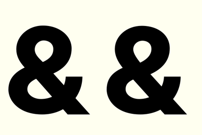
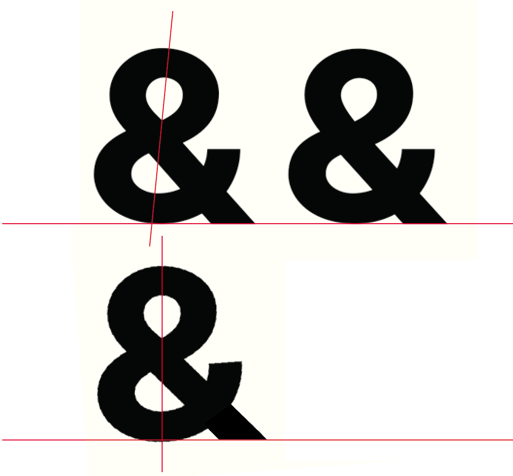
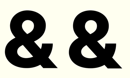
I am taking the liberty of creating this new post since the previous thread was quite old and I presumed that it would go unnoticed. Anyway for Hrant, Brainskywalker, Roger Waters and others, I would really appreciate it if more feedback is given on the newly added lowercase to my typeface.
I am attaching the new pdf with the designed characters along with some sample text.
Your feedback is extremely valuable and will help me progress further as it did previously.
To read the previous thread please go here
Thanks!
Manushi
| Attachment | Size |
|---|---|
| 170412_Jyamiti Sans.pdf | 56.52 KB |
| 270412_Jyamiti Sans.pdf | 54.43 KB |