Typophile

Talking about glyphs

I'm not sure if this has been discussed before or not, but I have been thinking about this a bit.

When somebody says something about a letter or glyph, they say something like "this lowercase a needs some work", and I get the meaning just fine. In writing, though, for some reason we feel like there needs to be some added emphasis, whether it be quotes, slashes, or italics. I've used all of them at one time or another. But I think it's unnecessary. And with non-alphabets or non-latin glyphs, it's even more obvious.

So rather than say,
—I think your 'a' is too wonky.
—I think your /a/ is too wonky.
—I think your a is too wonky.
—I think your «a» is too wonky.
I say:
—I think your a is too wonky.

This is simpler and still makes sense, right?

The quotes, etc. are not for emphasis, but for separation and clarification of meaning.

I think a is ok.
You think a WHAT is ok?

Was that the letter a or a lost word following the 'a'?

Many individual letters could be mistaken for typographical errors as above or, in today's texting shorthand, for full words. R u listening? C u later.

Right, but are we talking type in texting shorthand on Typophile? Should you text type?

Anyone who has used a font editor will recognize this notation:

     /H/e/l/l/o/period

I think this might work to unambiguously indicate a character. If this were adopted, it would be:

     "I think your /a is too wonky."

It only requires one delimiter, too, not counting the space, which would be there anyway.

You don't see how the second of these is much more unambiguous?
1) I may be entirely wrong, but a bowl should be a bit bigger.
2) /I/ may be entirely wrong, but /a/ bowl should be a bit bigger.

We definitely need some "declaration".

Personally I love guillemets, especially when you have to add a possessive (like "the «a»'s top") and I mean for any kind of quoting*. It's just that they're a hassle to type. The slashes seem dorky (although I guess one is not as bad as two). So I just use double quotes.

* In fact Nina and I made it part of Armenotype's house style.
Example: http://armenotype.com/2012/04/archipelago/

hhp

Still trying to argue against declaration at this point, although I'm clearly outnumbered.

So who actually says "I may be entirely wrong, but a bowl should be a bit bigger."? Do you not say, "The I may be entirely wrong, but a's bowl should be a bit bigger."?

I think your /a/ is too wonky.

I use this format specifically where the / delimit an actual glyph name in the font, and when I'm being really pedantic I distinguish e.g. /a/ glyph from |a| character. This is a personal convention, and I need to be careful not to use it when writing to linguists, who use the same conventions to distinguish natural orthography letters from phonetic transcription.

Because I'm lazy, I usually omit any indicator, and use them just when absolutely necessary (lowercase plurals, etc.). If I'm on a Mac, where I can type directly my curly quotes and apostrophes, I tend to use straight single quotes as enough distinct and minimally intrusive.
Anyway, the best solution would be having an appropriately styled HTML tag (chosen among the lees widely used ones, like < tt > or < kbd > or < dfn >, etc.).

Another problem: some letters and numbers (the usual suspects) are ambiguous of themselves, declaration or not. Like I tend to write things like "zero" and "el" (some of which actually don't need a declaration).

hhp

Why miss an opportunity to show one’s savoir faire?
Come on Typophiles, flash a few fancy keystrokes and get those curly quotes in play!

If Georgia had rationalist (AKA mirrored) ones I might go for that. This up-down business is too dumb a legacy to make an extra effort for.

hhp

Oh yeah, one arbitrary orientation is so much less ‛dumb’ than another.

The up-down (AKA 6/9) quotes were a result of metal typecasting/setting expediency (the arbitrariness of which somebody who -correctly- believes the rectangle model of type design is dumb should appreciate :-) while the mirrored ones point in a sensical direction (like parentheses). What's arbitrary about the latter?

hhp

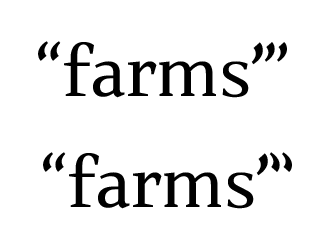
Also, the apostrophe should NOT look like a third* quote mark when it occurs right before a quote (which is one other way guillemets rule). But if we can't handle strongly diverging the shapes, here's an idea I suggested a long time ago on Typo-L (and it's actually a feature of my Daam Entity fonts): keep the apostrophe the way it is, keep the opening quotes the way they are, but flip the closing quotes vertically.

* Or second in the British tradition.

Before and after:

And in Patria (unmodified in the top setting) the apostrophe and single quotes are larger than the double quotes to help things along (but I don't think it's enough).

hhp

I happen to like Bodoni's symmetrical quotes, so I agree with Hrant to a certain extent.

However, I don't see it as a big deal, and so if typographers can save money by using an upside-down comma as an opening quote... I can sympathize with their motivation.

Now that we're no longer using little pieces of lead-tin-antimony alloy (mustn't forget that other element, riding in its triumphal chariot... and, for that matter, the small amounts of other elements such as copper as well), maybe it might be considered appropriate to revisit this. But when people are used to something, changing it will be resisted as an impediment to quick reading.

Although it's not as if ordinary people notice Bodoni's quotes and are confused by them - or even have trouble with typewriter quotes. So people designing new faces certainly could use Bodoni-style quotes - if they dared.

I don't think there are any rules about this, just conventions. The type designer may do as he or she pleases. If one comes up with a better way to do it, people may embrace or reject it. Convention changes slowly.

Back to the original topic, I guess nobody likes my idea about borrowing slash notation from font editors.

Since there are no formal conventions, the best approach is what works best to communicate what you're actually trying to say.

Out of context, “I think your a is too wonky” could be dis-ass-terously misinterpreted...

I believe the /a/ thing is a convention from linguistics, right?

What convention works best, then?

The advantage of the slash method, while visually a bit “heavy” and decidedly terminal-like, is that, as seen in Mark’s first example, it doubles as separator when one’s referring to mora than a glyph.
Perhaps another possibility could be square brackets: [A], [A]s, [A]’s, etc.

There is a convention from linguistics, but that is that /a/ stands for the sound of the letter "a", so using that punctuation for the glyph is potentially confusing. Just using quote marks, on the other hand, is relatively unambiguous.

Get the glyph outta here! Go glyph yourself, you glyph lover!

John and Birdseedling —

The normal linguistic conventions are /a/ for a phonemic transcription and [a] for a phonetic transcription, in IPA. Occasionally, |a| is used in "dictionary" phonetics.

If we're making a convention which is only relevant locally among typophiles, I don't get why some are taking into account phoneticians or linguists.

Now, I notice the slash ‛bracketing’ being used by most of the people here, and I see it as the practice with best chances to prevail. If the matter boils down to a simple question of taste, why not standardise a method that is already an habit?

Is it really a widespread habit?

If we must use a slash, I think Mark's "only one before" is best.

> ‛bracketing’

Ah, I see what you did there. :-)
But in some fonts it looks wonky.

hhp

IMO including a "trailing bracket" is good in situations where you want to pluralize, e.g. "Which of these /R/s is working best?"

IMO including a "trailing bracket" is good in situations where you want to pluralize, e.g. "Which of these /R/s is working best?"

I get what you mean, but that could still be confused as R/s (arr slash ess, arr or ess) rather than R's. Or maybe we need to what Hrant said: which one of the Aarghs is working best?

Ultimately I think any solution has the potential to be confused or misunderstood. That's why I'd like to remove declaration or bracketing and use wording to mark with. Is "I love the R." confusing at all? Especially when prefixed with "uppercase" or "lowercase", it's not really ambiguous. Even if we came up with a great declaration system, bad writing still makes it a fail.

@oldnick: Since there are no formal conventions,

I’m not sure what you meant by “formal conventions,” Nick; but this topic is usually addressed in publishing style guides. For instance, The Chicaco Manual of Style, 15th edition, has this to say:

§7.63 Letters as letters. Individual letters and combinations of letters of the Latin alphabet are usually italicised.

    the letter q
    a lowercase n
    a capital W
    The plural is usually formed in English by adding s or es.
    He signed the document with an X.
    I need a word with two e’s and three s’s.

I think that if there was a shortcut, italicizing characters would be the best option to adress glyphs. It's not so obtrusive, but emphasizes the text sufficiently. It would be great if typophile’s renewed layout would allow you to set a text in italics easily (e.g. via a shortcut or a button), instead of having to recur to the <em>-tag.

It's not difficult to make a little shortcut that adds the <em> tag using something like TextExpander. Probably easier than getting a character style feature added to Typophile.

If you're going for extra keystrokes, use guillemets.

hhp

Italicization is no good for type discussions, because one might think it referred specifically to an italic glyph.

It seems unlikely to me that italics would be interpreted by readers here as referring specifically to an italic glyph. I think italics is a sufficient way to do it.

But then the fact that < em > is rendered in italic is just a convention.

Right: there could be a number of ways <em> could be rendered. It could be reversed, or have a different background color (highlight), or use a different font or color.

Wow! That's quite the smørgåsbord you have spread out here. And in the end, most will likely use single ASCII quotes to delimit the letter anyway.

How about curly (smart) quotes, wrapped in double prime, followed by the unicode value – all in a different color and weight?

Personally, I like and use the /a method.

I favour the /a/ approach. Clear and easy to type.

I'd likely have to go with the 'a' as / is a shifted character on my keyboard.

Captured from commoncrawl.org on 19 Apr 2015. original URL