Typophile

Kelly Slab Review

Kelly Slab- one of my first fonts, I never thought he satisfy me.
http://www.google.com/webfonts/specimen/Kelly+Slab

After review by Angélica Díaz on Typereview
http://typereview.wordpress.com/2012/03/05/kelly-slab-etapa-1-stage-1/
I (with consultation with Angelica) did update - version 2
also adding it a heavy face.

I would like to show them before release
http://s018.radikal.ru/i509/1204/fc/91eaeb41e552.jpg
collect opinions and comments.

Why don't you put it in the 'Critique' board?

Sorry, the post can be moved?

Yes, you can use the Edit link in the top right corner.

Looks good to me. The only letter that doesn't seem to fit is the |G|.

I like how some of the serifs disappear in the bold face to avoid collisions.

@Catharsis - Thanks
one mistake is fixed - added serifs in cyrillic "Ж" and "к" of regular face.

lc ve?
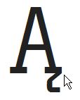
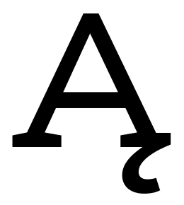
Polish letters need some work (IMO): acutes to the right, slash (Łł) ought to be steeper and I don't like ogoneks attached to the end of serif (they are very fragile and tend to break when used ;).

@JanekZ - You criticize the old version )))
I will take note of your remark in the work

Sorry, too much links...

It's always nice to let a diacritic affect the base letter, in a meaningful way.
Here's the Aogonek from Ernestine:

hhp

Huh, I thought I remembered Adam liking Ernestine's (but I could be wrong). In a way the outside serif is sort of being replaced by the beginning of the ogonek, so maybe that's why it's OK? Plus I think in a design with hefty serifs completely dumping the left half (like in some of those "approved" examples) would be a bit much.

hhp

The G definitely needs a horizontal crossbar. To compensate, it could have a base constructed like the base of a,d,u.

serifs of "x" regular does not look strange?

Maybe a little... The idea is sound; I think all it needs is to shorten the inside top right serif. But making it match the bold would be a safe change if you want to do that.

Captured from commoncrawl.org on 26 Apr 2015. original URL